Resources.
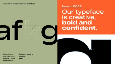
Monotype designed a pair of custom typefaces for global market leader in steel wire transformation and coating technologies, Bekaert, creating a bold, modernist design that speaks to the company’s extensive history and industrial heritage. The typefaces are an integral part of a company-wide rebrand, led by Interbrand and designed to support Bekaert’s ambition to be the leading partner in shaping the way we live and move: safe, smart, sustainable.

Monotype partnered with D8 to craft a fluid new identity for Pride Amsterdam, one of the biggest Pride celebrations in the world attracting thousands of visitors. Read the full case study for more.

Monotype and Lippincott partnered up to create a bold, inclusive new identity for NYC Pride, the marquee event held every year by Heritage of Pride, one of the most iconic, enduring LGBTQIA+ organizations in the country.

In early autumn of 2022, EDIT invited Monotype to partner on one of London’s most anticipated rebrands, the refurbished National Portrait Gallery which is home to some of the world’s most iconic and progressive portraits. Read on for the full customer story.

M&M’S® has been bringing people around the world together for more than 80 years. This year, the iconic brand got a modern makeover, with a revamped purpose of creating a world where everyone feels they belong. Other changes include a fresh look and updated personalities for the famous M&M’S characters; a more inclusive and welcoming tone of voice; and a new, attention-grabbing typeface called All Together — a large, warm, playful, and conversational family.

A global leader in medical technology, Brainlab has evolved into a powerhouse, transforming healthcare at scale across oncology, surgery, and total operating room digitalization. After 30 years, Brainlab was ready for a full rebrand and came to Monotype for a customized version of Helvetica Now to serve as their brand typeface.
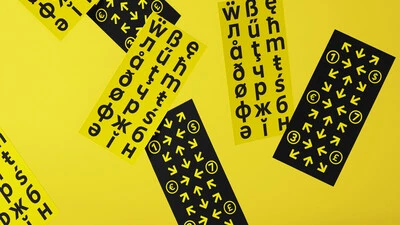
In our latest Studio connection session, Emilios Theofanous, Senior Type Designer at Monotype, and Tom Foley, Creative Type Director at Monotype, are joined by Martin Kofler, Digital Brand Lead at Raiffeisen Bank International. We explore the role type played in Raiffeisen's recent brand evolution, and we discuss the collaborative creative journey in creating their custom typeface 'Amalia'.
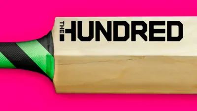
The England and Wales Cricket Board (ECB) have reimagined Cricket with the introduction of a new competition; ‘The Hundred’. Monotype collaborated with FutureBrand London to create a bold and confident typographic identity aimed at shifting perceptions to attract a wider audience to the game.
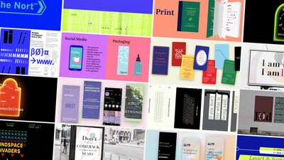
Over the past four years, we’ve been lucky to forge a reciprocal partnership with the Limerick School of Art & Design / TUS in Ireland. Both Creative Type Directors Tom Foley and Emilios Theofanous have now participated in workshops and modules at the leading fine art, design and creative media school. This year's students were asked to write a message platform for one typeface and build a marketing plan and design assets to promote it in digital or print media.
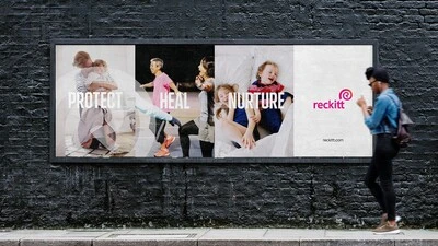
The new, bespoke typeface ‘Energy’ is distinctive, accessible and unique to the Reckitt brand, allowing it to confidently deliver its messages, reinforcing its commitment to making positive change.
Futurebrand and Kerzner International asked Monotype Studio to help refresh the brand identity for Atlantis, the beyond luxury hotel brand which operates both The Palm and The Royal in Dubai and Sanya in China. This is the first brand update for the group since the opening of The Palm in 2008 and is a move to unify the visual brand across all properties.
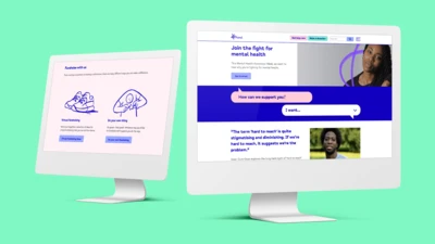
After years of raising awareness and understanding around mental health, the time had come for charity Mind to update its iconic visual identity. Monotype Studio developed Mind Meridian – a modified typeface that puts warmth and accessibility at the heart of the brand.
