Building unique brand equity, and consistency, for Rocket Mortgage.
Jenn Hilliard, Senior Brand Identity Manager, Rocket Mortgage
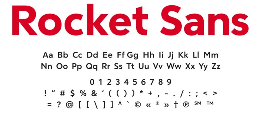
Monotype worked with Rocket Mortgage, the nation’s largest mortgage lender, to design a custom typeface for its brand to modernize and create consistency for the company across the full client journey.
About the company.
Rocket Mortgage is the nation’s largest mortgage lending company, headquartered in Detroit, Michigan. The brand helps people navigate the homebuying journey through an online and mobile-friendly mortgage application process. Rocket Mortgage engages existing and prospective clients across a myriad of relevant touchpoints, including print, digital, mobile and traditional advertising channels. With hundreds of marketing and creative professionals working throughout the brand, it is important for them to maintain consistency in its look.

The challenge.
At the start of 2019, Rocket Mortgage made a strategic decision to develop deeper brand relationships with its sister companies and to offer a more complete and meaningful experience to customers along their full home ownership lifecycle. The brand needed to build a unique and consistent visual equity so it could expand the relationship with its customers beyond a simple financial transaction.
“We are always reexamining the experience our clients have when they go through the homebuying process. In this review, we saw the need for consistency between Rocket Mortgage and our sister companies that handle credit reporting, real estate and personal loans,” says Jenn Hilliard, Senior Brand Identity Manager at Rocket Mortgage, who spearheaded the design of the custom font project for the brand. “The three visual elements we had to focus on were logo, color and type. Typography was a core part of our new strategy.”
The brand needed to select a foundry that had the right design experience, but for Rocket Mortgage, the selection process was far more complicated. The project required a partner that could understand the technical delivery of the typeface across channels and could balance design with regulatory standards and accessibility for all users.
Lippincott, the agency that Rocket Mortgage worked with on the rebrand, called in Monotype to collaborate on the ideation and design of a custom typeface that would achieve the brand’s goals. Lippincott is a champion of the role type plays in the branding system, and how it can enable continuity of visual voice and brand language.
The solution.
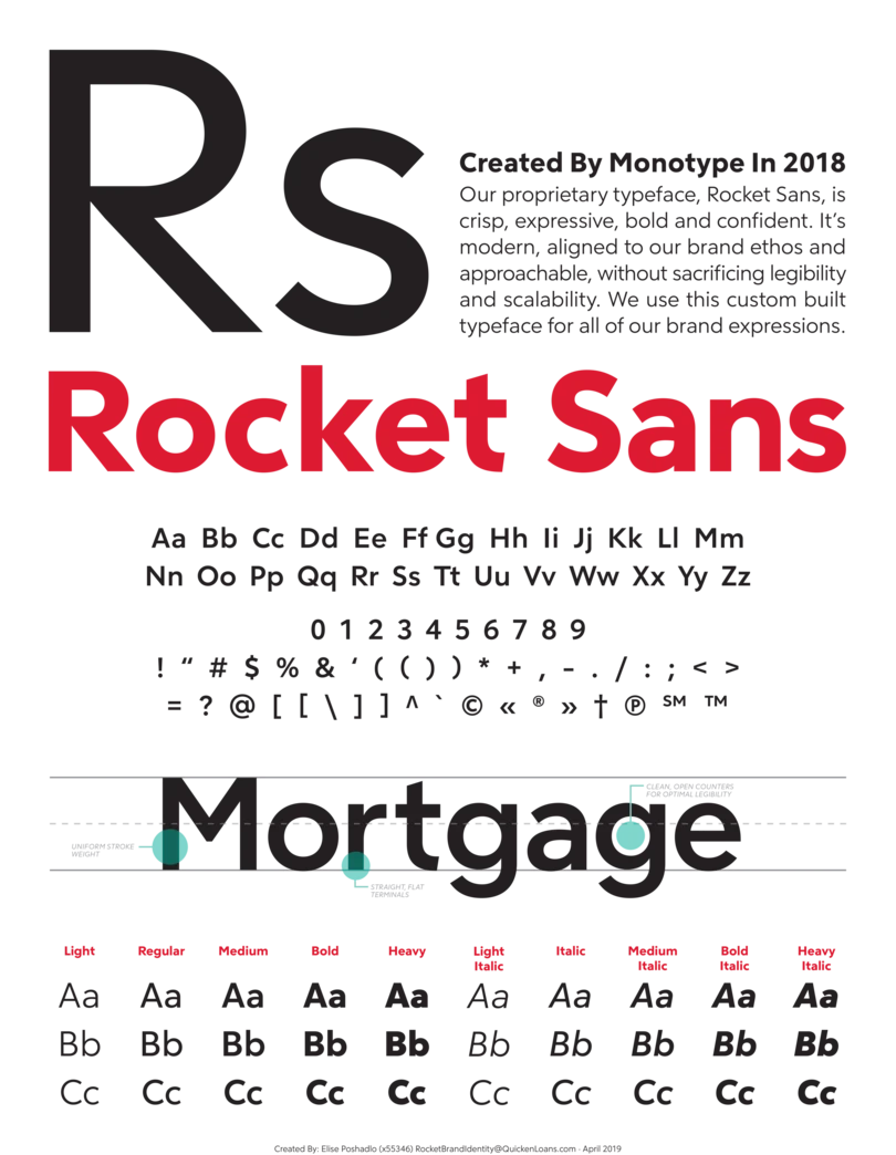
Working with the Monotype Studio, Rocket Mortgage adopted a new custom font design for its brand, which is modern, aligned to the brand’s spirit and approachable - without sacrificing practical considerations like legibility and scalability. Mortgage lending is a process that had been intimidating – until Rocket Mortgage provided confidence to homebuyers with the clarity, transparency and simplicity of its platform. The typeface needs to be legible, and professional, but keep the playfulness that Rocket Mortgage is known for.
“We define our voice and tone as being established, without being the establishment,” says Hilliard. “Our typography pairs well with that sentiment. It builds trust with our audience and it weaves in our reputation and legacy while making us feel human.”
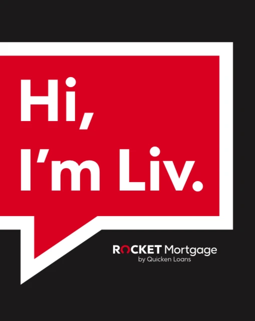
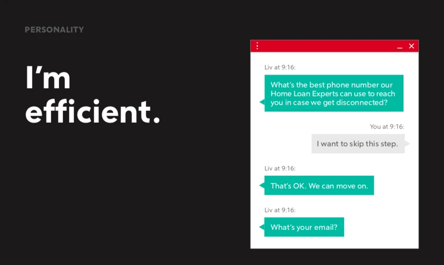
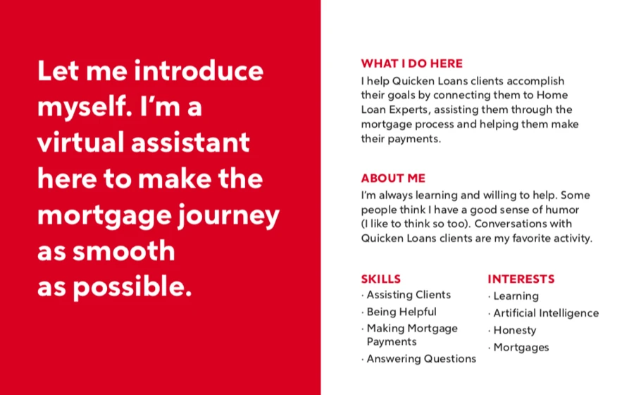
The result was an identity system that could translate to various mediums, from a mortgage application on a mobile screen to an advertisement on a large outdoor billboard. The Monotype Studio helped Rocket Mortgage ensure its new typeface, Rocket Sans, would be accessible for all users, and created characters of differentiation that would maintain consistency at all possible touchpoints, from marketing channels to legal disclosures.
Results.
The team really believes in that sentiment, using the design process to find other areas where they can make communication and interaction even clearer than they already are.


