A new brand identity for Atlantis Resorts.
Phil Garnham, Creative Type Director at Monotype.
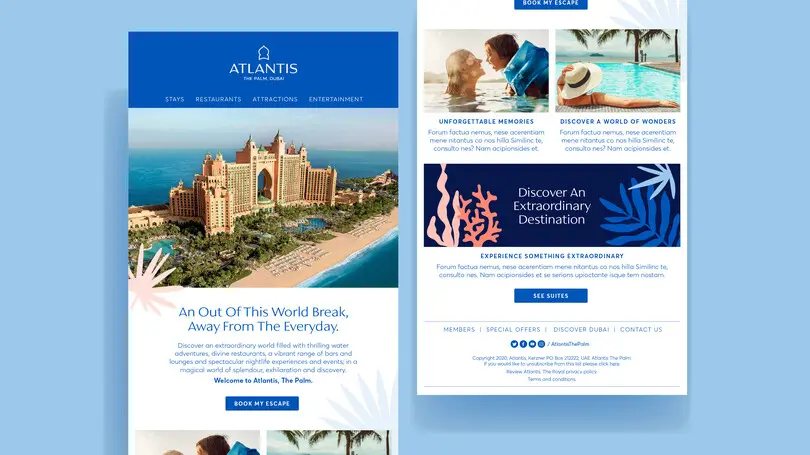
Futurebrand and Kerzner International asked Monotype Studio to help refresh the brand identity for Atlantis, the beyond luxury hotel brand which operates both The Palm and The Royal in Dubai and Sanya in China. This is the first brand update for the group since the opening of The Palm in 2008 and is a move to unify the visual brand across all properties.
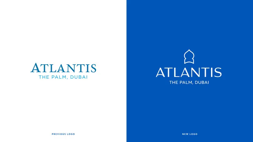
Futurebrand worked with Atlantis to draft a new logotype for the brand, a modernised evolution of the original typography, one that retained the arched ‘A’ crossbars of the original but now housed in a new, contrasted sans serif style. The formal idea was in place but something wasn’t quite right.
Futurebrand asked Monotype Studio to collaborate, to hone in on the design details and help bring their vision to life through the craft and refinement of the letters. We explored the logo’s weight, contrast, proportions, spacing and the curves of all characters to finalise the new mark and create a confident iteration of the letterforms.
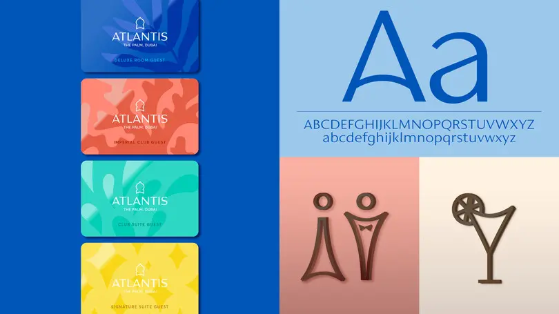
Logotype design is it’s own discipline, it requires a unique set of skills and demands a different approach to the design of a typeface, but logo design and logo-artworking can also be a nice way into the custom type design process. Together we began to expand on the idea of a unique custom font style that could provide a visual glue between all of the brands properties. A key aspect of the identity was the brand’s signage and hotel wayfinding system. Futurebrand had created a bespoke icon set for ‘The Royal’ and we could see an opportunity to create a typeface that took influence from that to build a coherent visual language with the new logotype and iconography.
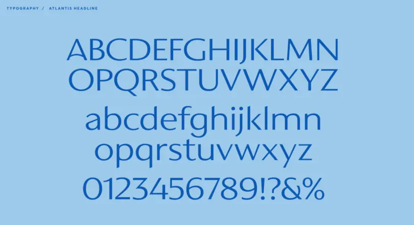
Our brief was to create a caps only headline font that would become synonymous with ‘The Royal’ hotel brand, one that was reflective of middle eastern cultures, regional typographic preferences and reflect Atlantis’s aim to move-on ideas around what a luxury brand is today. We also had to be mindful of how the fonts were going to be used in signage and in-turn signage manufacturing limitations. The letterforms would be cut from steel in a range of sizes so we balanced the weights and ran tests to avoid letter strokes that were too thin. Creating a typeface design born from the logo’s gentle arcs and The Palm’s distinctive architecture, but more robust to meet the functional needs of the brand.
As the brand identity grew with the number of applications and use cases, Futurebrand contacted us to expand the typeface into a full Latin character set of upper and lowercase with a view to creating continuity across the broader Atlantis brand. The lowercase letterforms were heavily influenced by a sense of calligraphic cultures, the calligraphic nature of arabic typography brought through into the Latin script.
Hanan Eissa, Vice President of Marketing & PR, Atlantis