Monotype Applauds 2026 Type Directors Club Scholarship Awardees
Monotype Imaging Inc., a global leader in type and technology, congratulates the 2026 winners of the Type Directors Club Adé Hogue Scholarship and Beatrice Warde Scholarship. The Type Directors Club (TDC), the world’s leading typography organization, announced the winners as part of its annual global student scholarship program. The two $5,000 scholarships, sponsored by Monotype, recognize promising student designers and support the next generation of typographic talent. Monotype has supported TDC student scholarships for more than a decade, sponsoring the Adé Hogue and Beatrice Warde scholarships since their inception.

Type Faces: Meet Manoj Lodhi.
For Manoj Lodhi, creativity doesn’t start with design — it starts with people. As a senior project manager based in Ghaziabad, India, Manoj brings a calm, thoughtful approach to everything he does, whether that’s guiding cross-functional teams at Monotype or navigating everyday life with his family. Grounded in simplicity, patience, and deep respect for others, he sees creativity as the quiet art of solving problems, building connections, and making life a little easier for those around him.

Type Around the World – Get to Know Sofia, Bulgaria
In this recurring feature in our “Fonts Having a Moment” series, we’ll be exploring cities around the world through the dual lenses of culture and typography, guided by our friends at Monotype and some of our partner foundries. Join us on this exciting virtual journey! This time, get to know Sofia, Bulgaria with Plamen Motev of Fontfabric.
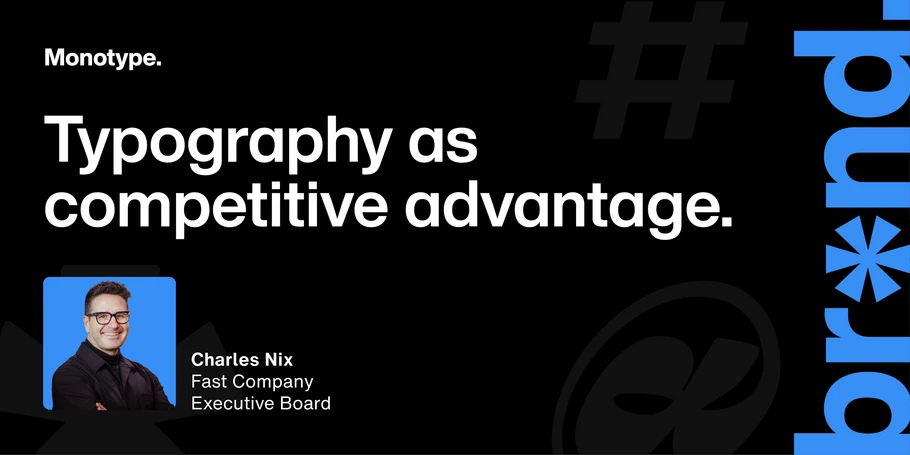
Typography is a Competitive Advantage
An elite athlete’s performance can look effortless. What spectators don’t see are the years of training, the coaches, the discipline, and all of the little decisions behind it. In his latest article for the Fast Company Executive Board, Charles Nix, Global Head of Creative Strategy at Monotype, argues that brands work the same way: every customer brand experience depends on an infrastructure of people, assets, technologies, and workflows. Nix explores how TypeOps — from font selection and licensing to distribution and governance — helps brands perform consistently, and why that discipline matters even more as AI enables teams to produce content at greater speed and scale.
Monotype Research Reveals the Operational Challenges Behind Brand Consistency
Companies invest heavily in defining their brand’s look and feel. But what customers ultimately experience depends on what happens after the guidelines are written. Monotype Imaging Inc., a global leader in type and technology, has conducted new research among mid-market and large organizations into how fonts are managed across increasingly complex brand and creative workflows. Among respondents, 62% cited missing or mismatched fonts among their top three workflow pain points, while 56% said their organizations source font IP through multiple creative platforms.
Type Faces: Meet Dr. Jan Kaestner.
A longtime Monotype colleague with a deep appreciation for music, nature, and the design space, Jan Kaestner brings curiosity to everything from choir rehearsals to questions of copyright law and the future of AI. Originally from Germany and now based near Boston, Jan is now Monotype’s General Counsel and has spent years building a career that combines logic and creativity in the application of law to typefaces and font software. Read on to learn more about Jan.
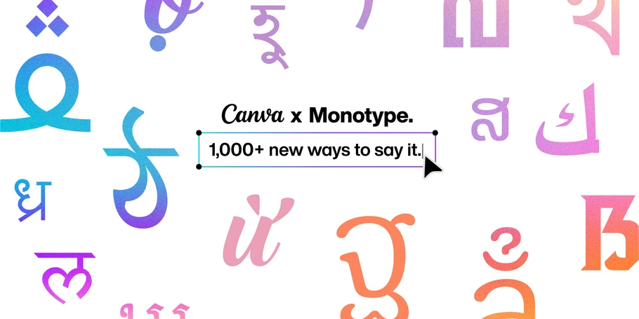
Canva and Monotype Bring 1,000+ More Font Styles to Creators Around the World
Monotype Imaging Inc., a global leader in type and technology, and Canva, the global visual communication platform, are expanding their partnership to bring greater typographic choice to Canva’s global creator community, adding more than 1,000 new font styles from Monotype and its global network of foundry partners. The expansion brings the total number of Monotype and foundry partner font styles available in Canva to more than 3,000.
Type Around the World – Get to Know Siem Reap, Cambodia
In this recurring feature in our “Fonts Having a Moment” series, we’ll be exploring cities around the world through the dual lenses of culture and typography, guided by our friends at Monotype and some of our partner foundries. Join us on this exciting virtual journey! This time, get to know Siem Reap, Cambodia with Sovichet Tep of Anagata Type.
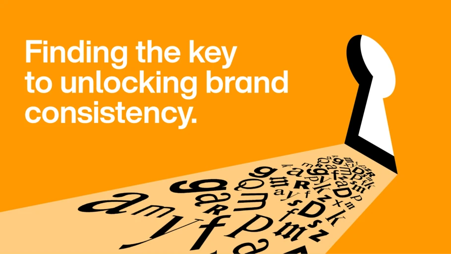
Fonts Are Creative Infrastructure. Agencies Should Treat Them That Way.
Agencies are being asked to produce more and more content across clients, channels, formats, and markets. But as creative output scales, so does the complexity of managing the fonts behind it. Kristin Ratzlaff, Vice President of Global Agencies and Partnerships at Monotype, explores why typography needs to become part of an agency’s operational infrastructure from the outset. Read more in Kristin Ratzlaff’s article in Transform Magazine.
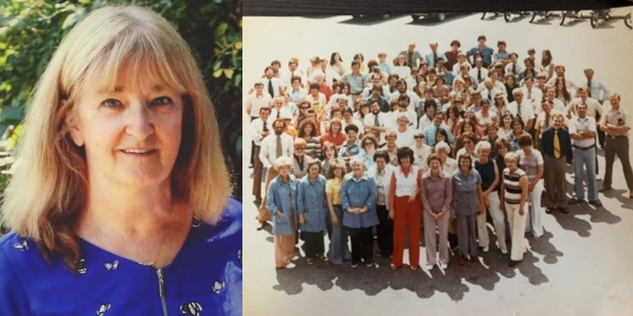
The Boston Globe Celebrates Pat Lightizer’s Remarkable 53-Year Career
The Boston Globe recently spoke with Pat Lightizer about her extraordinary 53-year career at Monotype — one that began when she joined Compugraphic Corporation at just 18 years old. The profile appeared on the front page of the Business section in the Globe’s September 8, 2026, print edition.