5 Common font management issues Monotype Fonts will help you fix.

This piece should cover how a MTF subscription can help alleviate problems organizations face due to font management issues. Provides examples of how a subscription may reduce the likelihood of commonly known issues that organizations face such as not having fonts all stored in one place or inconsistent branding. 

5 Tips for facing a font compliance challenge.

There’s something empowering about being a problem-solver. In the case of fonts, that often means being the one to resolve font license gaps. Everyone at your organization uses fonts, after all, and you have the chance to say, “I got this. I’ll make sure our creatives have the right tools so they can design with confidence.”

Evolving with the types: When to update your font solution.

Usually, if it ain’t broken, don’t fix it. But when it comes to vessels carrying precious cargo, be they vehicles, bodily or fonts, maintenance checks are imperative for avoiding a crash. We usually get a clear signal when something isn’t right. With a car, you might have a “check engine” light, while aches and pains tell us when something’s not right with our bodies, but with fonts, its not always obvious when something’s wrong. Unless you know where to look, that is… 

Font licensing & management terms and definitions.

From servers to desktop, this licensing lexicon covers terminology related to font licensing. While these definitions are applicable to licensing fonts in general, all examples given are related to Monotype font licenses specifically. Always refer to the relevant EULA to understand more accurate definitions for a software license.

Font licensing principles unpacked.

What is the difference between a typeface, a font, a font file, a font license, and a EULA? Does a font license cover one or multiple fonts? What informs a font license strategy? What’s the easiest way to resolve a font license gap—before or after it arises? From fundamental principles to pre-purchase considerations, this guide aims to help you confidently speak the language of fonts.

“Tip: You’ll want to bookmark this.”

Monotype Fonts: 5 Features that make font management a breeze.

Gives the reader an in-depth view into what font management features Monotype Fonts provides. Covers features such as managing company tags, managing permissions, assigning users to teams, etc… This should be written as if speaking to the admin so it should focus more on admin level font management features rather than the more tactical features that designers would be interested in.  Conveys how these features will benefit the reader.

Monotype Fonts: Our font library structure explained.

This piece should explain how the MTF library is structured and give the reader a good understanding of how the structure of the library benefits them. The article should be sectioned out into different categories such as the full range of styles, the range of languages, etc. with each section showing the reader why that portion of the font library matters. This piece should also touch on the foundries program and explain how Monotype partners with different foundries.

Monotype Fonts: What it really means for you.

This article should give the reader more context on why fonts and font services are worth what they cost. It should explain the value behind the services that Monotype offers and explain how this will benefit the reader cost wise in the long run/ the ROI they will hypothetically see on their font services. This piece should also cover how designers are behind fonts and they deserve to be paid for the work they put in.

7 common problems organizations face due to poor font management practices.

Every organization has their own approach to managing their fonts, but oftentimes these practices aren’t consistent across the board. This makes working with fonts tricky and causes issues over time.
5 Monotype Fonts features you’ll love.

Here are 5 of the best Monotype Fonts features to make font use easier. Monotype Fonts is not just a font library, it’s a cloud-based font management solution. Whether you’re a creative or an administrator, here are some of the Monotype Fonts features that will soon become your favorite.

What do your fonts say about you?

Your customers see your brand through design and typography. Typography is your brand’s ambassador. It is your visual voice, speaking for you every hour of every day, everywhere your brand lives.
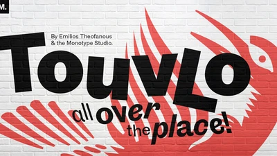
Touvlo: a zestful, modern grotesque with lively flair.

New from the Monotype Studio’s Creative Type Director, Emilios Theofanous, Touvlo – meaning brick in Greek – is an homage to London and the view from his studio window.
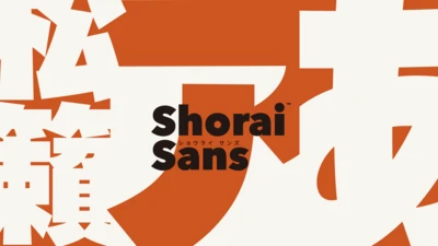
Shorai Sans.

New from the Monotype Studio, Shorai Sans is a contemporary Japanese sans serif designed by Creative Type Director, Akira Kobayashi; type Designer, Ryota Doi; and  typography legend, Yukihiro Nakamura. 

Cotford takes you places: A soulful, contemporary  serif typeface for the digital age.

New from the Monotype Studio, Cotford is a contemporary serif from Creative Type Director, Tom Foley. Cotford is available as a variable font and as 16 static weights, including  Display and Text styles. Cotford is available to all Montoype Fonts customers and can also be purchased at MyFonts. 
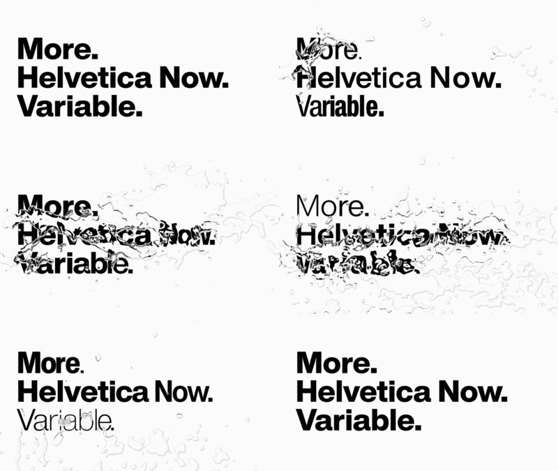
More of everything, for everyone. Introducing Helvetica Now Variable.

Helvetica Now Variable, new from the Monotype Studio, offers more than a million new Helvetica styles in one state-of-the-art font file, allowing you to create infinite shades of expression, incredible typographic animations, and ultra-refined typography.
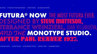
Introducing Futura Now: The definitive version of an iconic family.

Futura Now is the definitive version of the definitive geometric sans, re-digitized based on Paul Renner’s original designs and updated to provide a more contemporary typographic palette.
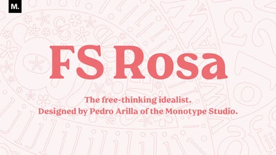
Meet FS Rosa.

Serif typefaces are sometimes seen as serious and overtly intellectual, a more somber sister to their laid-back counterpart, the sans serif. But FS Rosa breaks away from these conventions by combining the classic elegance of a serif with warmth and frivolity, created by its round letterforms and curves.