A living logo for every parcel, person, and place: Monotype and Superunion help Hermes rebrand into Evri.
Phil Garnham, Creative Type Director.
Evri is the new name and brand for Hermes, the UK’s largest dedicated parcel delivery company. The Monotype Studio design team led by Senior Creative Type Director Phil Garnham, worked closely with Superunion to create a living logotype powered by variable font technology to help the brand realize its mission of positive and reliable delivery experiences for everyone, everywhere. Hermes’ business tripled in size over the last five years, reaching £1.5bn in annual revenue. The parcel company handles more than 700m parcels for 80% of the UK’s top retailers - fulfilling the demands of online shoppers.
To align with the company’s growth, the rebrand had to reflect a new customer-centric business strategy, powered by technology and rooted in community. The Evri name, logo and mission evoke a commitment to positive customer experience and sustainable innovation. Evri now provides the most expansive coverage in the UK with flexible, personalized deliveries and collections both home and away - including Evri ParcelShops inside Tesco convenience stores.
A master logo.
In a digital-first world, most consumer-brand interactions happen on screens. Brands are defined by their written words, made by letters and made by logos, which blend with storytelling to evoke their values and voice via typography. At Monotype, we believe in the power of creative typography to make change and to have a significant and lasting impact in business. The Hermes rebrand to Evri is a notable example of how brands can promote the emotive use of typography and create distinctive and memorable engagements with their customers.
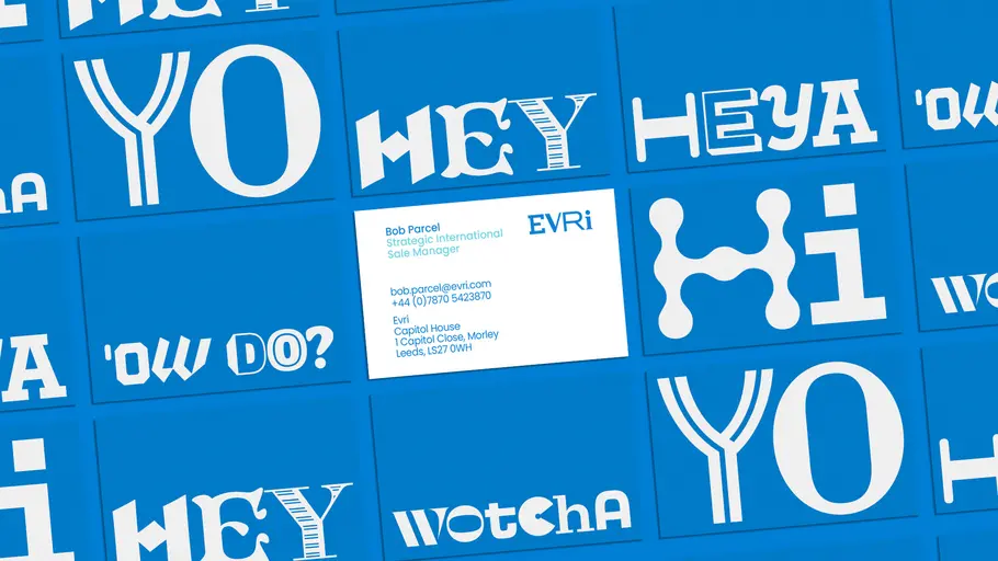
There is an unwritten rule that brands and designers live by; one golden rule: you must have a master logo. Generative identities whilst certainly are a ‘thing,’ are still exceedingly rare, and nearly unseen when it comes to mass market brands. Like every creative rebrand story, it is with this golden rule that Evri, Superunion and Monotype began this rebrand project: to create a master logotype. Conceptually, the Evri logo practically demanded variety, an execution that could speak to the adaptive and inclusive nature of the brand message.
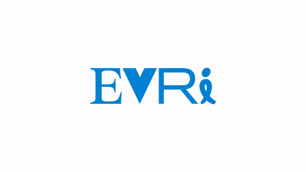
The team at Superunion asked the Monotype Studio to help with the refinement and craft of their idea: a four-character visual ‘mix-up’ of varying type styles: slab, sans, and serif. Collectively we felt it was important to create a logo that evoked the dynamic nature of the Evri brand, it needed to be unique and memorable, but also be stable and grounded, knowingly significant, without quite letting on. Creating the master artwork was ultimately a challenge of balancing variety. How do you balance shapes that bear no relationships to each other within one cohesive set? This juxtaposed variety, designed to represent the diverse nature of Evri’s services and the objects they deliver, needed some care, tweaking and exploration to get it just right. Type weight and this idea of visual ‘presence’ helped us to find the flatness and creative balance that all great logos live by. We created a master logo, but in today’s world of dynamic branding, we wanted to take it a step further.
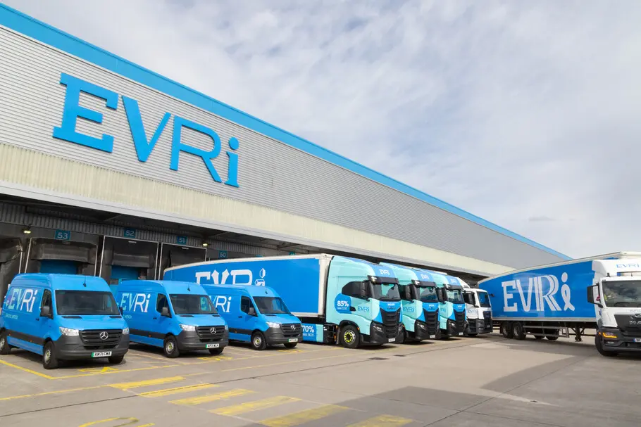
Master logo in use.
Generative branding.
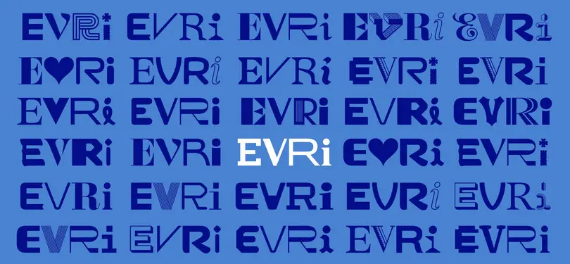
Brands are learning to flex their voice and speak to customers as individuals based on their choices, preferences, and personal data. As designers, we’re witnessing the top-down, client-centered approach to brand creation diminish as customers and users are increasingly ‘calling-the-shots.’ Today’s generative design systems evolve around you, or in the case of Evri, they evolve around the package, the destination, and the everyday engagements that happen on your doorstep. Brand engagement can be personalized, yet also remain cohesive and ‘on-brand.’ The Monotype Studio wanted to create a generative logotype system that was unlike any other seen before. By employing variable font technology, we envisioned the design of an adaptive logo system, one that enabled Evri’s logotype to change its letterforms entirely, and yet remain sticky; a logo that eliminates consistency at every customer interaction whilst still being completely recognizable. No small task!
Adaptive logotypes, powered by variable fonts.
Monotype pitched a variable font future to the client, this idea of utilizing typography as a vehicle to manifesting a diverse and boundary pushing identity, to make our cultures one and the same. A variable font is a dynamic font family, it can behave like multiple fonts, and with a little extra creative thinking they can become responsive too. Variable allows us to interact with and apply external data points to font data, to manipulate the font style to whatever form suits the design, the context, or even a customer’s preference. Our vision was to create a variable logo system that adapts from one, to many viable alternative designs. We had lofty ideas.
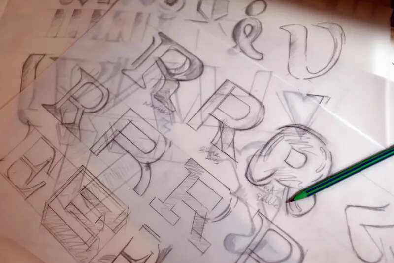
However, we had to apply some rules to our system, to establish cohesion from chaos. The Monotype Studio design team led by Senior Creative Type Director Phil Garnham, set out to create twenty alternative design variations for each letter in the master logotype. By designing each new glyph with similar metrics, we sought to imply a familiar ‘block’ impression to each logo iteration. Creatively this work also speaks to the emerging trends we have seen in type design over the last year, not only in generative design but in ‘Mix-up,’ a notable trend featured in this year’s Type Trends report.
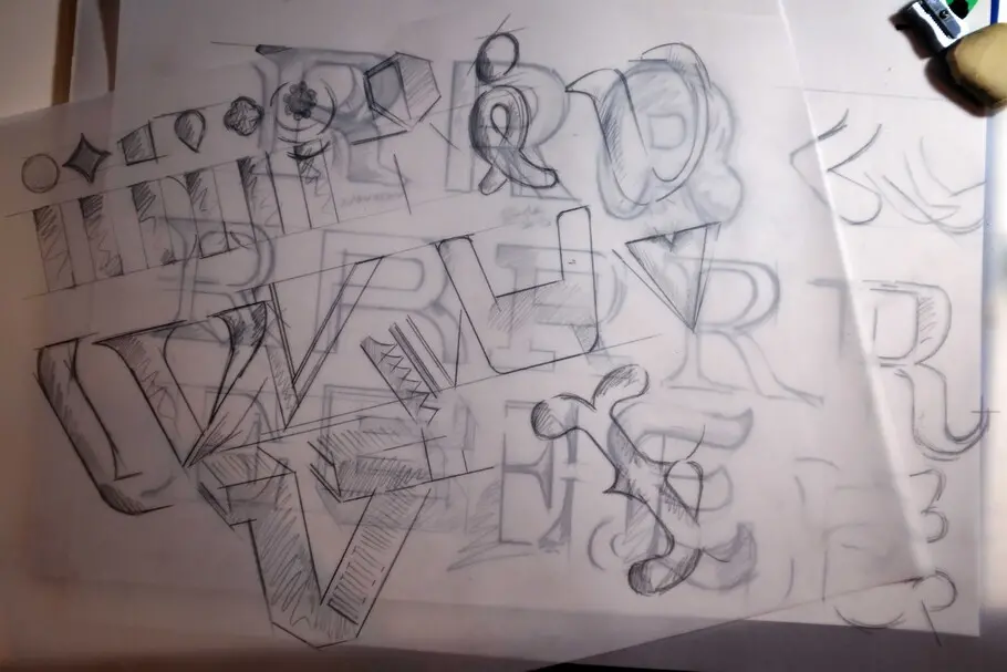
As type designers, drawing letters is what we do, it feeds our souls; and so being able to receive the gift of creative freedom from Superunion and the Evri brand team fostered a bountiful collaboration. The Monotype Studio set out exploring and iterating across all four letters of ‘E’ ‘V’ ‘R’ ‘I’ which inevitably led to all kinds of unexpected shapes. Iterating at whim almost became its own curse that naturally opened a lot of brand design questions around legibility, iconography, symbolism, and the possible danger of replicating another’s brand logo into Evri’s logotype. We established the approach of being curious and creating a set of unique letter shapes, whilst remaining mindful of the overall variety amongst type styles and balancing each character’s degree of expression.
During our creative conversations, we were able to reduce our scope and define clear rules for the brand’s typography. When a type designer receives wide open creative freedom, new ground is unearthed, and this can often push beyond expectations. Collectively, we established that legibility was of huge importance, especially given the already flexible nature of the design system. We had to be equally mindful of how the design ideas could be misinterpreted or used against the brand. Textures, brush marks, icons and symbols were largely removed when posed the question, “Will I be able to read this at 70mph on the side of a delivery lorry?”
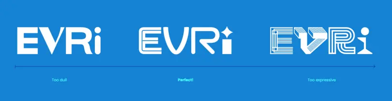
As we have said, logos can be flat and dull, over-embellished and complex, or somewhere altogether more balanced or perfect. Letters can be simple skeletons, or modular overlapping gems with glimmering shine. Variable fonts have their own inherent axis structures that designers can play with. Evri gave birth to the ‘Expressive’ [EXPR] axis. But, how does that work exactly? Imagine a slider where simple shapes have low values and decorative shapes have higher. Evri’s brand designers now have the creative freedom to dial up or down on the degrees of personality in each unique version of their logo. The axis enables a generative “Logotype Generator” system to automate the designer’s eye, perfectly balancing personality, and playfulness with legibility.
This project has been a technological game changer. Working with Glyphs App creator Georg Seifert, and Microsoft’s variable font specification team, the Monotype Studio has been able to pose questions that were unanticipated. In doing so, we have been able to expand the OpenType Variable Font specification for the entire type and graphic design community through our collaboration. The project is also now influencing the way we make variable fonts for the Monotype library.
Early in the engineering process, each of the four logotype glyphs had an individual axis controlling its expressiveness. That, however, led to exponential growth of the output font’s FeatureVariations table, resulting in a whopping 25 MB font file. The team took a step back and put the control of all glyphs under a single [EXPR] axis, shrinking the size to a much more adequate 25 kB. Granular control over each glyph was then easily taken over by a complimentary tool from Superunion.
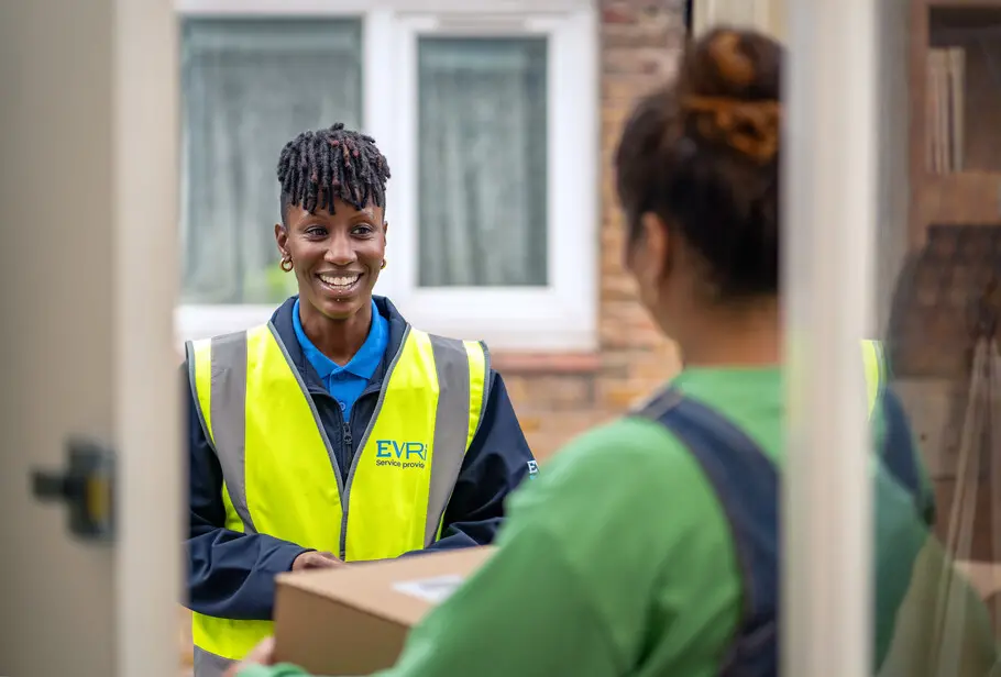
Logotype in action.
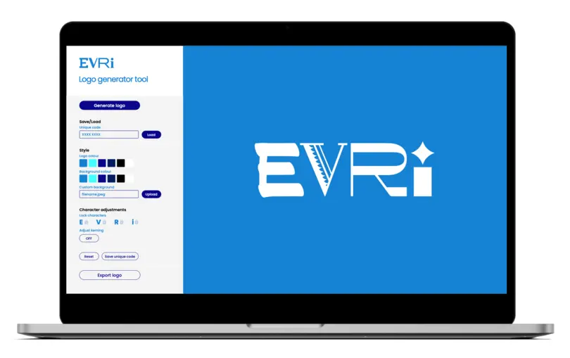
The bespoke Evri logotype generator tool made by Superunion allows Evri to create thousands of distinct logo design iterations with ease. The aim of the tool is to generate a variety of logo designs that can be used across all touchpoints and marketing materials. The intelligence and functionality within the tool allow the user to lock and change individual letters, create unique logo codes for favorite combinations, import custom background artwork and export for logos for final artwork. The typeface and tool create a space to access up to 194,481 possible unique logo combinations for use on delivery trucks, delivery slips, uniforms, and the brand website. This is possibly one of the most iterative logo systems to date.
Evri Monotype.
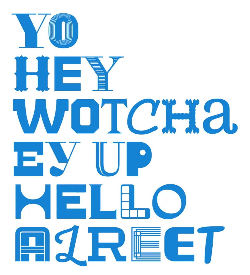
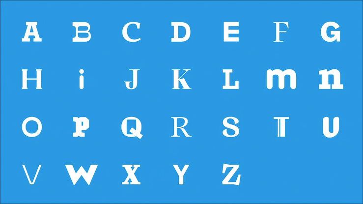
Imagine a typeface with every typeface in it: literally every typeface ever created in one font file. This idea is one of the first things we discussed when setting out to create the ‘Evri Monotype’ font, but it wasn’t possible as the planning and practicality of the concept was obscene. But what about a font which implies universality, diversity, and inclusivity – the very essence of that idea? Meet Evri Monotype.
Evri Monotype is Evri’s most significant brand asset. It’s a unicase typeface that contains 615 unique letters, numbers, and symbols. The font’s broad range of expression is preprogrammed to automatically change and react to its preceding letters via intelligent pseudo-randomization OpenType code that manages stylistic sets across the font. The font can automate the look and feel of words being typed without any user intervention, a simplified solution for non-type-savvy internal font users. The headline expands on the concept of Evri’s variable logotype, but here upper mixes with lowercase across all glyphs, the font’s spacing is looser yet remains compact in delivering punchy headlines, and the brand’s cheeky and chirpy tone of voice in short-form copy. This is a typeface that embodies the variety of each and every parcel, person, and place Evri delivers to.
Phil Garnham, Creative Type Director.
Expanding Evri’s typographic universe was an opportunity to collaborate across Monotype’s entire Studio team, to marry words with message and explore innovative ideas without the many constraints that a cohesive type design naturally enforces. Evri’s copywriting, and joyful play on words helped to ignite our sketchbooks. We moved forward as a creative team to explore the typographic display styles of the past, to reinvent old ideas as new single letters, and to create new display forms as moments of interest in what swiftly became a huge, disconnected alphabet. The buzz was real.

Going beyond expectations and realizing new design realities is what makes custom type projects so special, so we relished the challenge of sneaking typographic easter eggs into this font, with references to parcel packaging and emoji’s language. We sought to push the limits of acceptance, to elevate typography as entertainment and to create a font that could hold its own.
We chose to make 20 alternative characters for every letter, not arbitrarily but because of technical limitations: Adobe InDesign has a 20 Stylistic Set limit. If we could have made additional characters, we would have, but how much variety is too much variety? We were also conscious of the practical needs of internal users at Evri, those primarily using Microsoft Office tools, which have less than ideal technical support for OpenType font features. For the internal teams, we created multiple character set versions of the font that encompass the same variety of expression but delivered via upper and lowercase character positions.
In terms of randomization logic, this is probably the most complex code the Monotype team has created to date. It uses the Quantom randomization method from opentypecookbook.com as a starting point and extends it further to fit the specific needs of this project, in order to create an even more randomized impression. In the original Quantum method, each paragraph break starts with the default characters. We have added further methods to make sure that the first character of each line or paragraph is randomized. Finally, we added certain “cleanup-methods”, which make sure that there are no duplicate glyphs in words with maximum of 10 characters.
Pure typographic identity.
What is a brand without its voice? Evri is in some ways pure typographic identity. The brand is an advocate for the power of typographic identity in post-pandemic times where nearly all brands seek to stand out in the ever-increasing meta-world. We are seeing a surge, a rush in point of curves, a flurry of storytelling in typographic form. Digital brands are no longer wedded to utilitarian ideals. Brands like Evri are brave, opening doors to our ever-populated diverse visual landscape and should be celebrated as creative leaders. Together with Superunion we have harnessed our global creative teams to create a multi-faceted brand, seeking change for all, while delivering as the UK’s fastest growing parcel delivery company.


