Everything old is new again: a deeper look at nostalgia in design.

Nostalgia, thought to help people cope during times of crises, is having a moment in design of all kinds. We explore what’s driving the trend and some of the complexities inherent in reviving historical design elements.
Over the past year or two, nostalgia has begun to creep in to many facets of daily life – fashion and furniture, brand identities and even the music we stream. During what has been the most uncertain, unsettling 2 years most of us have experienced, we’ve watched brands and designers seek out a sense of comfort by reinventing the familiar. Scientifically, it makes sense as psychologists have found that reminiscing can help people cope with crises.
Like picking for antiques, designers similarly love to dig for inspiration in heritage logotypes, books, posters, and books, and pay homage to those designs. How many typefaces were inspired by letterforms in an old book discovered at a used bookstore or a postcard sourced at a yard sale? It’s a way to celebrate icons or curate a unique style – whether in a logo, your closet or in your home.
Even our most recent Studio release, a contemporary serif titled Cotford, from Creative Type Director Tom Foley, carries a nostalgic touch. “Cotford reflects an experience many people had during the peak of last year’s lockdowns: A yearning for familiar comforts and a bit of warmth amidst the uncertainty.”
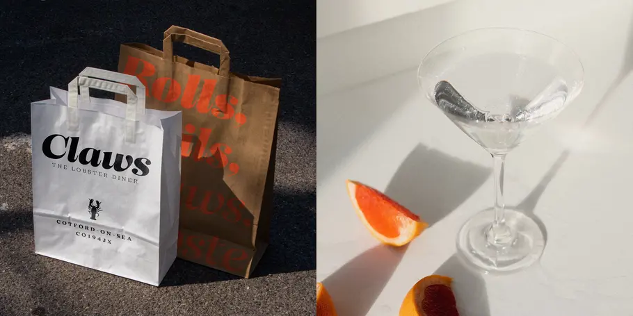
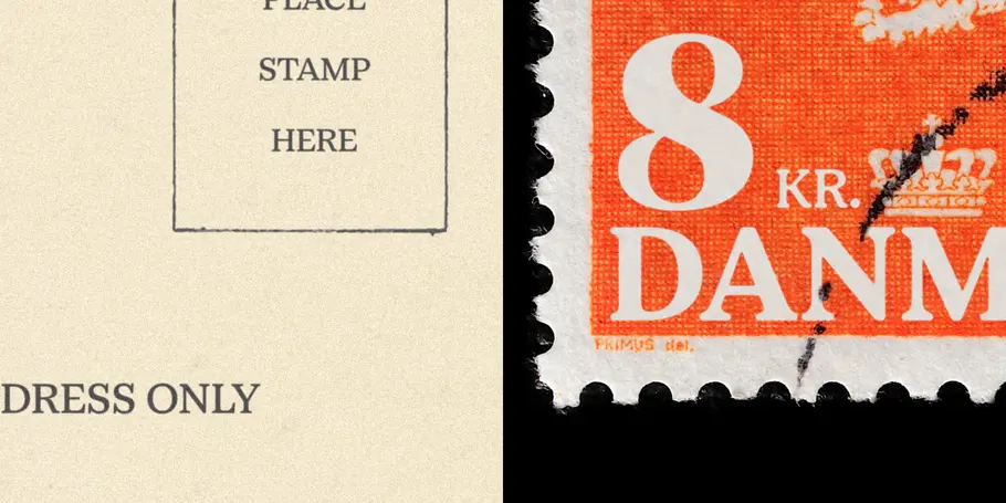
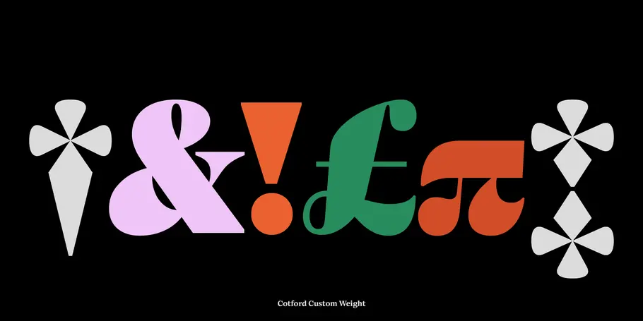
Cotford from the Monotype Studio.
The thrill of the find.
Outside of type and graphic design, vintage styles have gained mainstream popularity across furniture, home décor and fashion. The ritual of discovering a rare piece of history and giving it a new life in the modern world has offered relief during the pandemic and grown via new channels like Instagram and fashion resale websites like Depop.
Fashion trends have always come in cycles, but according to ThredUp, an online resale store, thrifting has recently grown into a $36 billion industry that is expected to eclipse fast fashion by 2025. A heightened focus on sustainability has turned crowds of increasingly younger consumers towards consignment instead of supporting fast fashion. The pandemic has also caused supply chain issues across nearly every industry, and some customers prefer the instant gratification of thrifting over waiting for delayed shipping on new items.
The hunt for vintage finds extends to the lived-in world as well, as photographer Tyler Haughey shared on our podcast. His work focuses on certain signifiers like old signage or décor to explore how these items can anchor memories or experiences in our minds. “Memories start out being very familiar and recent and tangible,” Haughey said, “and then as you get further and further away, they kind of turn strange and take on this fantastical element. I think the nature of memory is that it just becomes less and less specific over time.”
All of these elements, whether bubbly 70s style fonts, hazy photos of bygone beach towns, thrifted denim, or antique furniture, can serve as vehicles for storytelling and reviving the past. In our 2021 Trends Report, we first identified our “soft-serve” serif font trend after noticing the appearance of classic, cozy, heavily nostalgic Cooper Black–influenced serifs in rebrands for Chobani (InHouse), MailChimp (Collins), Meridian (BulletProof), Dunkin and Burger King (JKR). After a relentless year, the trend has held strong, showing up via letterforms with playful swashes, fat serifs, quirky letters and vibrant color schemes.
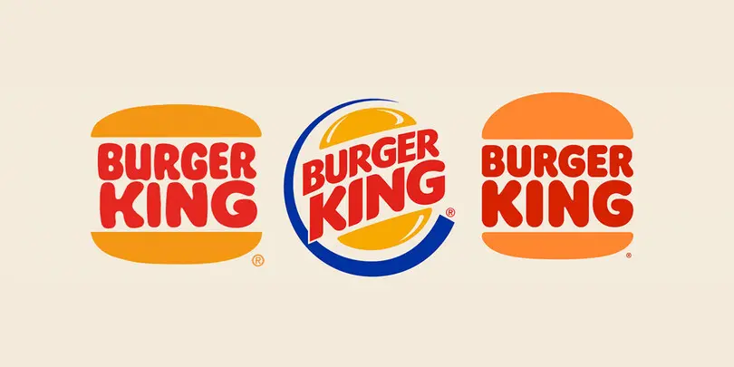
JKR’s rebrand of Burger King.
Celebrating diversity in history.
Where it gets tricky, though, is separating that appreciation for heritage design elements with the sometimes-unsavory social contexts they were born in. “This whole idea of nostalgia and rose-colored glasses leaves us prone to cherry-picking—ignoring sexism, racism, and social inequality, and saying, ‘Well, there was a time when white men were able to go play baseball!”” Monotype Creative Director Charles Nix pointed out in a Print Mag interview about the resurgence of retro sports uniform design.
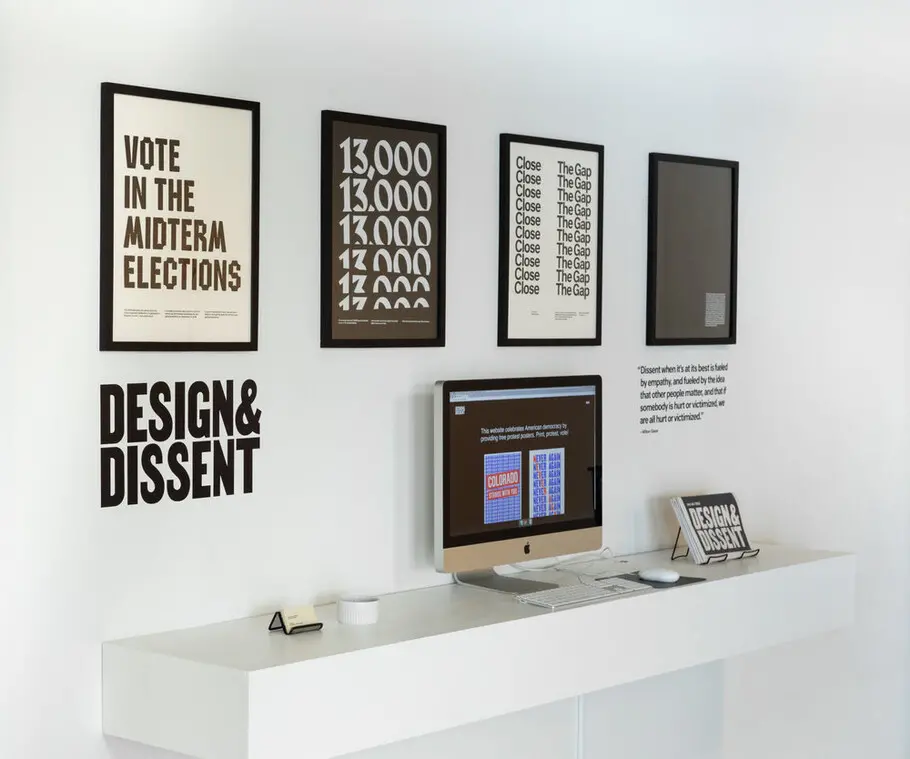
To take it back to type, let’s look at the work that Tré Seals, owner, and founder of Vocal Type, is doing to use fonts as a means for storytelling. All of Vocal’s typefaces are derived from historical events such as marches and protests, and are named after prominent advocates of social justice, including Marsha P. Johnson, Martin Luther King, and Bayard Rustin.
Vocal Type Work.


As a black designer who hadn’t seen himself represented in the industry, Seals has spoken about the lack of diversity in design and how it has shaped his career.
“In March 2016, while aimlessly scrolling for fonts while crafting another identity for another real estate agency, I just became really bored,” Seals said in an interview on It’s Nice That, “Everything I saw, no matter how beautiful, all just looked the same. You could argue it’s because we are obsessed with grids and perfection, but the truth is there was no culture, no character – only monotony and stereotypes. While design is my passion, I started wondering if I had picked the wrong career.”
While doing some professional soul searching, Seals reflected on the negative and positive racial experiences he’s had in the workplace. He also thought about civil rights activists and the pride he felt in learning about their roles in history.
Tré Seals.
This realization moved Seals to work full-time on typeface design with Vocal Type. To date, his designs have become the typographic face of many Black Lives Matter murals and protest signs, museum exhibitions, numerous non-profits, magazine editorial spreads, and even Spike Lee’s new book. And as the direct result of a historic event, the murder of George Floyd, Seals has also seen an increase in usage of his designs in branding – which aligns with the mission for Vocal Type. Seeing his fonts used in a wide array of brand identities is the mainstream exposure Seals was hoping for, “This, to me, reinforces the primary mission of Vocal Type – to diversify design.”
So, while for centuries nostalgia was considered a disease, if used well, it can also serve as a design differentiator or provide that fuzzy reminiscent feeling we all crave. Charles Nix summarized it well in his interview in Print Mag, “The way that we use [nostalgia] now is almost the same reason we eat chocolate chip cookies when we’re watching television—it feels good. Pop-Tarts, boxed cereal—all of these things allow us to escape for a moment. There’s nothing harmful about it. But the thing that moves us forward collectively and individually is confronting the things that are wanting in our world and designing—whether it be in graphic design, product design, or just the design of our lives—toward some ideal rooted in the past but is looking forward to what we’re going to leave behind, or what we’re going to make for ourselves and our offspring.”
To learn more about Seals and the work he’s doing with Vocal Type, listen to his episode on our Creative Characters podcast below.


