Resources

Monotype introduces Ambiguity, a typeface designed to effectively express a range of attitudes and beliefs.

Learn more
Embrace Ambiguity.

Monotype introduces Ambiguity, a typeface designed to effectively express a range of attitudes and beliefs.

Designers and studios might be deeply familiar with Neue Helvetica, but it’s the product of a pre-digital era. Here are four reasons why it’s time to switch.

Learn more
From Neue to Now.

Designers and studios might be deeply familiar with Neue Helvetica, but it’s the product of a pre-digital era. Here are four reasons why it’s time to switch.

Neue Fonts

More than 150 languages and scripts are supported in this global super family, which uses the warmth and clarity of the original Frutiger design to help brands communicate around the world with consistency.

Learn more
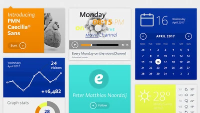
Introducing Neue Frutiger World.

More than 150 languages and scripts are supported in this global super family, which uses the warmth and clarity of the original Frutiger design to help brands communicate around the world with consistency.

Monotype’s Walbaum typeface is the modern serif font to beat all modern serifs. Freshly restored by Monotype, this updated family oozes charm.

Learn more
Meet Walbaum.

Monotype’s Walbaum typeface is the modern serif font to beat all modern serifs. Freshly restored by Monotype, this updated family oozes charm.

VAG

This extended version of the VAG Rounded typeface by the Monotype Studio brings the 1970s design up to date, expanding its language support and adding two new display fonts.

Learn more
Meet VAG Rounded Next.

This extended version of the VAG Rounded typeface by the Monotype Studio brings the 1970s design up to date, expanding its language support and adding two new display fonts.

Hope Sans

Hope Sans has been selected by the judges of the 22nd Annual TDC Typeface Design Competition to receive the Certificate of Typographic Excellence. It will be included in the Annual of the Type Directors Club, “The World’s Best Typography,” and will also be shown at the 65th Awards Exhibition (TDC65) in New York City.

Learn more
Meet Hope Sans.

Hope Sans has been selected by the judges of the 22nd Annual TDC Typeface Design Competition to receive the Certificate of Typographic Excellence. It will be included in the Annual of the Type Directors Club, “The World’s Best Typography,” and will also be shown at the 65th Awards Exhibition (TDC65) in New York City.

Neue Plak

German designer Paul Renner is best known for his Futura design, but Plak, his 'other' typeface, is long overdue a rediscovery. Monotype designers Linda Hintz and Toshi Omagari have restored this under-appreciated design, creating a versatile set of 60 weights that draw on the forms of the original wood type.
Learn more
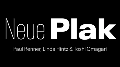
Meet Neue Plak.

German designer Paul Renner is best known for his Futura design, but Plak, his 'other' typeface, is long overdue a rediscovery. Monotype designers Linda Hintz and Toshi Omagari have restored this under-appreciated design, creating a versatile set of 60 weights that draw on the forms of the original wood type.

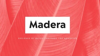
Malou Verlomme’s Madera is a fresh addition to the popular geometric sans serif font genre, intended as a go-to typeface for branding and visual communication.
Learn more
Meet Madera.

Malou Verlomme’s Madera is a fresh addition to the popular geometric sans serif font genre, intended as a go-to typeface for branding and visual communication.

Sagrantino

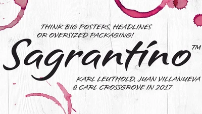
Sagrantino is a non-connecting script that traces its roots back to hand-drawn letterforms, and the connection between pen and paper. Named after the Italian wine, Sagrantino is bold and full of flavor, while embodying a sense of freedom and fluidity. Its quirky character shines at larger sizes – making it perfect for headlines, posters, or anywhere type is needed to really make a point. The family is available as OpenType Pro fonts, and has an extended character set that supports most Central European and many Eastern European languages.
Learn more
Introducing Sagrantino.

Sagrantino is a non-connecting script that traces its roots back to hand-drawn letterforms, and the connection between pen and paper. Named after the Italian wine, Sagrantino is bold and full of flavor, while embodying a sense of freedom and fluidity. Its quirky character shines at larger sizes – making it perfect for headlines, posters, or anywhere type is needed to really make a point. The family is available as OpenType Pro fonts, and has an extended character set that supports most Central European and many Eastern European languages.