Meet FS Rosa: Warm, quirky, with a hint of nostalgia.
Creative Type Director Pedro Arilla.
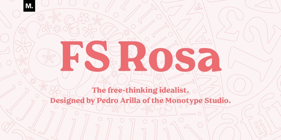
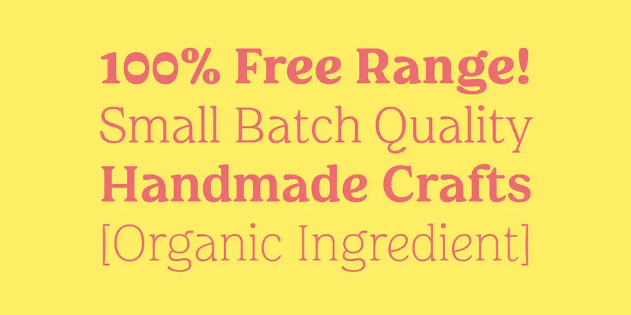
Serif typefaces are sometimes seen as serious and overtly intellectual, a more somber sister to their laid-back counterpart, the sans serif. But FS Rosa breaks away from these conventions by combining the classic elegance of a serif with warmth and frivolity, created by its round letterforms and curves.
I wanted to design a new typeface that steers away from the sameness of sleek, smooth geometric sans serifs we see everywhere today, and tap into something more human and approachable. I’m tired of the quest for digital perfection and wanted to create something with more visual variety, that was diverse and colorful.
So I turned to nostalgia and looked to the serif typefaces that were booming in the 1920s – beautiful classics like Cooper, Souvenir, and Windsor, which later had a resurgence in the 1970s, featuring on the covers of sci-fi magazines, vinyl record sleeves, and film title sequences. I wanted to give these a modern twist, and create a typographic homage to this era.
Working digitally but freehand, I began by developing a regular weight for FS Rosa before moving on to the heavier weights and then finishing with the lightest. I initially gave the bold weight a high contrast, making it prominent as a display font, but discarded this so that all five weights could shine. Black is often the most popular choice for this typeface style but I wanted to preserve the identity of FS Rosa across all five weights without letting it lose its confidence.
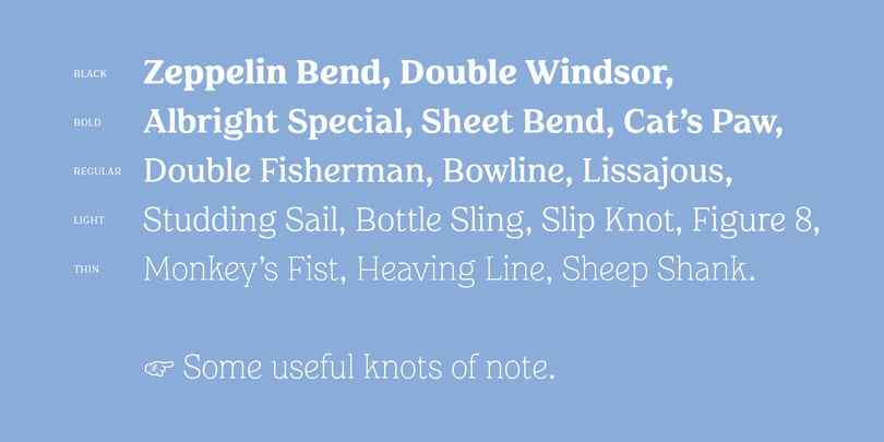
In the end, I designed the heavier weights to be perfect for loud statements and groovy headlines, a regular that is functional and robust for large amounts of text, and two lighter weights, which are more elegant and contemporary. It’s a type family with three distinct voices.
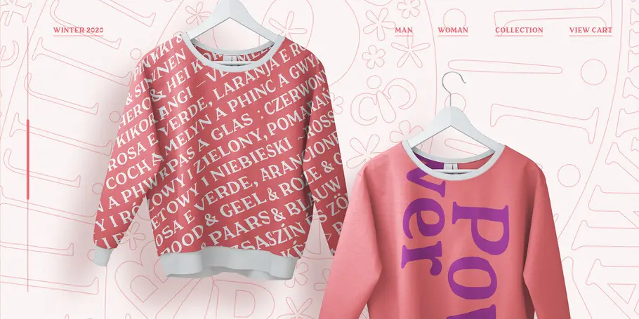
I wanted FS Rosa to be eclectic and raw in its letterforms, while still being friendly and approachable. In line with many of its 1920s counterparts, its characters are warm and rounded, with soft terminals, a large x-height and wide apertures. These soft features are cut through by short ascenders and descenders with slanted serifs and unusually low crossbars on the uppercase. There are many surprises to be found in the characters: the tail on the ‘Q’ is peculiar, the ‘e’ appears to be smiling and the ‘f’ almost has a 1950s-inspired, rockabilly hairstyle.
Through these quirks, FS Rosa is beautifully rustic. I drew on the nuances and lovely flaws found in type created before the digital age, looking at early films and cartoons, old magazines and vinyl records for inspiration, as well as Letraset and other dry transfer techniques of the 1970s, which were so expressive.
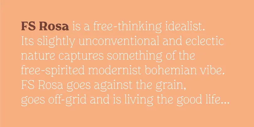
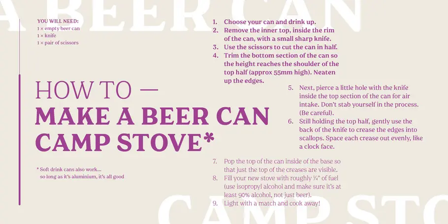
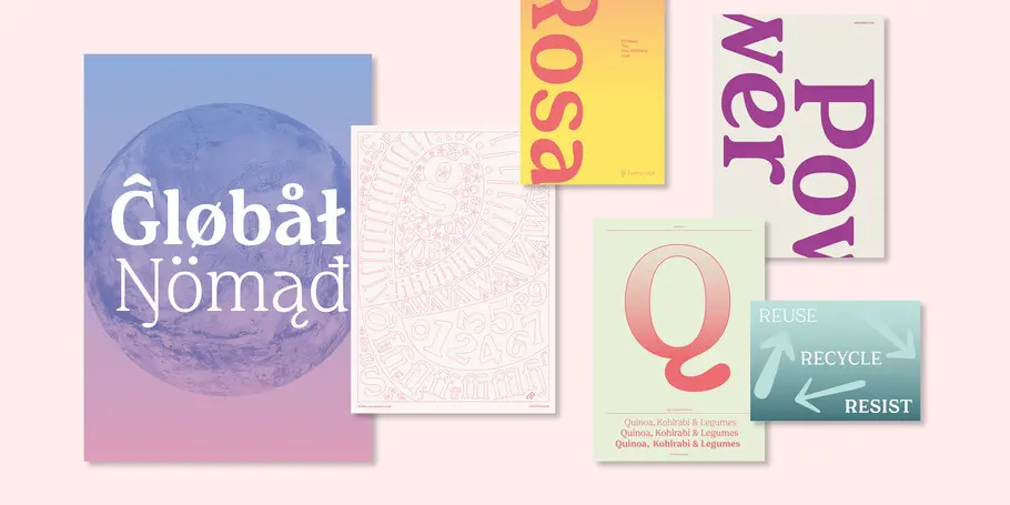
The result is a contemporary take on these techniques – a diverse typeface that is unconventional and individual, but also robust and pared back when it needs to be. It’s not in your face and aggressive, but a quiet protest, a progressive force for change. Counter Studio has designed a range of typographic images for FS Rosa, which reflects its free-spirited nature – featuring recipe pages, and instructions on how to make your own beer can camp stove, perfectly capturing the proactive, DIY and grassroots nature of the typeface. Its name, too, is inspired by optimism – Rosa is a link to “rose-tinted” glasses, as well as my own Spanish roots.
It’s this warm quirkiness that makes FS Rosa perfect for socially conscious and honest brands, magazines, campaigns, print publications, websites, and any company wanting to incite positive change. Far from the austere feel and overly polished look of many serifs, FS Rosa celebrates the beauty of just being yourself.
You can purchase FS Rosa on MyFonts or access it through your Monotype Fonts subscription.


