Resources.
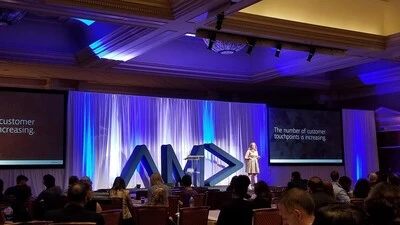
Monotype's VP of Marketing, Alice Palmer, spoke at AMA Marketing Week Live about the role of persona-based marketing in building a customer-centric experience.

We’ve compiled six common myths around the role of text in augmented and virtual environments and reasons why these challenges don’t hold true.
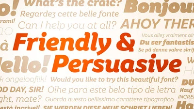
Typeface design is a mysterious business. While most people are acquainted with the dropdown menu in Word or a website like MyFonts, not everyone realizes there’s a host of independent designers and foundries all quietly making their contribution to visual culture.
UK Type Director Tom Foley discusses how today’s brands can deliver stunning, impactful creative work--if they can get everyone on the same page.
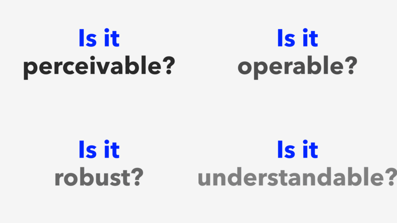
In this three-part series, we’ll show you how fonts can help your website follow the standards established by the Americans with Disabilities Act.

In this three-part series, we’ll show you how fonts can help your website follow the standards established by the Americans with Disabilities Act.
Choosing the right typeface can be a daunting task for any brand. We explored this topic in greater detail during a panel discussion at this year's Adobe MAX.

Brand Talks on the Terrace explored different ways to achieve customer-centricity with Domino’s and Walmart.

When designing with type, the use of numbers can take a layout from good to great. Here's how to use them to the best of their ability.

The conversation around individual data rights is accelerating. Learn about our approach to privacy guidelines and how brands can use them to their advantage.
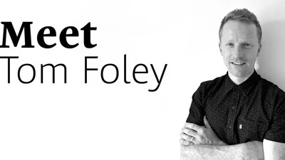
We’d like to introduce the newest member of the Monotype team, Tom Foley. As Creative Type Director, Tom will lead the Studio team in London.
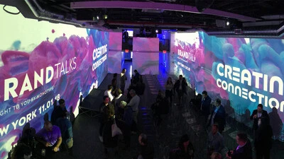
Actions speak louder than words. But for marketers trying to form genuine, lasting relationships with their customers, embodying that ideal is complicated.
