How understanding font licenses can simplify creatives’ lives.

Creatives are the primary users of the fonts, but licensing approval typically runs through other departments. Here are a few key concepts all designers should understand.

What’s on tap for Adobe MAX 2019.

Adobe MAX is right around the corner! Here’s a quick look at what we have planned for this year’s conference.

Where digital and physical meet: The future of retail.

The idea of brick and mortar stores has been a hot topic lately. Are they dying? Thriving? Whatever you believe, they’re changing, with an eye toward digital.

Q&A: Dan Rhatigan talks fine tuning fonts.

Type designer Dan Rhatigan discusses the details of fine-tuning fonts and making the most of OpenType features.

The evolution of typography with variable fonts.

With the emergence of variable fonts, design no longer has to be traded for page speed. See how this new technology can transform how we think about web design.

In our on-demand era, creative asset licensing is more challenging than ever.

It’s safe to say that few people, if any, set out to commit copyright infringement. The reality is that most individuals and brands fully intend to pay.

How fonts can help you win the technology race.

As technology raises the stakes for brands, fonts can either level you up or hold you back. A simple, well-organized font system is essential to making sure you can keep pace.

The challenging game of designing for sports.

The World Cup is back, and all eyes are zeroed in on the best football … jersey fonts? We examine the tall task of designing for the world of sport.

Just how neutral is Helvetica?

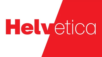
In many ways the idea that Helvetica is a ‘neutral’ typeface has become a self-fulfilling prophecy. That’s not to say it isn’t, but the neutrality narrative is only half the story.

Fonts: The underrated political campaign staffer.

There’s more to a political campaign than ideology. Fonts and design play a crucial role in conveying a candidate’s personality (or lack thereof), perspective, and potential.

Consistency is the future: A recap of Brand Talks San Francisco.

The 2019 edition of Brand Talks San Francisco brought together leaders in design and branding to hear from brands that have tackled the issue of visual consistency head-on.

When type goes tiny

When screens get smaller, spacing gets tight, details get lost, and forms blend together. The resulting legibility issues can make for a frustrating reading experience. Here’s how to find the fonts that can fix it.

The Role of Fonts in Modern Publishing.

Fonts play an indispensable role in shaping your experience of published media, working in a deliberate way to communicate the information clearly and legibly.

What is optical sizing and how can it help your brand?

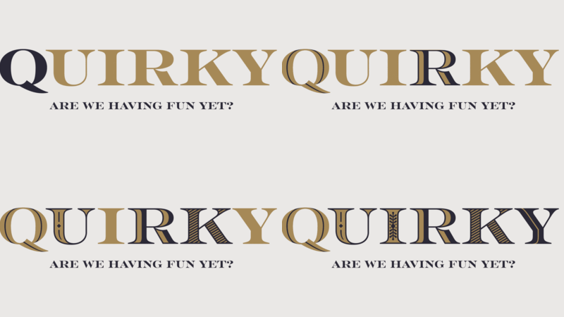
Optical sizing has long been part of the type designer’s toolbox, but  for many people the term may not be familiar. Here’s why that should change.

Why brands love to use sans serifs (and how you can choose one, too).

You know what they say, “classics never go out of style.” Maybe this is true, maybe it isn’t. But one thing is certain: When sans serifs took over typography in the early 1900s, they weren’t just a fad. They came to stay.

Is the text on your website ADA accessible? Part one: Color.

In this three-part series, we’ll show you how fonts can help your website follow the standards established by the Americans with Disabilities Act.

A wordless future? What Mastercard’s new logo tells us about the modern brand.

Mastercard made waves when it announced that it will drop the word “Mastercard” from its logo. But is it the right decision for every brand?

The perils of piecemeal font licensing.

Whether you’re a startup that recently hit the big time or a legacy brand with offices around the world, a messy font library can cause major headaches.