Dive into Dingbats Part 1: Interview with Wingdings creators.
– Charles Bigelow
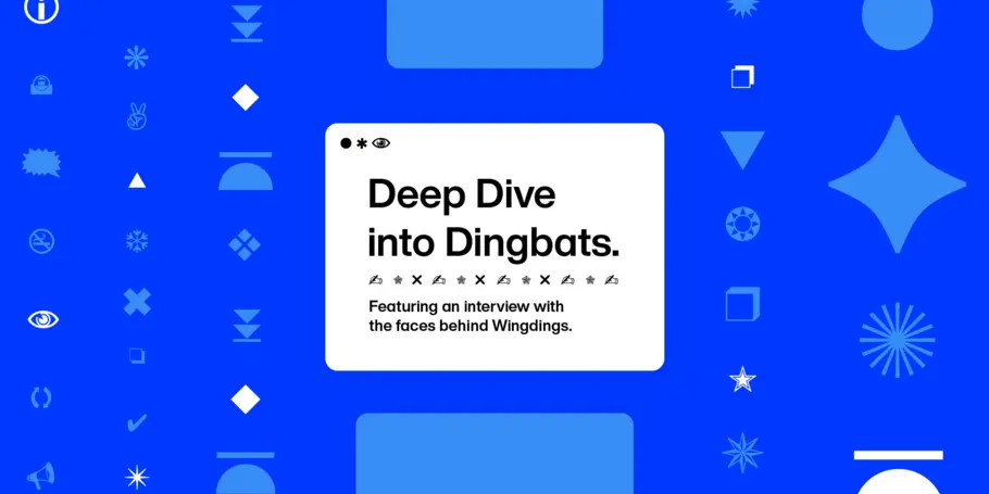
Inspired by a conversation with the power-couple in typography who blessed the world with the Wingdings font families —Kris Holmes and Charles “Chuck” Bigelow—we bring you a two-part deep dive into all things dingbats. Here, in Part 1, we unpack dingbats with a focus on Wingdings; In Part 2, we look at “Dingbats beyond Wingdings: Zapf Dingbats, Webdings, Emoticons, and Emojis”.
This may be a bold statement, but there is no type of type as curious as the dingbat. What is a dingbat, you ask? Precisely. Curiosity in typography brings many to these bizarre symbol-based font elements, seeking answers to: Who makes dingbats and why? Who uses dingbats and for what purpose? What is the difference between dingbats, Wingdings, Webdings, and Zapf Dingbats? Where does a dingbat end and an emoji begin? Let’s dive in.
Disentangling Dingbats & Wingding
A strange term with stranger beginnings, “dingbat” has been used to refer to many a thing: a cocktail, a whimsical insult, a comic strip, a board game and a supply term for anything unknown, like a doodad or thingamabob. The one thing that each use of dingbat has in common, is that it conjures up a sense of silliness, demonstrating in each iteration how humans are instinctively drawn to the curious.
In type, “dingbats” (or “symbol fonts”), serve as an umbrella term for ornamental elements available in font format typically used for decorating or indicating. They can take the form of “flowers, icons, vignettes, arrows, geometric shapes, stars, smileys, emojis, and pictograms,” says Bigelow. “Pictograms are the most ancient [graphic symbols], dating back to the beginning of writing in Mesopotamia, but new emojis are being invented almost every day”.
Even though they are primarily ornamental rather than communicative, there’s something innately human in dingbats. After all, humans have always used images to communicate, and many major writing systems today still use symbols and icons to communicate ideas rather than letters to construct words.
Dingbats have been aiding expression in both print and digital publishing. Ushered in by technological advances, some of the most well-known dingbat font families today were designed within the last 50 years to work with computer publishing, notably Zapf Dingbats (1975-1978), Wingdings (1990-1992) and Webdings (1997).
Dingbats
Predating the emoji, dingbats are often described as non-letter and non-number symbols, but this can be slightly misleading as some dingbat symbols feature these figures within shapes (such as, |①②③|).“Dingbats are a set of symbols to be used with text, for example, an image of a pair of scissors to show a user where to cut,” explains Holmes. “Dingbats can also be used decoratively in borders and areas of ornamentation.”
Printers using physical founts to print text with visual aids on paper require image blocks, but these are tricky and expensive to customize. Enter the heroic dingbat, a collection of ideographic symbols which, lined up in particular patterns, allowed printers to create enchanting borders, directions, and emotive elements.
Wingdings (1990-1992)
Arguably the most famous of all the dingbat font families, “Wingdings” refers to the dingbat typeset created by Holmes and Bigelow between 1990 and 1991. “Wingdings can be informational, expressive, or decorative depending on how they are used, so it is up to the typographer to choose,” Bigelow explains. “The more abstract Wingdings can be used for emphatics, directionals, clarifiers, or anything a designer thinks would be expressive or significant, whether for web, print, eBook, or signage.”
Designed to match their Lucida Sans and Lucida Bright Fonts, Wingdings were initially named and organized as Lucida Stars, Lucida Icons, and Lucida Arrows. In 1992, Microsoft released them as three font families regrouped and renamed as: Wingdings, Wingdings 2, and Wingdings 3. “The Wingdings match the Lucida family of typefaces in height and weight,” Holmes points out, “because of this they will never look too small, or too light to match the Lucida typeface they are being used with.”
What’s in a Wingding?
Across the three sets of Wingdings, you can find a kaleidoscope of symbols, from astrological signs, arrows, shapes, faces, florals, and human inventions from the telephone to the mailbox, making it difficult to distill their components into a few words. But for general guidance, you can expect to find a wide variety of symbols in Wingdings and Wingdings 2, but only arrows in Wingdings 3. “There are roses, rosebuds, twining vines, vine leaves, and other natural motifs,” Bigleow says. “There is an art to combining them into patterns and textures.”
Wingdings are often credited for being “one of the first times people realized fonts could break through to the mainstream”. However, they were not the first dingbats to be widely used – ITC Zapf Dingbats were designed in 1978 and used across Apple laser printers by the mid 1980s. In part two of this story, we’ll put Wingdings in its historical context: what similar font families preceded and succeeded Wingdings? What can type designers learn from dingbats, emojis and emoticons, and their influence on typographic movements?
5 Little-known secrets hiding within Wingdings.
- The uppercase “J-L” in Wingdings reveal the only faces in any of the Wingding bundles.
- The lowercase “z” in Wingdings reveals Kris’ favorite Wingding symbol inspired by her grandmother’s quilt design.
- The punctuation marks “{” and “|” in Wingdings as well as the lowercase letters between “a-h” in Wingdings 2 reveal Charles and Kris’s favorite group of wingdings symbols.
- The punctuation marks “_” or “]” in Wingdings 2 reveal the holy grail of punctuation marks: the interrobang. The interrobang merges the exclamation mark with the question mark. Can you believe‽
- You can use any and all dingbats to create blocks of texture!
Click HERE to dive into Dingbats Part 2: Beyond Wingdings.


