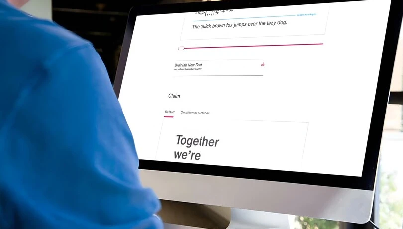
A bespoke modification of Helvetica Now for medical tech company, Brainlab's rebrand.
Tom Foley, Creative Type Director.
A global leader in medical technology, Brainlab has evolved into a powerhouse, transforming healthcare at scale across oncology, surgery, and total operating room digitalization. After 30 years, Brainlab was ready for a full rebrand and came to Monotype for a customized version of Helvetica Now to serve as their brand typeface.
How can a modified typeface unify a medical technology company’s branding and its workforce?
After using Helvetica as its brand typeface for 30 years, Brainlab was looking for a modernized version to suit digital-first use cases and highlight their unique brand DNA and human-first approach. Brainlab wanted a distinguished corporate typeface that reflects the individuality of its company, its products and its people.
Stefan Vilsmeier, CEO/Founder.
When Monotype announced the first Helvetica redesign in 35 years, Brainlab knew the Monotype Studio would be the perfect partner to build the right design experience. The customized version, named Brainlab Now, offers bespoke results that differentiate Brainlab visually, without the more substantial undertaking of a fully custom typeface.
As part of a major brand refresh, Brainlab’s new typeface needed to be:
- Influenced by core brand DNA
- Digital-first
- Impactful in all languages
- Expressive of both humanness and technology
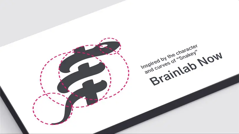
- Inspired by the Brainlab ‘Snaky’ logomark
The Modifications.
Working closely with the Brainlab team, the Monotype Studio developed a custom font that is modern, human, and aligned to the brand’s spirit, with careful attention to practical requirements like legibility, scalability, and language compatibility.
“From the earliest conversations with the Brainlab team, it was clear that they needed to optimize Helvetica rather than overhaul it,” says Creative Type Director, Tom Foley. “Helvetica Now Text was our starting point, but we needed to design a new set of condensed master drawings, and several versions of key characters to test legibility at small sizes. This approach was ideal for Brainlab Now, as it gave us the flexibility in the design space to test many iterations of proportion, aperture size and spacing, allowing us to precisely hone the design for their needs.”
To design a flexible typeface for all, that works everywhere, and is unique and useful at any scale, we condensed the spacing by 92.5% to accommodate wordy content and drive impact within digital constraints. We also adjusted the height to weight proportions according to the narrower shape of Brainlab Now and added an italic style.
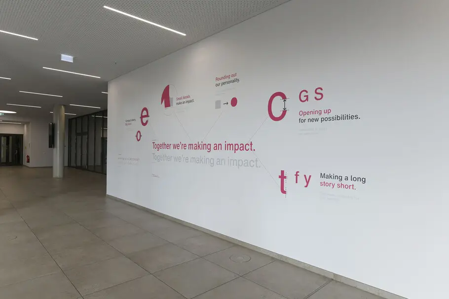
Taking inspiration from the iconic Brainlab logo created in 1989, Brainlab and Monotype explored how the shapes inherent in the logo design could be incorporated into the typography. We opened select lowercase and uppercase letters, numbers, and punctuation, and rounded the punctuation and diacritics to infuse the letterforms with the snaky logo attributes.
One Brand, one typeface for all.
Brainlab Now works across all touchpoints big and small, from large-scale exhibit installations to mobile apps. The Monotype Studio ensured that Brainlab Now is accessible for all users and created characters of differentiation that maintain consistency at all possible touchpoints.
Brainlab Now is evocative of what its brands stand for: open ecosystem and architecture, delivering a thoughtfully refreshed brand for “everyone, everywhere.”
“We have a clearly defined attitude and personality that we apply to all communications, so we’re clearly heard, quickly recognized and easily remembered,” says Tobias Schalkhausser, Executive Vice President Marketing & Digital. “Our typeface delivers on the Brainlab purpose, building trust in all we do and have done, past, present and future.
Bringing Brainlab Now to life.
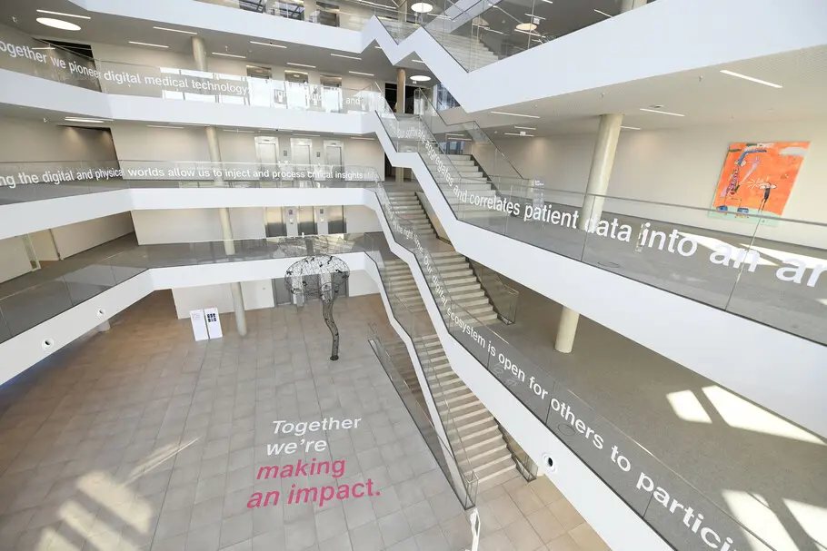
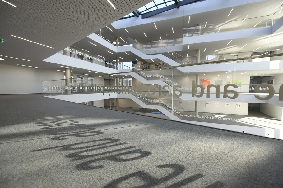
At launch, Brainlab made sure to champion the typeface internally going beyond traditional employee communications. The company has infused the typeface throughout its headquarters, in murals and graphics promoting the new brand positioning and even with a scannable QR code allowing employees and visitors to download branded background images for mobile.
The Monotype Studio helps brands across the globe find their voice through type. Discover more from the studio and check out the services we offer here.


