Monotype x Middlesex.
Emilios Theofanous, Type Designer at Monotype.
This year, we had the joy of collaborating with Middlesex University and Andy Gossett’s typography module. Phil Garnham (Creative type director and Middlesex alumni) and Emilios Theofanous (Type Designer, Monotype), had the opportunity to host two online sessions, initially to help kickoff the project and a later session during the semester to discuss the process, critique the designs and answer any type design related questions.
Designing a typeface during an academic semester is not as easy a task as it may seem, especially during this past year with the sessions held online and the limited daily interaction between the students. So, it is with admiration that we should always observe student’s work, often surprised by the typographic solutions these fresh eyes propose; not everything might work out of the bag in a commercial space, but with solid ideas, genuine inspiration and guidance we could see exciting projects on the horizon. The 3rd year students of the Graphic Design BA were no exception this year, they rolled up their sleeves and dived enthusiastically into the project with curiosity, ready to experiment and explore this wonderful world of letter making.
During our first online session we discussed basic principles of type design, current type trends and explored their creative brief.
The Creative Brief:
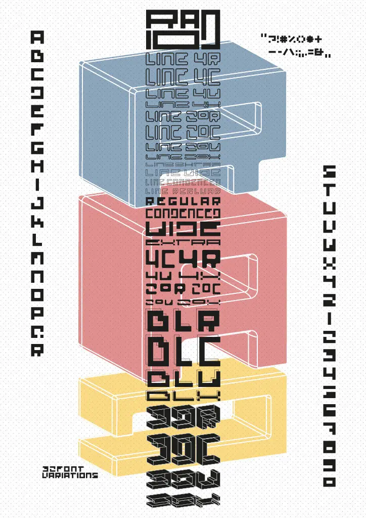
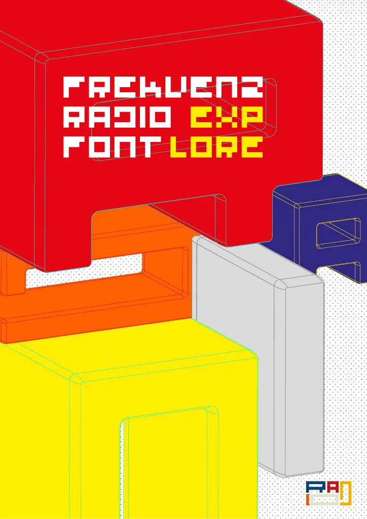
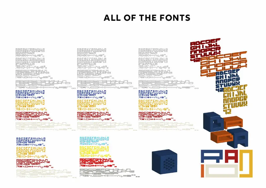
Students needed to choose an object from a selection of iconic product designs (such as furniture, machinery, utensils, appliances) and then develop a new typographic brand for it. The aim was to extend their initial ideas into a fully working font design.
Concept workshop:
After a few weeks, we met again to discuss their process. It was very interesting to see how the students interpreted their chosen inspiration into typographic forms. Many of them were very literal and illustrative translations, others very modular and often illegible. Understanding the context of these initial proposals is important, as part of a brand identity they can often belong to the genre of display typography and touch on graphic design, so our feedback had to guide the students on how to proceed and expand their ideas into more usable, brand world ready type. We discussed the importance of legibility, for example what to keep in mind when expanding from a logo to a typeface and how coherency between similar typographic shapes can be the key to harmony and typographic rhythm. Some of the designs were like type blueprints, based on skeleton forms without much weight. So, we discussed the idea of weight and scale, and the role of type size, the scenarios of type in use, how it should feel if printed or displayed in different mediums.
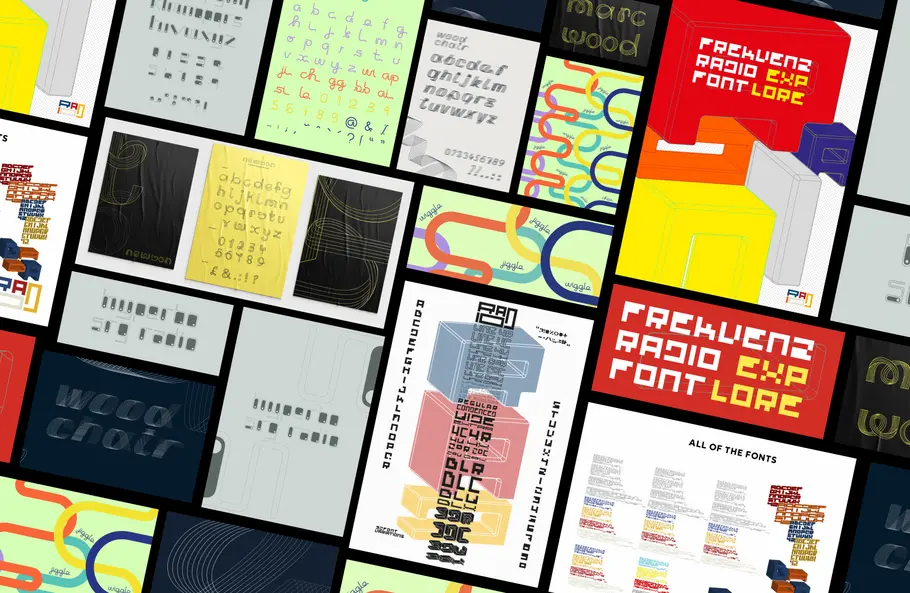
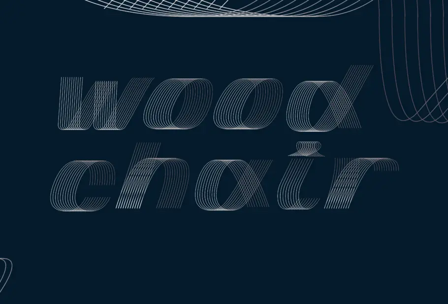
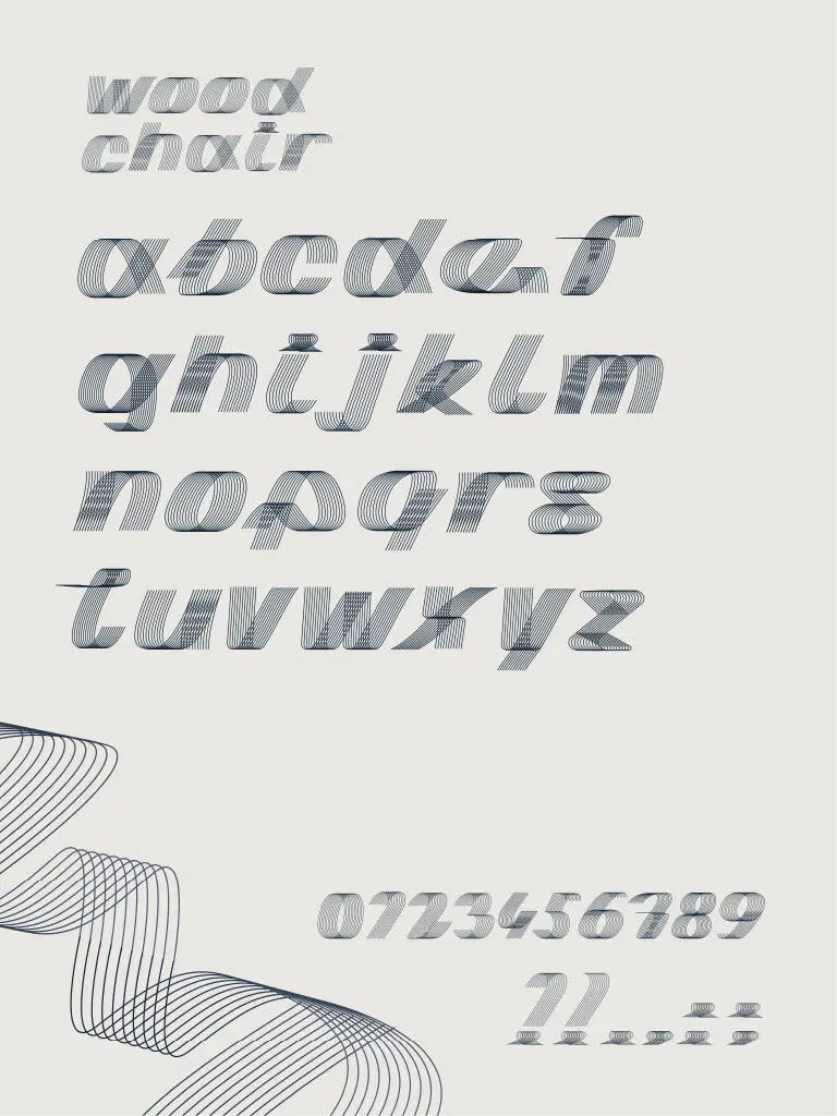
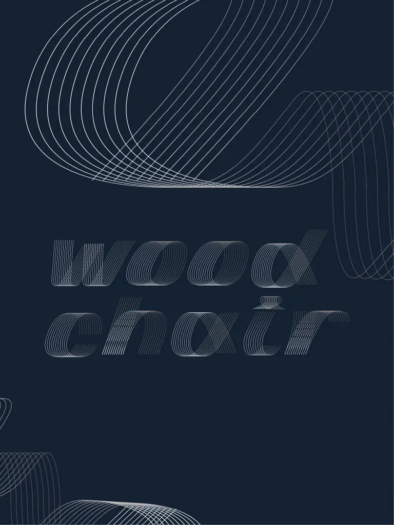
The typefaces:
Over the course of a further three weeks under the guidance of Andy Gossett the students developed their conceptual thinking into alphabets of A-Z, figures and basic punctuation. Each typeface was submitted for review and we can now share some of our favourites
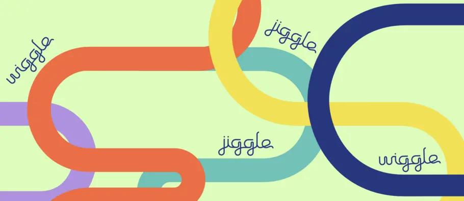
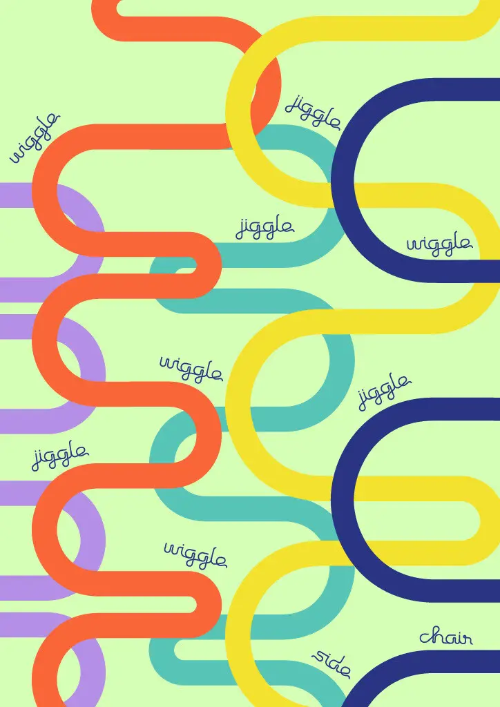
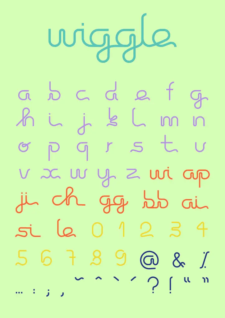
Julia Verena Adolphs
Jessica Mills
Benedikt Durban
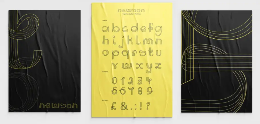
Sara Martinez
Margarida Murteira Duque Da Fonseca
Final congrats to everyone:
Lastly, we would like to congratulate all the students for their hard work and amazing job during a very difficult pandemic year. It has been a rewarding journey for us at the Monotype Studio, to see how the designs have evolved and learn about the thought process behind them. As type designers it’s always a joy to see designers engage and bring new ways of seeing and approaching the type design process to the fore. Huge congrats to everyone involved.


