Featured article.
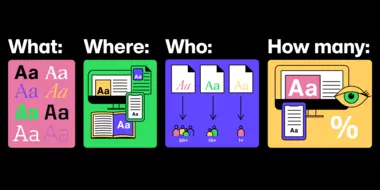
Let’s look at some common font issues you might have already come across, and how Monotype Fonts can help you resolve them.
Let’s look at some common font issues you might have already come across, and how Monotype Fonts can help you resolve them.
Long gone are the days of zipping up folders of font files and sharing them across your organization, or even messier, embedding fonts in documents in the cloud in hopes that the design remains intact. We recently announced an expanded set of licensing rights which allows all employees within an organization to access Commercial Production Fonts in their desktop environments.
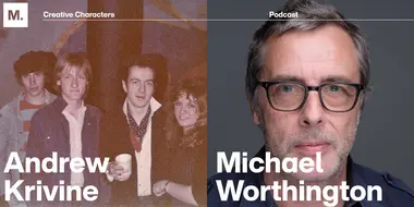
This week we’re welcoming Andrew Krivine, author and punk rock collector, alongside Michael Worthington, faculty at CalArts and co-founder of Counterspace. The creative duo is here to tell the tale of how they co-created the largest exhibition of punk and new wave graphics ever shown on the West Coast.
Over the past four years, we’ve been lucky to forge a reciprocal partnership with the Limerick School of Art & Design / TUS in Ireland. Both Creative Type Directors Tom Foley and Emilios Theofanous have now participated in workshops and modules at the leading fine art, design and creative media school. This year’s students were asked to write a message platform for one typeface and build a marketing plan and design assets to promote it in digital or print media.
Rebranding a business is not for the faint of heart. It’s an enormous operation that requires significant time and investment while offering the possibility of totally revitalizing a brand.
Legibility is a crucial consideration when trying to choose a font for your project. Here’s how to find a legible font that will be easy on the eyes for your readers and customers.
Launching a website or app? Your font choice is key to your success. Here’s how to assess the legibility, consistency, performance, and longevity of your font choice.
Find design inspiration in an age of information overload.
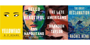
In this article, get a peek at recent and upcoming book releases in a variety of genres to get a sense of what typography styles are trending in publishing right now. This post is a guest piece from our friends at Reedsy, a website that connects authors with publishing professionals.
Today’s brands must keep up with a fast-paced digital world and navigate a “new normal” that’s still emerging from the worst of the pandemic. The last few years shifted everyone’s digital expectations, how brands operate, and in some cases, impacted their business models.
Designers who have encountered issues with low-res legibility or missing glyphs understand the value of high-quality typefaces sourced from established designers and foundries. However, many non-creatives don’t see the point in paying for fonts. How many creatives have heard the words “just get something free” at some point in their career?
When it comes to choosing a font to represent your brand can be a daunting task — especially when you’re trying to balance the needs of stakeholders and your customers. After all, the font you choose is one of the first things people see when they look at your brand. Here are key traits to look for when choosing a font library.
Launching a website or app? Your font choice is key to your success. Here’s how to assess the legibility, consistency, performance, and longevity of your font choice.
Every organization has their own approach to managing their fonts, but oftentimes these practices aren’t consistent across the board. This makes working with fonts tricky and causes issues over time.
As our world becomes immersed in digital experiences, the type you use needs to keep up. Use this checklist to ensure your typeface meets the task at hand.
The best way to ensure brand continuity across all customer touchpoints? The consistent use of fonts. But inconsistencies are surprisingly common. Use this guide to find and resolve them.
Find design inspiration in an age of information overload.
Graphic designers and other creative team members are usually the primary users of the fonts at a brand, which means they’re also responsible for ensuring those fonts are used properly according to their license.
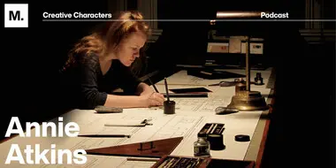
Today we’re welcoming Annie Atkins, a creative in the film industry (just like our last guest, Holly Fraser). She’s known for her graphic props and set pieces for Wes Anderson’s Grand Budapest Hotel and Isle of Dogs. Tune-in to learn about the magic of film.

