Introducing Sagrantino, a fluid script font with hand-drawn heritage.
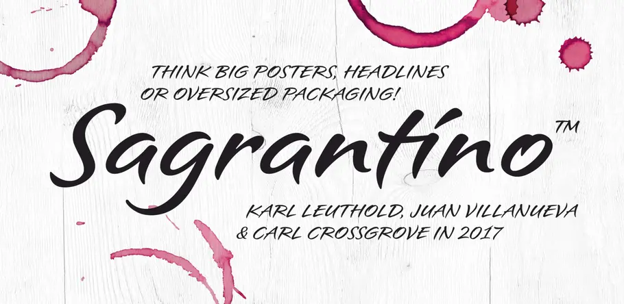
Sagrantino is a non-connecting script that traces its roots back to hand-drawn letterforms, and the connection between pen and paper. Named after the Italian wine, Sagrantino is bold and full of flavor, while embodying a sense of freedom and fluidity. Its quirky character shines at larger sizes – making it perfect for headlines, posters, or anywhere type is needed to really make a point. The family is available as OpenType Pro fonts, and has an extended character set that supports most Central European and many Eastern European languages.
“To me, the key is always to start with pen on paper,” says type designer Karl Leuthold. “You can’t replace that connection of the tool and surface, and the moment you touch pen to paper and create. That’s really hard to fake.”
Leuthold’s Sagrantino typeface – a non-connecting script that embodies the fluidic movement of hand-penned letterforms – also started it’s life on paper. Leuthold spent days, marker in hand, repeatedly drawing its loops and curves, and capturing the freedom of form that comes with hand-drawn type. This gave him a chance to immerse himself in the subtle variations and proportions of each glyph, often using mechanical pencil drawings to get a better sense of contours, and work out any issues that might crop up.
“I went through the long process of drawing, writing, scanning and digitizing,” explains the designer, who started his career as a sign-writer and lettering artist. “Trying to capture as much of the natural spontaneity as possible.”
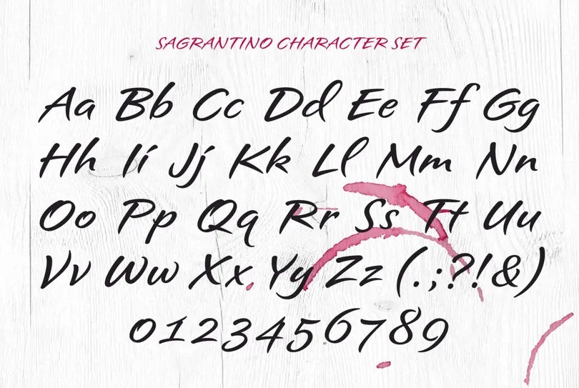
Sagrantino’s roots are firmly in the world of pen and paper
Sagrantino is, in part, a reaction to the kinds of typefaces that attempt to replicate the authenticity of handwritten letters. With its roots firmly in the world of pen and paper, it retains a sense of movement that can be lacking from purely digitally created faces. As a non-connecting script, it also avoids some of the awkwardness that comes with connected counterparts.
“There are certain pairs that may happen to connect, but in general the letterforms are freestanding, which took away some of the rigidity that can come with scripts,” adds Leuthold, who named the typeface for his favorite Italian wine.
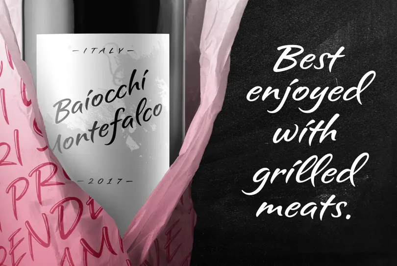
Karl Leuthold named Sagrantino after his favorite Italian wine
“I wanted it to be somewhere in the space between calligraphy and handwriting, like you picked up a marker and dashed it out.”
Sagrantino lends itself well to large sizes, where its form not just maintains energy, but becomes more expressive – emphasizing its looping ascenders and fluid, sloping shapes.
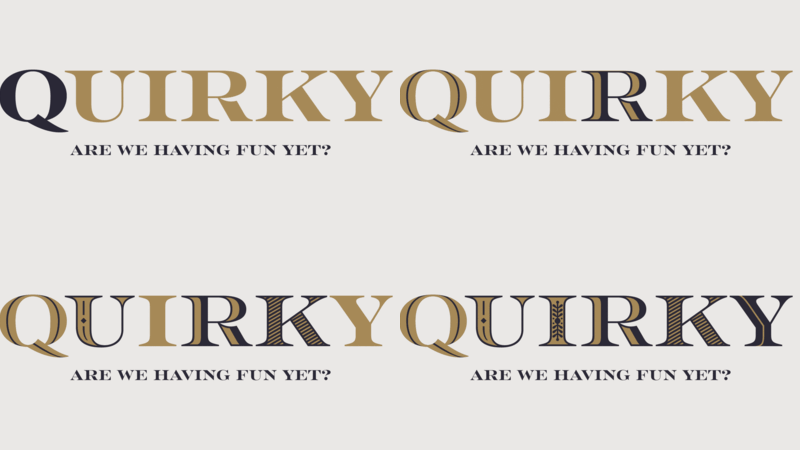
It also comes in a trio of flavors, with highlight and shadow versions – created by Juan Villanueva – designed to amplify and complement its voice further. These more decorative weights are intended to be used at larger sizes, particularly aimed at posters, adverts, headlines, or even one and two-word lockups in magazines.
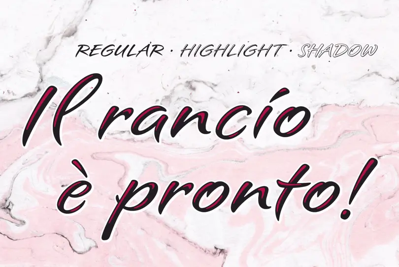
Sagrantino is available in a trio of flavors, with highlight and shadow versions – created by Juan Villanueva
“It’s thick enough that it looks like it was made by a tool, but also soft and round,” says Villanueva. “It doesn’t look like brush calligraphy, but you can definitely see these roots.”
The designer also individually tailored each character set, ensuring that accented glyphs and their marks honored their original languages, while maintaining Sagrantino’s personality and avoiding clashes.
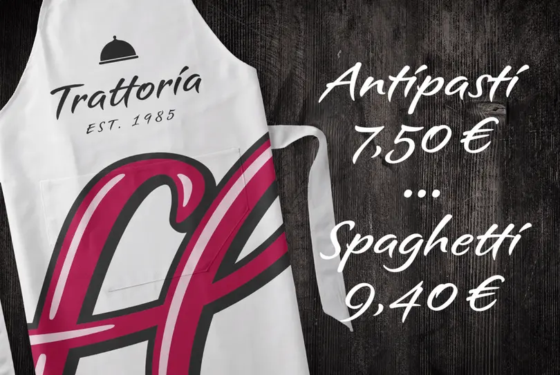
Above and beyond its versatility, the typeface also taps into a sense of nostalgia, and a need for digital letterforms that still retain some warmth of personality.
“I think for whatever reason, in a world of digital fonts people really crave things that look hand-drawn, that look organic and natural and spontaneous,” said Leuthold.
Get the Sagrantino fonts
Sagrantino by Karl Leuthold is included in the Monotype Fonts service.
The Studio team.
Juan Villanueva.

Juan Villanueva is a Creative Type Designer at the Monotype Studio in New York City. He grew up in Lima, Peru and Clifton, New Jersey. His heart is in both places and his work reflects both languages and cultures. Juan joined Monotype in 2016 where he contributes to library designs including Helvetica Now, Futura Now, and Walbaum and creates custom projects for global brands such as Google, Microsoft, Tencent, M&Ms, and Entertainment One.


