Type historian Ferdinand Ulrich shares the story of PMN Caecilia Sans.
The making of the serif typeface PMN Caecilia from first sketches to usable fonts took more than seven years. Designed by Peter Matthias Noordzij, it is the child of a time when font technology changed rapidly, not knowing which development the next day would bring. Eventually it was released in 1991 and quickly turned into a quiet tip for designers; not overused, and yet selected for prominent applications. Today, more than 25 years later, Noordzij adds a sans serif companion to his first type family and equips it for today’s needs.
PMN Caecilia gave Peter Matthias Noordzij (*1961) opportunities to extend the family with a sans serif, but it was ultimately born from a fundamental ambition to design a new typeface for new applications. An interview with Noordzij provides insight into the background, purpose and possibilities of PMN Caecilia Sans.
The roots of PMN Caecilia Sans
To get a better understanding of the idea behind this font family, one has to take a look at Noordzij’s early days as a student at the Koninklijke Academie van Beeldende Kunsten (KABK). At the time, the theories of his teacher, who also happened to be his father, Gerrit Noordzij (*1931) were influential. Although, Peter Matthias Noordzij also received confirmation on his approaches in the work of Bram de Does (1934–2015).
“I met Bram de Does at a time when I was struggling with the creation of a harmonious typeface for text—something he had achieved. I knew very well what I was searching for, but at the time I had no clue yet as how to achieve it. De Does’ Trinité was the first typeface I ever saw, in which this problem had been convincingly solved. He suggested to evaluate a typeface by the typographical appearance of the text and not by the drawings.”
The precondition of Gerrit Noordzij’s theories is based on the assumption that all typographic letterforms are derived from written forms. He was able to overcome the established categories of type classification and proposed a scheme that would recognize letterforms by the tools they were written with rather than by historical references. According to Noordzij’s father, letterforms are either designed based on the principle of translation, (drawn with a broad-nib pen), or based on expansion (drawn with a flexible nib)—either cursive, with the letter written in one stroke or interrupted, with the pen lifted between strokes.[1]
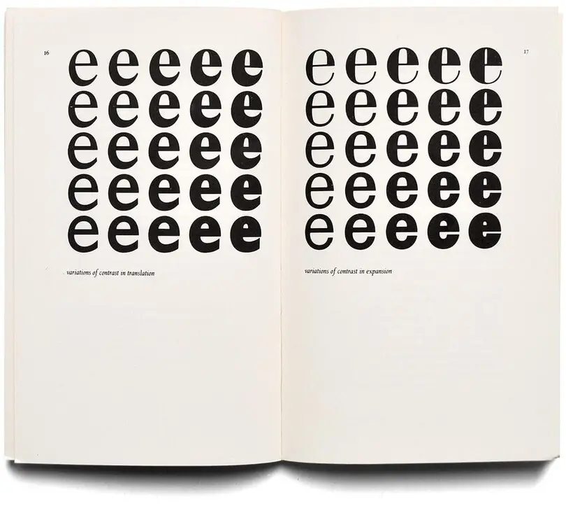
According to Gerrit Noordzij (in: The stroke of the pen. Fundamental aspects of western writing, The Hague 1982) letterform designs are either based on the principles of translation (drawn with a broad-nib pen) or expansion (drawn with a flexible nib). (From the private collection of Erik Spiekermann, Berlin)
When Peter Matthias Noordzij met Bram de Does for the first time at a type design symposium at the Willem de Kooning Academie in Rotterdam in 1983 he was working on a text type, but was not yet happy with the results. During the symposium large size working drawings of de Does’ Trinité caught his eye, a typeface that was released for phototype that year.
De Does made corrections to his letterforms based on prints, apparently neglecting the appearance in large sizes. As Noordzij recalls, he found these drawings to be “not particularly attractive” at first, judging them from a standpoint of what he had been taught, but at the same time he remembers:
“I had finally found what for months I had been looking for. It was highly exciting to exchange ideas with Bram de Does. The conversation that followed sowed the seeds of an almost lifelong cooperation, as we had recognized our corresponding views on type and typography. Though Bram was my father’s age, it felt as if we both found a typographical soul mate.”
The same year a large-format brochure titled Letters in studie (Studying Letterforms) with an introduction by Gerrit Noordzij was published. It featured a group of young type designers from Dutch art schools in Arnhem, Breda, Enschede, and from The Hague. These young designers were unfamiliar to the design community at the time, but are well-known today. Among them were Frank Blokland, Petr van Blokland, Jelle Bosma, Martin Majoor, Albert-Jan Pool, Fred Smeijers and Wim Westerveld. In the brochure one double page spread displayed letterforms by PMN (Peter Matthias Noordzij) in which he explored the combination of slab serifs with little contrast and translation-based letterforms drawn with a broad-nib pen. He had worked on these studies since late 1982, then in his third year at KABK. At the time, the encounter with an almost monolinear slab serif (with optical compensations, e.g. ink-traps) mixed with old-style (or humanist) proportions was astounding. Jan Middendorp has called it an “unprecedented confrontation” and suggested that it was “the first typeface to successfully reconcile certain principles from the tradition of type design that were held to be incompatible”.[2]
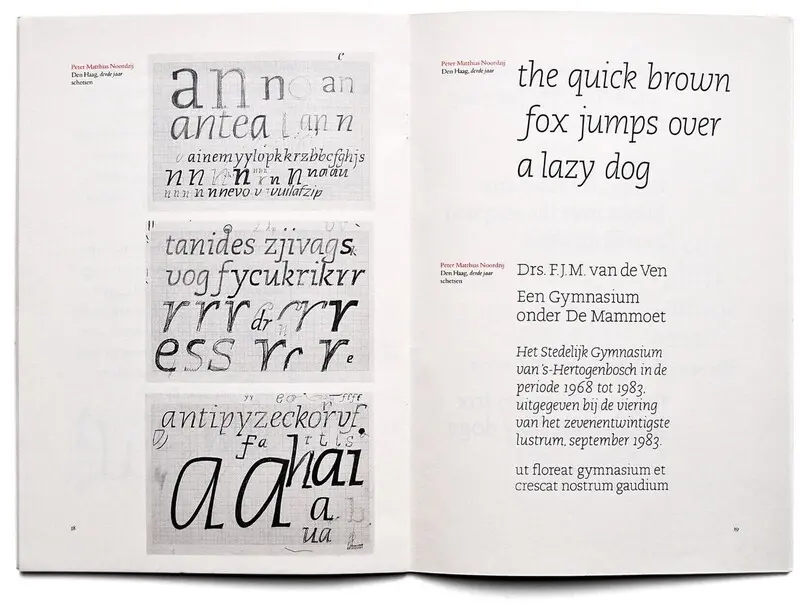
A double spread in the publication Letters in studie (Eindhoven, 1983) displays early letterform experimentations of slab serifs with little contrast and translation-based letters by Peter Matthias Noordzij. (From the private collection of Ferdinand Ulrich, Berlin)
In 1983, the draft was not yet a complete alphabet and by no means a typeface, but it formed the basis for the working steps and soon to be known by the working title Academic. The italics of Academic were particularly noteworthy: While all previous original designs of slab serifs and revivals of such were simply equipped with obliques (slanted romans without revised forms), Academic (and the later PMN Caecilia) offered a set of true italics – for the first time since the early nineteenth century egyptiennes.[3] Even in the early sketches, we could see humanist italic letterforms close to the handwriting with elegant transitions from the bows to the stems—a key characteristic of Noordzij’s later typeface PMN Caecilia.
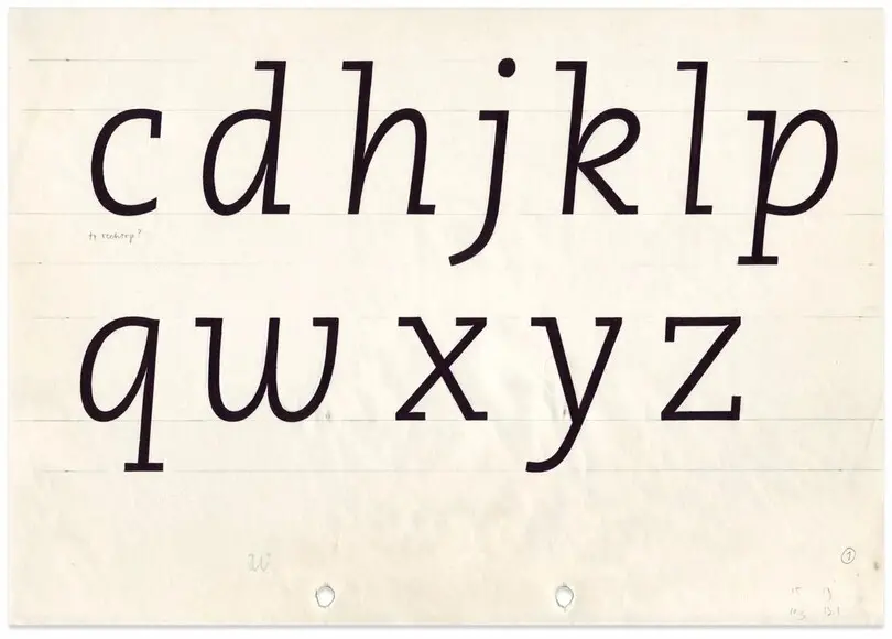
Early sketches of PMN Caecilia reveal humanist italic letterforms close to handwriting with elegant transitions from the bows into stems. (With kind permission from the private collection of Peter Matthias Noordzij, Hurwenen)
Justifying the design of letterforms so closely with the form of writing can become a burden and gives an impetus for a long process. In the context of Gerrit Noordzij’s theory, Robin Kinross critically remarked: “A fully workable typeface requires that it be put through the mill of ‘justification’ (spatial fitting of the characters), as well as adaptation for different technical formats. Until this process of making a typeface publicly usable has been accomplished, it remains just a means of private expression—like handwriting.”[4]
PMN Caecilia in the making
Convinced that he had discovered “the solution to a problem that no one had been able to solve before”,[5] Noordzij decided to seek for help in releasing Academic. In 1984, it was still difficult—especially for a recent graduate—to produce fonts as an independent designer with little financial support and without access to the appropriate tools (i.e. expensive pre DTP-era hardware and software). One year before his graduation from KABK, the ATypI London in 1984 turned out to be an opportunity for him to present his type design. There it was acknowledged by no one less than Adrian Frutiger who immediately perceived it as an “original concept” and pointed it out to his colleagues at Linotype.[6]
Noordzij was requested to submit his design to the following Type Selection Meeting of Linotype, where it was eventually met with general approval—after he invested much effort and time in convincing the company’s specialists of producing the typeface in all its peculiarities.[7] An agreement was signed in the second half of 1986; production would take another four years, in which Noordzij had to convince the production team of his philosophy.[8] He credits type director Werner Schimpf, who had much influence at Linotype, for pushing through his ideas.
“An essential part of my philosophy is the requirement of liveliness or natural rhythm which is apparent in handwriting and occurs in nature, in the woods for instance. Although the forest is an entity, no two trees are identical. It is these subtle differences that create a natural and human space. This is not only the case for each stroke or shape—no two shapes are identical or plainly rotated or flipped without any optical correction—, but also for my method of spacing.”
Around 1988, he was assisted by Peter Verheul (*1965, a later FontFont designer) who was an intern in the production phase of the fonts. Based on Noordzij’s letterform sketches, Verheul executed a good deal of working drawings that were necessary for the digitization process. In the late 1980s at Linotype, letters were digitized using the Ikarus type design system and a working process known as ‘hand-digitization’. In this process, one uses a digitizing tablet to trace the marked analogue working drawings with a so-called ‘puck’—mark by mark. The puck was equipped with a sensor and buttons with which the user could produce a sequence of points resulting in curves. Most importantly, one could embed the information of the curve definition, i.e. selecting between starting point, straight point, curve point, corner point, turning point and tangent, required where straights transition into curves. This process could be retraced on screen—often with a certain delay.
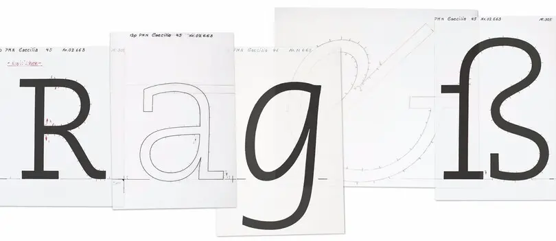
A set of working drawings of PMN Caecilia used for hand-digitization with an Ikarus system. (Discovered by David Sudweeks in the Linotype archives in Bad Homburg, Germany)
In 1991 Noordzij’s first typeface was finally released with Linotype in four weights (light, roman, bold, heavy) and respective italics. Academic no longer seemed to be the appropriate name for it—and so it became PMN Caecilia, following the name of his wife Marie-Cécile Noordzij-Pulles and PMN, an acronym of his own name.
In the past, PMN Caecilia has not been an overused typeface, but it has been selected for attention-grabbing projects. Perhaps the most iconic application is the use of PMN Caecilia as default font on Amazon Kindle. Although it was designed for a print-driven environment of the early 1990s, it cuts a fine figure on screen given its robustness and functions as a pleasant reading font due to its humanist side. PMN Caecila is a versatile typeface that can be found in editorial design, packaging—and again on screens.
PMN Caecilia without serifs
Linotype suggested creating a sans serif companion for PMN Caecilia in the early 1990s, but Noordzij was in search for a new impetus. He made a point of not wanting to solve problems of the past but to search for a new purpose instead. And above all, he was occupied with running his own business. The use of PMN Caecilia on the Amazon Kindle many years later gave him an opportunity to study the behavior of his typeface on screen and explore the characteristics that would perform well on this medium. Gradually, a new motivation to design a typeface matured in him.
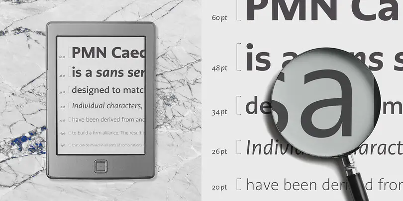
While he wanted to take on some of these characteristics, he also knew that the sans would be fundamentally different from the serif. New purposes brought new problems and therefore demanded new solutions. This was especially true for optical compensation as well as the type’s spacing and kerning.
“Jacques Le Bailly transferred my design decisions to digital data. In other words, he created the digital working drawings and was responsible for the digitization of PMN Caecilia Sans. Similar to what I did 20 years ago when I took care of the digitization of Trinité, while Bram de Does was responsible for the design.”
According to Noordzij there was one major challenge in designing a new typeface for screen, the way readers treat type: “In books for instance type and typography has only one representation, printed on a certain paper, creating a particular contrast and in a fixed point size. Readers use a magnifying glass when the text type is too small, in digital media however, they simply enlarge the image.”

In an early step he removed all of the serifs from PMN Caecilia and then revised individual characters. Knowing that the “typographic tone” would have to change, he made revisions with a focus on stroke widths and contrast, which is fundamentally different in a sans serif. Today he has a stronger interest in applications on screen than in print media, Noordzij says. Therefore his main task was to design a sans for a new environment, that would still complement the existing serif.
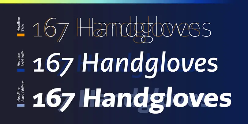
PMN Caecilia Sans matches the four weights in PMN Caecilia and offers an additional heavy weight as well as two additional light weights. Attention should be drawn to the italics of the sans serif sister. Noordzij always felt that the italics lost some of their gracefulness in the very heavy weights. Given this impression, he went back to the roots of the slab serif and decided to design a set of obliques alongside the italics. The oblique weights are slanted at the same angle so that they can be combined with the italics, and of course their letterforms are optically corrected. What’s more, they are equipped with alternates for ‘a’ and ‘g’.
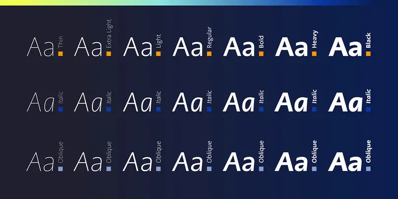
“According to my design philosophy to assess every aspect of a typeface individually and decide solely by my eyes. Whether it is the shape—proportion—, stroke width, spacing—rhythm—, kerning, angle—slant—, weight, relationship between weights and styles, anything. You name it.” Ultimately, PMN Caecilia Sans inherits the same liveliness as its older sister. This is not only due to Noordzij’s spacing philosophy, but also due to the slight slanting of a selection of upright weights at just .5 degrees, yet just enough to coherently exude a certain kind of energy. His explanation for this decision refers to the flat nature in his native country: “As if you ride the bicycle with a slight tail wind: You don’t notice it, but it makes the ride much more pleasant.”

Get the PMN Caecilia Sans fonts
PMN Caecilia Sans is included in the Mosaic font service.
Thanks to Peter Matthias Noordzij for taking his time for conversations in preparation of this article. All type specimens of PMN Caecilia Sans designed by Alexandra Schwarzwald.
Footnotes
1 Read about the theory in Gerrit Noordzij: The stroke. Theory of writing, London 2005; also read Robin Kinross’ essay A Dutch voice in Modern typography, London 2004 2 Jan Middendorp: Dutch type, Rotterdam 2004, p. 203 3 Keith Tam: The revival of slab-serif typefaces in the twentieth century, MA dissertation, University of Reading, 2003, p. 13 4 Kinross, Robin: A Dutch voice, in: Modern typography, London 2004, p. 163 f. 5 Jan Middendorp: Dutch type, Rotterdam 2004, p. 204 6 Read Frutiger’s statement in Schriften vor Gericht, in: Page, vol. 13, no. 1, Hamburg 1998, p. 45 7 Antje Dohmann reports in Schriften vor Gericht, in: Page, vol. 13, no. 1, Hamburg 1998, p. 45 8 Read about this process in detail in Max Caflisch’s review of Caecilia, Eine neue Egytienne: die PMN Caecilia, in: Typografische Monatsblätter, vol. 61, no. 5, 1993


