Burger King: Soft serve digital and the importance of nostalgia during a crisis.
In recent years you would be forgiven for thinking ‘digital’ is in itself a visual trend of geometric typography combined with a vaporwave gradient, an interactive logo, sprinkled with primary shapes etc. I’m aware this is quite a sweeping one-dimensional statement. However, it’s true that this idea of ‘digital’ has created a sense of homogeneity. Brands themselves are saying that they operate on a platform of lookalikes; they often share the same space, the same visual flavour and footprint as their fiercest competitors.
Clients are demanding ‘better’ and that ‘better’ is deeper strategic thinking, going the extra mile to generate authenticity, distinction and typographic uniqueness. The accelerated digital transformation of 2020 has initiated a customer centred rethink for visual identity. How should brands look and feel in new-normal 2.0? Can a visual identity convey a genuine care for the world, the environment, us, our futures?
One thing is certain, our digital experiences will continue to be led by reading. Everything on a device is reading and brands are beginning to grapple with the nature of that reading experience with a deeper analysis of digital typography. The words we read are carried by fonts and those fonts are a voice. As a type designer working with brands I’m increasingly asked questions like ‘How can we own our tone of voice?’ ‘Does this voice represent who we are?’, ‘Should our voice be more human, more accessible, more empathetic?’
Looking to the past.
Every font has a personality profile and I think we all agree that our digital engagement should be richer and more diverse. Heritage as inspiration is not a new idea, but there is a renewed sense that brands are looking to their past to onboard a deeper meaningful engagement with consumers. There’s never been a greater call to empathise with the state of things and to do good. This aspiration and ‘look back to move forward’ approach has given birth to a typographic nostalgia, vintage type and lettering used as a means to reconnect. It’s a trend that has slowly been gathering pace ever since the Chobani (InHouse), MailChimp (Collins), Meridian (BulletProof), Dunkin, etc rebrands of recent years and the approach continues to draw widespread adoration.
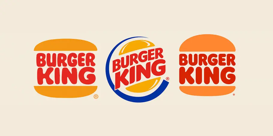
JKR’s deservedly headline grabbing rebrand of Burger King speaks to this emerging type and graphic trend that celebrates a softer service warmth. Going back to the past and re-doing as new; brand heritage reimagined, ethereal wood type classics updated as crisp digital pixels. A nod to the vintage typographic era of playful swashes, fat serifs, quirky letters and vibrant colour schemes. There is comfort to be found when paying homage to the warm and soft edge physicality of these letter shapes.
Burger King’s identity as a whole is conveying warmth in a way that celebrates creativity, and the brands typographic optimism is aligned to its warm bouncy burger iconography. This sense of fun and joy, shares comfort at a time when we most need it. And significantly, the rebrand has reframed brand typography for screen. The brands new typefaces ‘Flame Serif’ and ‘Flame Sans’ by Colophon are born from Burger King’s marketing archives, and as such they feel vintage and speak to the classic soft-service typography of the classic New York burger joint.
Nostalgia as a vehicle for empathy.
‘Nostalgia’ as a theme is not a driver for change, but it is a vehicle to empathy in a world that seeks familiarity and comfort during difficult times. Designers are obsessed with the ‘iconicity’ of things, not only of logotypes, but of books, packaging, graphic ephemera. We just love this stuff. Everyone’s a collector of something. Brand leaders understand this too.
Burger King’s logo of 1969 was ripe for modern reinvention and it has been executed perfectly by Newlyn. It’s a no-nonsense logo that plays to all the flat goodness our pixelated screens can offer. It feels akin to a brand looking forward, thinking about sustainability and ‘eco branding’, another trend in its infancy. There’s worthiness about all this.
Typically brands reinvent anew or evolve. JKR jumped back and reworked the logo in the middle. It’s as if they took an eraser to their brand of 20 years and hit refresh. Co-op and North worked a similar strategy with their rework of the 1968 Co-op logo, as did NASA with ‘the worm is back’ last year. But really nostalgia as brand is not really nostalgia at all because these logos have an inherent timelessness about them. Fashions come around and these expressions of brand feel as in-sync now as they once did then.
Phil Garnham
Type lives in culture.
That’s not to say we are going backwards. It means brands are going to the heart of who they are, relying on bold and iconic expressions of themselves to affirm a sense of security and trustworthiness. Heritage inspiration as an antidote to the world’s post-truth and brand’s evolving at their core as communication platforms evolve too. Burger King are evolving their heritage, bringing along their distinct visual equity, modernising in line with technology.
Type lives in culture, and what feels like a great idea for one territory doesn’t always translate or feel right in another. In the past brands have been accused of ‘latinising’ eastern writing. I was curious to hear how our creative team in China reacted to the new Burger King logo, but it seems burgers are in themselves their own universal language. “The shape of bun, onion, tomato, juicy beef is conveyed across Burger King’s global typography. Yummy,” said Robin Hui from Monotype Studio, China.
Brands are beginning to re-think. They are breaking away from mis held beliefs around digital aesthetics. Digital just is, and it can be whatever we want it to be. Typography for food, served by humans should look human. Looking back isn’t nostalgic. Looking back is a means to graphic clarity, a one pointedness that builds on the inherent nature of service and product. Burger King is a green shoot amongst a digital landscape of imitation and is further confirmation that distinctive typography is so important today.
Phil Garnham is Senior Creative Type Director at Monotype and a type designer with many years of experience in the design and engineering of fonts for global brands. Working in collaboration with design studios and global clients, Phil understands the creative and business needs of brands looking to build continuity with type.
Credits
Brand Identity: Jones Knowles Ritchie
Logotype Refinement: Miles Newlyn
Custom Type: Colophon


