A talk with Tom Foley on trends, the possible decline of Sans Serif, and what makes a type timeless.
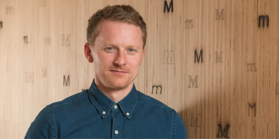
Creative Type Director, Tom Foley, sat down Antalis Creative Power to discuss the 2021 Type Trends report, the state of Sans Serif, and consider what makes a font timeless in his latest interview.
First published on Antalis Creative Power
Would you like to say a few words about Monotype and your work there?
Monotype is traditionally known as a type foundry, but over the last 20 years or so it’s become much more than that. On one hand, we are the keepers of many of the world’s most famous typefaces. On the other, we are the type company at the cutting edge of new developments in type design and technology. Monotype is at the centre of today’s typographic universe, which might seem like an overstatement to some, but I really believe this to be true. It is this expertise and ambition that we bring to bear when working on something like our upcoming trends report.
Could you tell me a bit more about the creation of this trends report?
Typographic trends are a popular subject among graphic designers and branding agencies, because type is an important part of all successful brand identities. We have produced trend reports in the past, and over the last couple of years, we’ve taken this to the next level. Working closely with many of the world’s top brands gives us a lot of anecdotal insights into what typefaces are trending, and which could become new trends in the near future. We also have access to data from our “font user habits survey”, which looks at all manner of data about what people are buying, which fonts are popular, what users expect in terms of choice, and also which type foundries are trending. So, this year we thought why not try to combine all that knowledge with all our connections in the industry, with people who are working at the cutting edge within branding and technology, and to put it all together to create an even bigger and better type trends report. It’s an ambitious project led by a fantastic team here at Monotype, who have been working on it for the past 6 months.
Tom Foley, Creative Type Director
This year, the global pandemic has had a big impact on a lot of creative fields, what has been its creative impact in type design?
We are all completely susceptible to context, and what’s happening is going to have effects in the medium and long term. As for immediate changes, in the first six months of the pandemic, the digital transformation definitely accelerated. This elevated the importance of good branding and good typography for many companies, and as a result, some sectors moved very quickly into that digital space. I think this has elevated the importance of type as a brand asset in places where maybe it wasn’t before. In the medium - long term, I think brands will respond to changes in lifestyles, behaviours, and expectations that have been brought on by things like remote working – which has changed many things in many people’s lives and altered our priorities. Nobody knows how this will play out, but I think it’s already had an influence, and we can already see some aesthetic changes.
You talked about the resurgence of “authentic type”, is that one of those aesthetic changes?
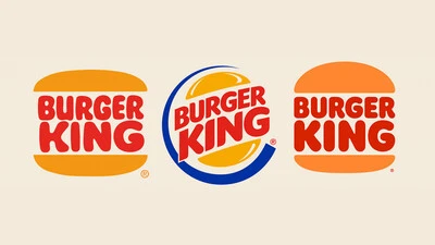
Yes, I think that due to the sudden change of pace and disruptions that we’ve experienced, a lot of brands are trying to tap into feelings of authenticity and familiarity in how they communicate to their audience. I think that this will manifest in the use of typefaces that evoke a sense of nostalgia and the ideas of comfort and familiarity. A good example is the Burger King rebrand by JKR in late 2020. A very successful rebrand that uses super-soft, retro type as a central component of its identity. But there will be much more on this in the trends report, so make sure to check it out!
Any other changes we should expect?
People are doing more interesting things with type. I don’t know if it can be directly linked to this pandemic. It might also be, like I said before, that if many more people are competing in the same space, there suddenly becomes a need to stand out. There are always quite pragmatic reasons behind trends. For example, I see a connection between the Sans Serif trend and the importance of user interface and user experience design principles in branding. The need for consistent, easy, and accessible user experiences through print, websites, and apps is of huge importance to many big and influential brands. Legible sans serif typeface supports these principles very well, which may have helped drive the sans serif trend. We’re now seeing a need to layer more brand recognition on top of these principles. So, we might see the use of more expressive typefaces, and more experimental use of kinetic and animated type through new technologies such as variable fonts.
In your last year’s report, one of the main trends was the need for global language coverage, is it still going strong?
I think it’s something that went from being a trend to becoming a feature of our industry. This often boils down to the need for a unified typographic voice across different languages, with the ultimate aim of supporting the consistency of brand expression. This has predominantly been achieved through neutral sans serif-based designs, for many of the same reasons I mentioned above. And I think it will be interesting to see, as global brands evolve, if the use of more expressive, high contrast styles start to appear in large multiscript type design families.
According to you, what makes a typeface timeless?
For me, as a type designer, timelessness is related to how certain typefaces become genres. There are well-established categories of type such as Humanist, Transitional, Slab Serif or Sans Serif etc. These all started with the design of one or more typefaces, which became a trend which in turn became a genre. Typefaces that are timeless also have a neutrality about them, a consistency in design features and a balance of beauty and utility. But it’s also worth keeping in mind that some designs take on an element of timelessness when they are widely used. This can happen when a typeface is widely distributed through a dominant printing or publishing technology, and through successful marketing. So, timeless typefaces in my opinion have a combination of these things; beauty, utility, familiarity and as a result cultural resonance and relevance.


