Resources.
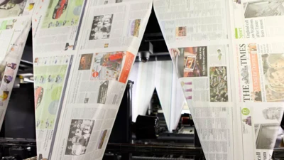
When your business is the printed word, your use of type is serious business. From the introduction of the Times New Roman® typeface in 1932 through to its Times Modern fonts today, The Times newspaper’s use of type has been a critical and iconic aspect of its brand.
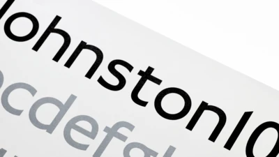
Transport for London commissioned Monotype to remaster the 100-year-old Johnston typeface.
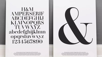
The H&M custom font family speaks stylishly across all brand communications— from large in-store graphics to smaller type for their website.
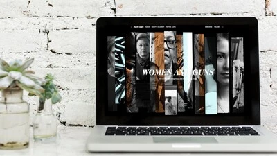
Hearst Media has dozens of iconic titles. Learn how Monotype helped them evolve to meet the demands of a growing digital audience by offering more design flexibility and freedom.
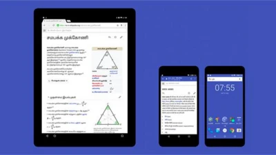
A typeface five years in the making, Google Noto spans more than 100 writing systems, 800 languages, and hundreds of thousands of characters for users worldwide.
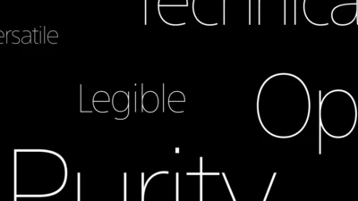
Monotype's Akira Kobayashi worked closely with Sony’s Chief Art Director Hiroshige Fukuhara to create an original typeface ready for nearly 100 languages.
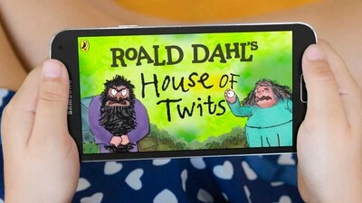
Monotype worked with noted illustrator Sir Quentin Blake and his team to recreate his handwriting as a bespoke typeface.
One of the best rebrands of 2016, the new Premier League identity features a typeface that performs confidently from screens and jerseys to TV and league tables.

Monotype designer Terrance Weinzierl delivered a taste of modern Americana to Domino’s, with his modular, multi-weight Pizza Press typeface.
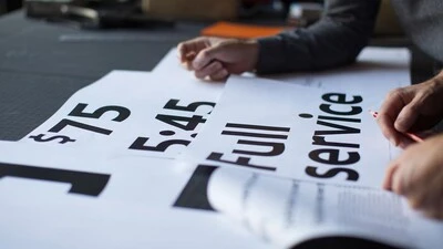
Monotype and Lippincott worked closely with Southwest Airlines to craft an authentic typographic voice that formed the center of a fresh new identity.
This custom-designed font family, Alibaba Sans, will help partners and customers power on-brand designs.
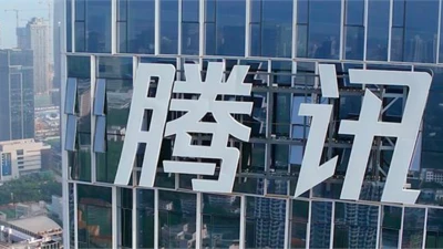
If you’re using a messaging app in China, chances are it’s owned by Tencent. See the brand identity and typeface that is helping Tencent expand to new markets.
