Fashion-forward fonts for H&M.

H &M was in need of a custom typeface to speak stylishly across all communications — from large-scale formats like in-store graphics to smaller size type on their website and seasonal look books. Monotype and The Studio collaborated on the design and development of exclusive typeface HM Amperserif for the brand.
Swedish clothing brand H&M – which is ranked as the second largest global clothing retailer – has over 3,000 shops in 61 countries around the world. Its branding materials cover everything from advertising and catalogs, to packaging, films and signage. Although H&M was already working with a bespoke sans-serif typeface design called HM Ampersand – which was also designed by Monotype – it wanted to develop a fuller typographic language that it could use in a range of contexts around the world. The brand approached Monotype to commission a companion serif typeface that would contrast and complement the existing HM Ampersand design.

This secondary typeface needed to speak authoritatively and stylishly across all of H&M’s communication, whether that be in large-scale formats like in-store graphics, or used at a smaller size in seasonal lookbooks. Monotype Type Designer, Toshi Omagari, worked closely with Swedish design practice The Studio and H&M’s own marketing team to develop the HM Amperserif typeface – a design that follows the structure of HM Ampersand, but introduces greater flexibility for H&M’s typography. The brand needed to be able to present a clear global visual language, while maintaining its identity, and speak to a broad audience without compromising on design quality.
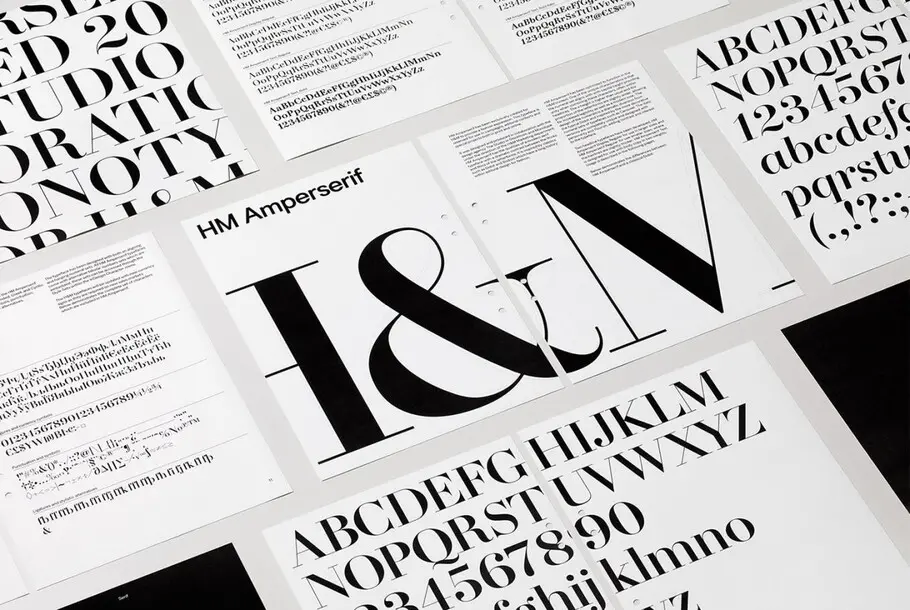


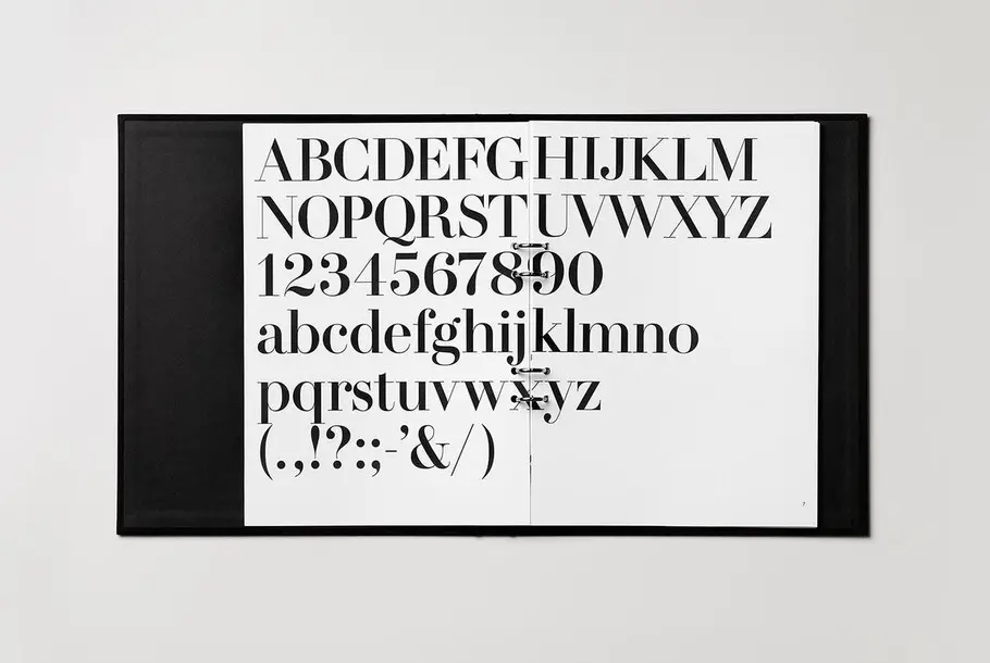
HM Amperserif follows in a long tradition of high contrast serif typefaces, which rose to popularity in the fashion industry after being used prominently in the 1950s by magazines including Vogue and Elle. The typeface continues this visual history, but incorporates notable but subtle quirks – for example a slightly tapered stroke for the bottom bowl of the lower case g.
HM Amperserif was developed at three different sizes, to ensure its character was maintained at the largest or smallest proportions, from billboards to shopping bags. Together with The Studio, Monotype also devoted particular attention to numerals, optimizing them for use in prices and campaign headlines – a key part of H&M’s business.


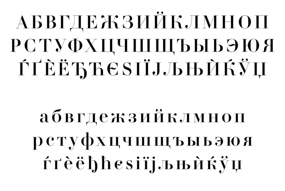
Also bearing in mind H&M’s position as an international brand, Monotype developed a multiple language character set that includes Latin, Greek, Cyrillic, Thai and Arabic. The design team worked together closely to also develop Indic logos, for use in India, and Monotype actively updates the fonts with new currency signs and additional characters, as the business expands into new locations.
HM Amperserif has allowed H&M to establish its own fashionable yet pragmatic typographic voice, with a full set of bespoke typefaces that can be used to address consumers around the world in a range of print and digital environments.


