The new voice of O₂ - Custom typeface.
Paul Skerm - Creative Director, Brand Agency.
Monotype’s Creative Type Director Phil Garnham, is joined by O₂ and their brand agency to discuss O₂’s new custom typeface, with an in-depth look at how this has propelled O2 to become a more digital and contemporary brand throughout different markets.
O₂ is Telefonica’s leading mobile-first brand which aims to make every day better. Standout customer experience and clear communication enables it’s customers to get the most out of mobile connectivity and that’s why O₂ is a brand that places typography front and centre. In every level of brand design, the clarity of text and the humanity of language lie at the brand’s heart.
Frutiger has been the voice of O₂ since their inception in 2002, but much like the world around us, the telco market is changing. Brands are adapting to the increasing demands of digital, as the reach of digital touch points grow, so does the need for continuity and authorship in every medium. O₂’s long relationship with Frutiger is testament to how great a design Frutiger really is, it’s a font that excels in clarity. It was very much on-trend when the brand launched, it’s a reliable workhorse but has become a bit predictable — not a distinctive brand maker.
As the O₂ brand looked to move forward, pivoting to the new normal, O₂ and their brand design agency contacted the Monotype Studio to discuss the design of a new typeface that could introduce a distinct and more human centred voice. A pared-back and simplified approach to a font family which has the ability to meet the broad demands and challenges that brands are facing today.
O₂ is a brand that looks beyond categories, it’s far bigger than a ‘Telco’. It is a life affirming brand that crosses sectors, a prevalent voice in the minds of many, both in-store and online, owner of 20 UK music venues and backer of England’s national rugby union team. The O₂ brand focuses on the human experiences that tech enables. Not the tech itself.
Francisco Foncea, Corporate Global Brand Manager, Telefónica.
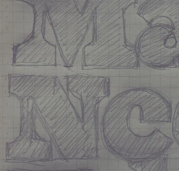
The project began with a kick-off meeting at the agencies London studio with the O₂ brand team, Creative Director, Paul Skerm and Monotype’s Senior Creative Type Director, Phil Garnham. We analysed the brands use of type, deep dived into the telco landscape and asked probing questions around the nature and personality of O₂, Frutiger likes and dislikes, discussions on type trends, and sharing initial sketchbook ideas… Custom type design is a collaborative process, and having these open conversations as a team helped to build a framework to ensure we could deliver on all aspects of the type design
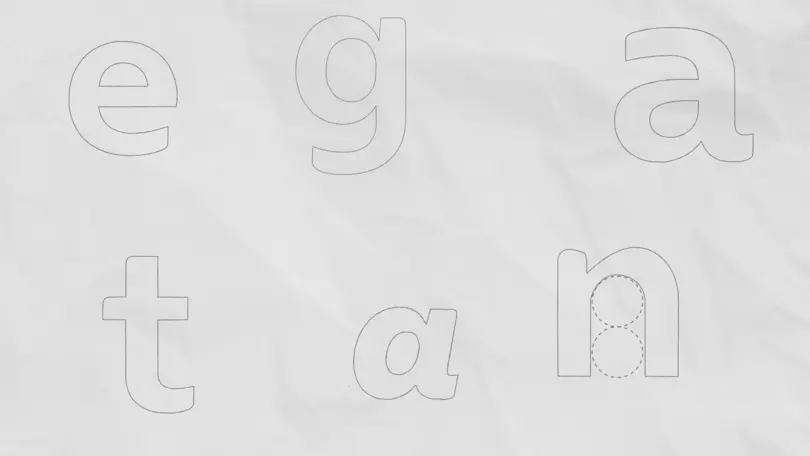
From outset it was clear that a sense of openness and ‘breathability’ was going to be key to the new font’s success. Playing on this theme of ‘oxygen’ in type, we created a range of ideas that looked to geometry and circularity, accessibility, clarity, joyful liveliness, and warmth. This font needed to celebrate the human side of digital. We locked our new font ideas into ads using key phrases ‘Breathe it all in’, ‘Magical realism’, ‘Priority’ and asked the most basic of questions — ‘What feels right?’ ‘Does this type speak O₂?‘
Three ideas struck a chord and helped us firm up the brief. A sense of roundness was important, the letterforms needed to feel open. The O₂ brand gives peace of mind and therefore the design needed to be structurally simple. However, with Frutiger so firmly embedded into the brand, a fully open circular approach wasn’t an entirely viable option. Proportionally, the design needed to function company wide in new and old templates already using Frutiger as a placeholder, we needed to harmonise reflow whilst also evolving the letterforms tonally.
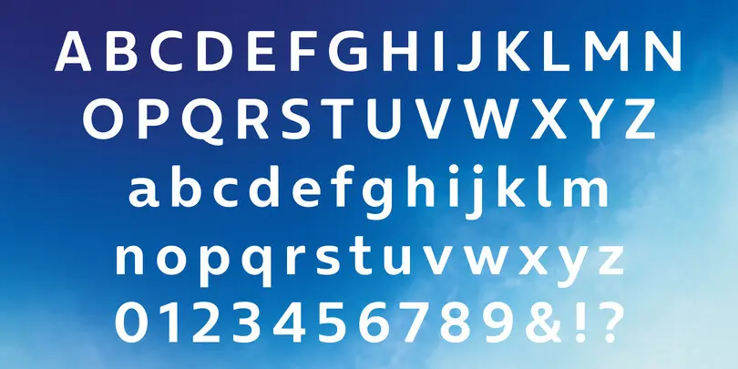
It was at this point we began developing a subtler approach to geometry and exploring circularity within letter stems and strokes. We introduced this idea of the human hand, a calligraphic influence where the letters round in and out as the pen moves, the frayed edges where writing meets type. A forward moving rhythm, where the type stems round away from a mechanical feeling and into a more human centred flow.
The typeface started coming alive, the character set grew and with it we spent a lot of time ensuring the font would resolve concerns around proportions, scaling, reflow, accessibility and distinction. We provided multiple creative options for all characters, added in figure sets and intelligent OpenType features that automate logo usage from within the font file. The font moved to brand team testing.
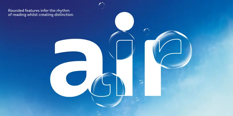
At this point we started thinking about the Italic styles and a possible display font for campaigns. Given the calligraphic influence of the Roman fonts, we were keen to make a cursive, more natural feeling italic font set. And for the display font, we wanted to make an interactive font style that could bring in another dimension whilst retaining synergy with the core font family. Paul and his team were experimenting and animating with an outline version of Frutiger, but applying outlines and animating was a cumbersome process. We pushed outside of the project scope and created three strokes of outline from the Bold font style.
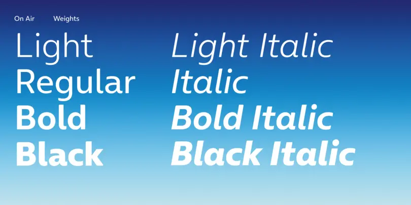
The final custom fonts are named ‘On Air’ and ‘On Air Outline’ and create a cohesive brand language, aligned to the heart of O₂’s values of openness and trust.
On Air is an exclusive family of four weights of Light, Regular, Bold and Black plus Italics and On AIr Outline is available in 3 styles.
