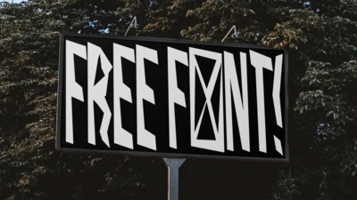
Crafting connection and authenticity: Insights from Brand Talks Köln.
— Marcel Hausler, Karl Anders
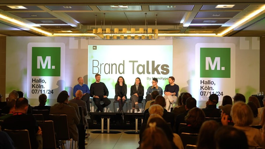
We recently had the pleasure of hosting Brand Talks in Cologne. It was our first ever aufenthalt in the carnival-capital, and it was a great success! We enjoyed a captivating afternoon, hearing from some of the industry’s finest, talking about what they do best.
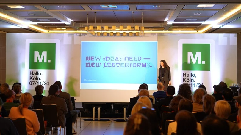
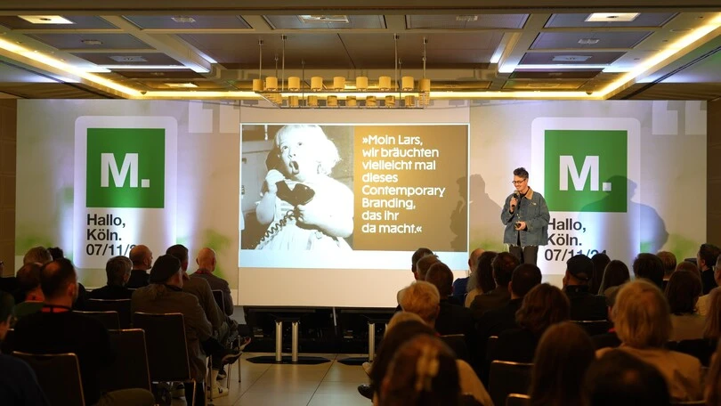
Monotype’s Creative Type Director, Sina Otto set the stage with a powerful opening. She reminded us that typography is more than just letters; it’s a grounding force in design, seamlessly blending functionality with emotion. She challenged us to push beyond the familiar, explore fresh letterforms, and embrace the potential of new ideas and technologies. Her insights laid the foundation for the day’s conversations, inspiring us to think about what’s possible when imagination and authenticity meet innovation. First, Monotype Senior Type Designer Friedrich Althausen was joined by Ulrich Aldinger, Creative Director at Peter Schmidt Group; and Alexander Tibelius , Corporate design Lead at Bechtle, to discuss the creative journey to a future-first custom font. Then Lisa-Marie Sinnig, Digital Account Manager at Mutabor took to the stage to explore the possibilities and limits of AI in branding. Marcel Häusler,Creative Director at Karl Anders closed off the talks with a thought-provoking presentation on identity and how to communicate it through type.
Human connection in a digital era.
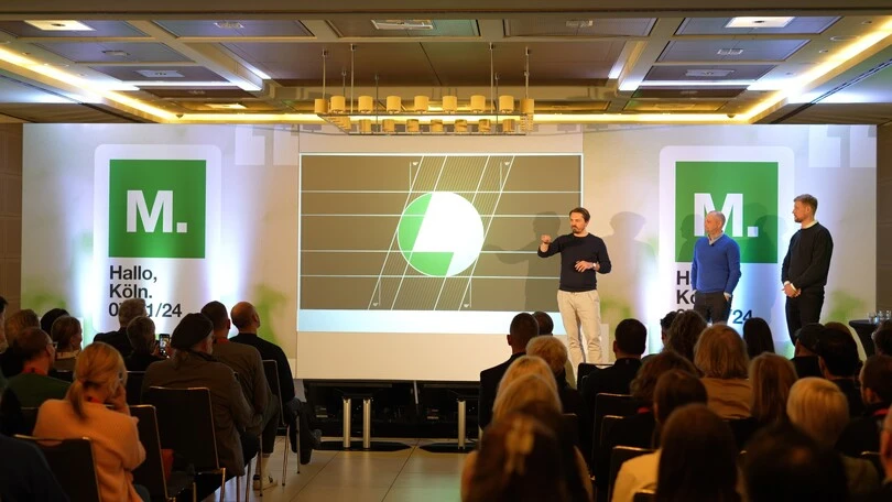
In the quest for digital transformation, preserving a human touch is essential. Friedrich Althausen, Ulrich Aldinger, and Alexander Tibelius spoke to this directly. Bechtle, Germany’s leading IT company, redesigned its corporate identity with connection as a core focus, balancing digital expertise with approachability.
Their new logo — a circle with a rhombus at its heart — symbolizes unity and connection, blending aspects of past and future, people and technology. The IT giant now boast a new wordmark and custom typeface that prioritize readability, subtle details, and emotional resonance. The work shifts Bechtle’s visual identity from rigid and corporate to approachable and future-focused. The new typeface for Bundesliga’s most rebellious club, FC St. Pauli, also demonstrates a commitment to connection. The typeface, FC Sans Pauli, mirrors the club’s community ethos and left-leaning stance. Here, technology is wielded as a bridge to connection and presents a wholly inclusive typeface: for instance, gender neutral symbols are coded within the typeface to ensure it speaks to and for everyone. As Marcel Häusler’s presentation showed, emotion isn’t simply a byproduct; it’s the essence that defines and strengthens the brand.
Authenticity through innovation.
In a world of digital tools and AI, authenticity might seem at odds with automation. Yet Lisa-Marie Sinnig from design agency Mutabor shared how AI can enhance authenticity to a certain degree. Mutabor’s brand imagery tool uses AI to create customized, on-brand visuals, allowing brands to scale imagery production without sacrificing quality or cost. Yet, as emphasized in the presentation, human guidance remains vital. If machines are to learn, and learn well, then they should learn from the best. Without investing in talented people, the work produced cannot match up. To quote Sinnig, “Use AI whenever sensible, rather than whenever possible.”
The FC Sans Pauli typeface is another powerful testament to authenticity. The typeface includes political symbols and cultural references intrinsic to the club’s identity and Hamburg’s vibrant community, evoking St. Pauli’s outspoken character. Developed by agency Karl Anders and type designer Christoph Koeberlin, it visually expresses the club’s commitment to being “different.” More than a design, FC Sans Pauli is a statement of values, it’s a “A font with attitude, for a club with attitude.” Inclusive and activist at heart, the typeface features a range of styles, alternate glyphs, and a broad glyph set, extending its accessibility to an additional 200 million speakers worldwide.
Cultural identity.
For brands seeking a distinctive voice, typography offers more than just a visual aesthetic, it becomes an emblem of cultural identity. Bechtle decided to invest in a custom typeface was driven by a desire to convey their brand’s reliability and adaptability in a visually unified way, extending beyond logos to encompass their entire digital and physical presence. This functional yet flexible type embodies the brand’s “future-first” approach and aligns with Bechtle’s innovative ethos.
FC St. Pauli’s custom typeface takes cultural identity to a new level by incorporating the club’s rebellious and marked political stance as a core element of design: FC Sans Pauli boasts left-leaning letters and strong symbolism . The club has stood as a symbol of progressive values and resistance for decades, and now wields typography to capture and tell its unique narrative.
Meanwhile, Mutabor’s exploration invites us to consider how AI can ensure that brand imagery is suitably tailored to the target audience, allowing companies to scale and adapt to suit diverse audiences and geographies. When thoughtfully applied, AI can extend a brand’s reach without diluting its essence, allowing it to expand while maintaining a sense of aesthetic continuity.
From custom typefaces that embody a brand’s ethos to AI tools that build on human sensibility, authenticity was at the heart of discussions at Brand Talks Köln. In an era of rapid transformation, brands that master the tricky balance of innovation and authenticity stand to resonate on a deeper, more meaningful level.


