A shape shifter logotype with infinite possibilities.
- Natalia Kotkowska
Pioneering French lingerie brand Chantelle has stood for decades as a powerhouse of innovation and elegance. Over the past seven years, the brand has undergone a major transformation, refining its portfolio to better speak to the many facets of femininity.
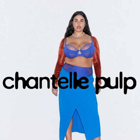
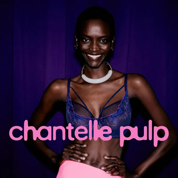
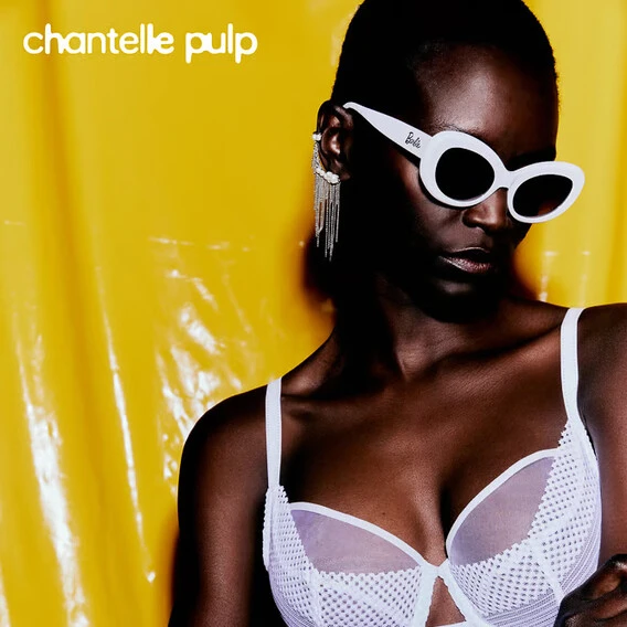
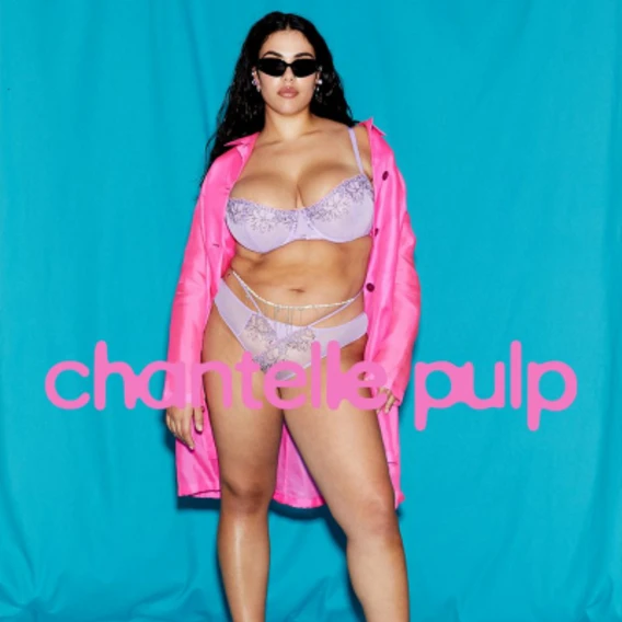
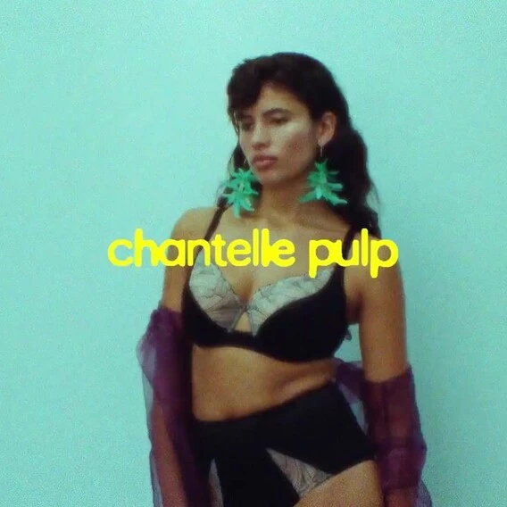
This evolution led to the creation of Chantelle Pulp, a playful and daring sub-brand within a sleek, classic family. With inclusivity at its core, Chantelle Pulp celebrates all shapes and sizes. As a disruptive newcomer, it required a distinctive identity, and what better way to achieve that than with a custom variable typeface?
A logotype to represent what femininity can mean today and tomorrow, in all its complexities.
Celebrating diversity and fluidity.
Any constructor will tell you: without strong foundations, your building will fall. Building a brand identity is much the same, and in the case of Chantelle Pulp this was far from being an issue! At its core, Chantelle Pulp is a testament to inclusivity. Boasting an extensive size range, from A to H, bright colours and varied designs, the brand is aimed at all women, no matter their shape or size. Pulp speaks to the fluidity of femininity, giving a varied interpretation to what the female form suits and needs, “in all its nuances, its complexity and its richness”, explains Chantelle’s Global Chief Creative Officer Renaud Cambuzat.
That said, this notion of fluidity is even more wide reaching. It also speaks to the fluid nature of the brand itself, building as it goes, taking on new challenges and ways of expressing itself. While standing for and speaking to wider societal issues, not only inclusivity but sustainability, and more.
Chantelle knew that a variable logotype would give them the freedom to explore fluidity, in all its forms and meanings. Chantelle’s Head of Design Natalia Kotkowska, sums it up: “This shape shifter logo represents how the brand is shifting and evolving.”
A unique and disruptive identity for an “evil child.”
Hand in hand with a commitment to inclusivity, is a disruptive, playful side. As Renaud Cambuzat puts it, “we wanted Chantelle Pulp to be a little bit like the evil child,” challenging the traditional and classical direction of the wider brand family. Pulp’s essence lies in its desire to push boundaries and test limits, offering a look and attitude “dissimilar to anything that already exists in the lingerie world.”
This departure from the brand’s heritage posed a challenging yet exciting task. Chantelle, known for its elegance and timeless appeal, was now asked to give rise to a bold, instinctive, and playful language—one that was unmistakably confident and playful, but not childish. The name itself sets the tone for this boundary-pushing approach, with its clear references to Pulp Fiction, the iconic UK band, and a broader cultural counter current. The logo needed to be a powerful statement, establishing Chantelle Pulp as a fresh and daring voice within the lingerie landscape.
— Natalia Kotkowska

— Renaud Cambuzat
Giving form to a creative vision.
Why Monotype.
Now having values and vision is crucial, but so too is the ability to bring them to life. As a small, almost entirely in-house brand, Chantelle initially tried to execute their strong vision internally. Confident in the clarity and strength of their ideas, they tried, but eventually reached a point where they needed more. “We needed other creatives around the table, people who could bring fresh perspectives and expertise,” says Natalia Kotkowska.
This is where Monotype stepped in. As Natalia Kotkowska puts it, “A truly great branding is always a reflection of a good collaboration,” and Monotype’s expertise was the missing piece to this creative puzzle. Reflecting on Monotype’s Creative Type Director Damien Collot, Natalia adds “he came in and really helped us push this vision forward, resulting in something truly remarkable.”
A collaborative dance.
The journey to the final logotype was dynamic and collaborative. It began with workshops, sketching, brainstorming, and live design sessions, where both teams worked closely to ensure the design remained true to Chantelle Pulp’s core values. “We finished that workshop feeling confident that this was going to be an amazing project and that we were on the right track,” confided Natalia Kotkowska. Trust in the partners and open communication were crucial throughout the process. As the design evolved, several iterations were made to refine the logotype.
The first draft was a step in the right direction but needed further refinement to align with the brand’s essence. “That’s when we entered into a dance with Natalia and Renaud, pushing the design to be as close as possible to the brand’s true identity,” says Damien Collot. The flexibility of the designer and the hands-on involvement of the Chantelle team were key to achieving the final version. Multiple rounds of discussions and feedback ensured the design not only aligned with the brand’s vision but also captured its bold playful spirit. Every decision, every adjustment, was a step toward creating a logotype that was a true reflection of the brand’s identity.
A flexible identity with open ended possibilities.
Setting the stage.
Chantelle Pulp’s final custom variable logotype captures the very essences of the brand. The variability of the logotype morphs through different weights and shapes speaking to and embracing the varied nature of the female form. On a more technical note, Damien Collot adds “the logo uses the variable font technology and has two axes, three masters per axis to give better control of the extreme variations of the design across the range.”
While pushing boundaries, it remains grounded, namely by the clever pairing with Chantelle’s brand font Helvetica now, “a revisited classic”. Currently, the logotype is primarily used in a static form, to establish brand recognition and awareness. This allows Chantelle Pulp to set the tone and build familiarity before exploring the logo’s full potential.
Playing with possibilities.
For Chantelle Pulp, more than what the brand is today, the challenge and excitement come from the endless possibilities for tomorrow. The variable logotype lies at the heart of their evolving identity, offering a wealth of options and flexibility that can be leveraged across a variety of campaigns and contexts. This design asset empowers them to continuously adapt and explore new directions, ensuring the brand remains fresh and dynamic.
As Renaud Cambuzat puts it, “We haven’t really played with it yet, but we know we can, and we will for sure.” The potential is vast. Natalia Kotkowska adds this flexibility will allow the brand to have “a mini-visual identity for each season.” And it’s only the beginning, as Natalia Kotkowska emphasizes: “The logo has a real potential to be explored and reimagined for many, many, many years.”
Playful, bold, and full of potential.
The custom variable logotype is central to this boundary pushing and evolving brand. With the flexibility to explore and adapt across various campaigns and touchpoints, Chantelle Pulp’s logotype is an undeniable creative asset, the full potential of which is yet to be explored. As Renaud Cambuzat sums it up, “Our goal is to have fun with it, if you have fun with it then ultimately customers can have fun with it too, and feel it” – We can’t wait to see what’s to come!


