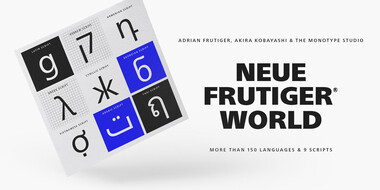
Neue Frutiger® World
More than 150 languages & 9 scripts.

More than 150 languages & 9 scripts.
The Neue Frutiger World typeface is an expansive family of functional, legible and warm fonts that cover more than 150 languages and scripts including Latin, Greek, Cyrillic, Georgian, Armenian, Hebrew, Arabic, Thai and Vietnamese, to name just a few. Designed under the supervision of Akira Kobayashi of the Monotype Studio, the family provides brands with a consistent voice across markets, geographies and consumer touchpoints. All scripts included in this super-family can be used together, and also pair seamlessly with Monotype’s new Chinese, Japanese and Korean (CJK) designs: M XiangHe Hei for Chinese; Seol Sans for Korean; and Tazugane Info and Tazugane Gothic for Japanese. This collection carries on the unmatched legacy of the original Frutiger typeface, designed by the legendary Adrian Frutiger, as well as the Neue Frutiger typeface, designed by Akira in close collaboration with Adrian.
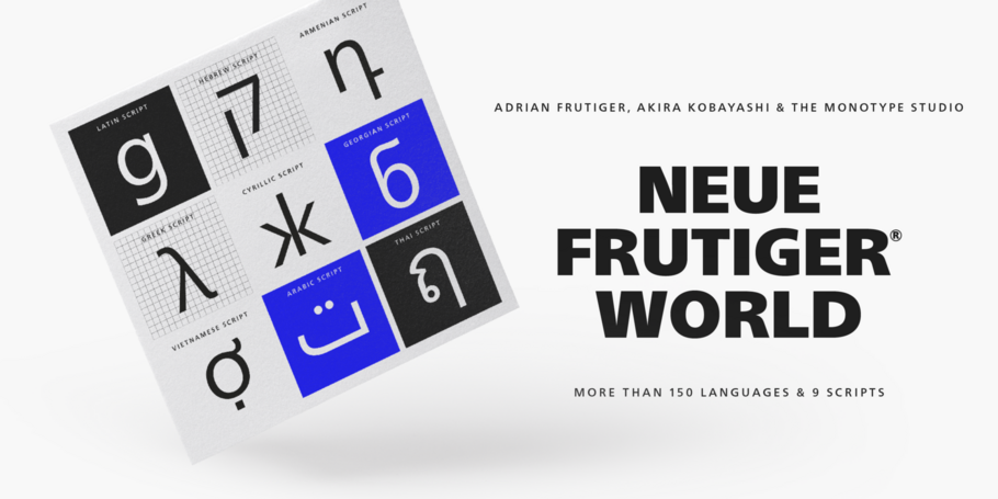
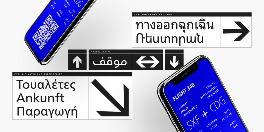
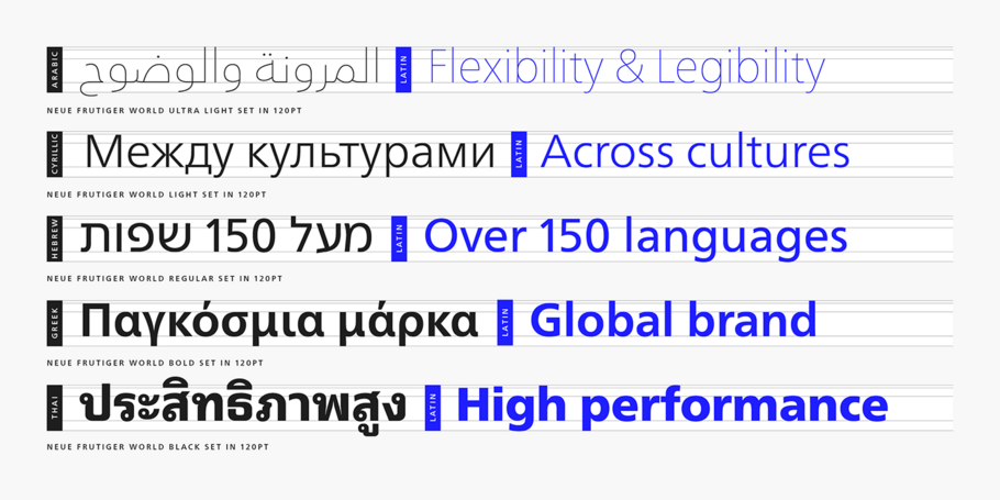
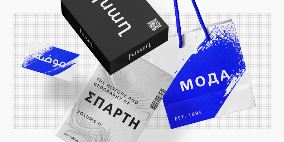
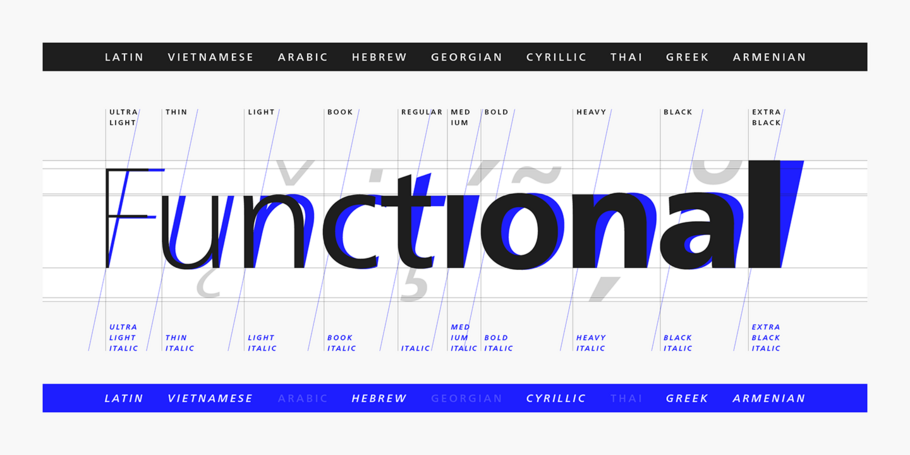
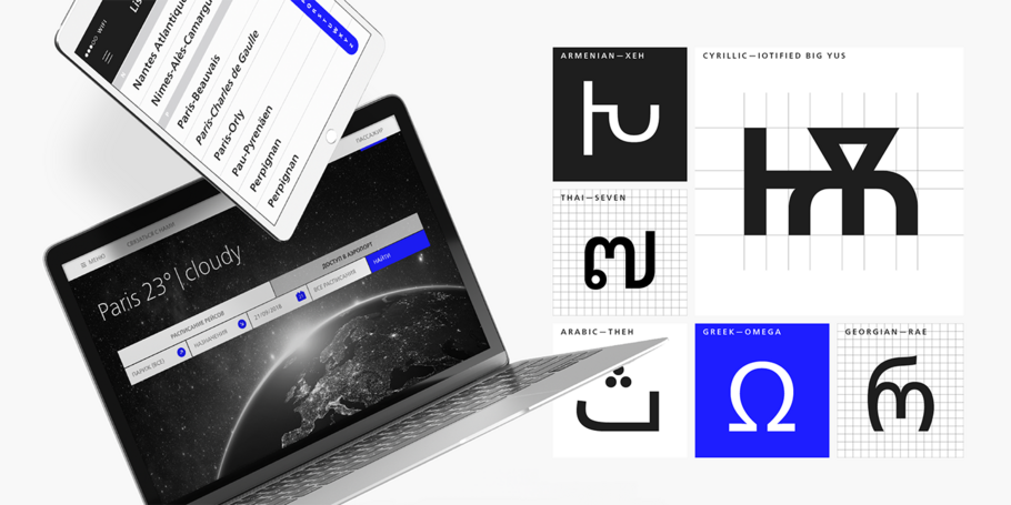
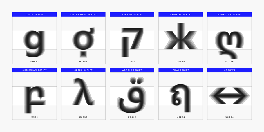
Neue Frutiger World is designed for global use with an impressive range of 10 weights, from Ultra Light to Extra Black, with matching italics. It embodies the same warmth and clarity as Adrian Frutiger's original design, but allows brands to maintain their visual identity, and communicate with a consistent tone of voice, regardless of the language. Neue Frutiger World supports more than 150 languages and scripts including Latin, Greek, Cyrillic, Georgian, Armenian, Hebrew, Arabic, Thai and Vietnamese.
“Before Neue Frutiger World it was not an easy task for western brands to find families in Arabic, Hebrew, Thai and Vietnamese which match with their Latin,” says Monotype type director Akira Kobayashi, who led the Neue Frutiger World project. “They may find a type with closer expression, but there was no guarantee if the bold version in the non-Latin family matches the bold in their Latin. Neue Frutiger World offers a better solution.” In addition to Neue Frutiger World’s linguistic versatility, it works hard across environments – suited to branding and corporate identity, advertising, signage, wayfinding, print, and digital environments.

Creative Type Director Akira Kobayashi has three decades of experience, with an extensive background in Japanese typeface design and a deep understanding of calligraphy. After studying at Musashino Art University in Tokyo for four years, Akira Kobayashi accepted his first job at phototypesetting manufacturer Sha-Ken Co., where he was involved in the lengthy and intricate process of designing Japanese fonts.
We offer a number of ways for you to start working with our typefaces.
You can love it or hate it, use it for nearly anything or refuse to use it at all. But however you feel about Helvetica, no one can deny its place in society.
