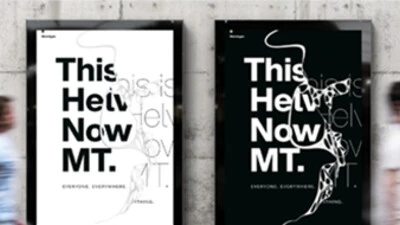
Tazugane Gothic: a Japanese typeface with the elegance of a crane.
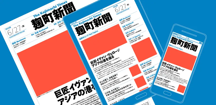
The first Japanese typeface from Monotype is a humanist sans serif, designed to work in partnership with Neue Frutiger. Tazugane Gothic sets out to introduce a new typographic standard, allowing designers to comfortably set Latin and Japanese characters alongside one another while maintaining visual harmony.
The typeface resolves some of the current challenges faced by designers, who often set English and Japanese words in different typefaces that can create uncomfortable contrasts. Akira Kobayashi, the lead designer on the project, was first encouraged to make Tazugane after seeing road signs that featured awkward typographic pairings – for example Japanese set in square sans serifs with large counters, used alongside English set in Helvetica, with condensed and tightly spaced letters.
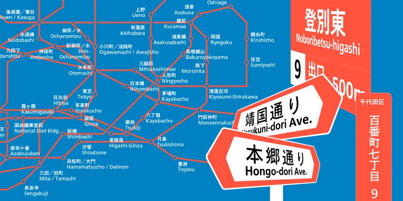
In contrast, Tazugane Gothic has smaller, more narrow counters and characters that reflect the balance of handwriting. The kanji – one of the three scripts, alongside hiragana and katakana, that make up the Japanese writing system – have been designed with the structure of traditional characters, and feature more gently curved strokes in comparison with many modern gothic typefaces. The hiragana have also been created to reflect the proportions of handwriting, with characters naturally elongated along the vertical and horizontal axis to improve readability.
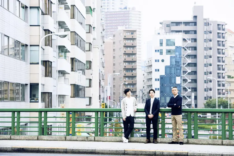
The Tazugane Gothic design team in Tokyo includes (from the left) Kazuhiro Yamada, Ryota Doi and Akira Kobayashi.
“As Neue Frutiger does, Tazugane Gothic’s characters preserve the sense of natural and human balance,” says Kobayashi, whose own experience collaborating with Frutiger was a key part of the design process.
The typeface includes a fresh version of Neue Frutiger, which has been enlarged to 108% and had its baseline nudged downwards to resolve the issue of Latin characters appearing smaller, when set alongside Japanese fonts. The design team also carefully considered the proportions between the letterform and its surrounding white space, to create a “calm” look that didn’t become either too modern, or too classic.
“They fit together nicely as they share the same philosophy,” adds Kobayashi. “They were both designed to generate a certain rhythm when type is set, which results in greater readability as each word is more easily perceived as a discrete unit.”
Kobayashi worked alongside fellow Monotype designers Kazuhiro Yamada and Ryota Doi to complete Tazugane Gothic, which required a huge number of glyphs to be developed – the kanji alone needing several thousand. Despite the sheer level of detail, the family was in development for just under three years, and features 10 weights – an unusually large range for a Japanese typeface.
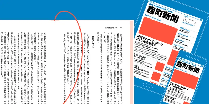
Although created with the needs of contemporary designers in mind, Tazugane Gothic remains true to its heritage, and not just through its design DNA. Its name, which means crane, is taken from the Man’yoshu – Japan’s most ancient collection of poetry. Recurring time and again in Japanese art and literature, it’s a symbol of both longevity and beauty.
“I had never heard of the archaic Japanese word for Tazugane but I immediately liked it as it reminded me of the grace and elegance of the crane,” says Kobayashi.
Get the Tazugane Gothic fonts
Visit the Tazugane Gothic web specimen to experiment with all 10 weights. The full family is available from MyFonts.
The Studio team.
Akira Kobayashi.
Creative Type Director Akira Kobayashi has nearly four decades of experience and an extensive background in Japanese typeface design and is a 2022 TDC Medal and Keinosuke Sato Award winner. After studying at Musashino Art University in Tokyo for four years, Akira Kobayashi accepted his first job at phototypesetting manufacturer Sha-Ken Co., where he was involved in the lengthy and intricate process of designing Japanese fonts.


