Meet the 2021 Beatrice Warde Scholarship recipient: Ximena Amaya.
We recently caught up with Ximena Amaya, a young designer who is currently interning at Pentagram. Ximena talked about her own bold and sometimes rebellious design style, her passion for the feminist movement in her home country of Mexico, and how design can be used as a communication tool.
Meet the 2021 Adé Hogue Scholarship recipient: Sakinah Bell.
In a recent interview with Monotype, Sakinah Bell, discussed how creative work has provided an outlet to improve her mental health as well as to process current events. Bell described her colorful, bold use of hand-drawn type, her senior thesis focused on metamorphosis, as well as the personal significance of winning the scholarship after overcoming many of life’s hardships.
Meet the 2020 Beatrice Warde Scholarship recipient: Tatiana López.
Every year, Monotype and the Type Director’s Club (TDC) award the Beatrice Warde Scholarship to a young woman entering the design industry. This prestigious scholarship pays tribute to the “first lady of typography,” Beatrice Warde, a champion of type education throughout her career with Monotype and the first female member of the TDC.
A talk with Tom Foley on trends, the possible decline of Sans Serif, and what makes a type timeless.
Creative Type Director, Tom Foley, sat down Antalis Creative Power to discuss the 2021 Type Trends report, the state of Sans Serif, and consider what makes a font timeless in his latest interview.
First published on Antalis Creative Power
Soft serve digital and the importance of nostalgia during a crisis.
Phil Garnham, Senior Creative Type Director at Monotype Studio explores the evolution of type in digital and celebrates the heritage at the heart of the Burger King rebrand.
First published on BITE
Why it pays to pay for creativity.
Artists pour their heart and soul into their craft and creations and in an ideal world, every artist would be recognized and paid appropriately for their efforts. In reality, however, artists often have to fight for their rights to be upheld. This has been true for centuries and is only intensifying in the digital era.
Announcing the 2020 Type Champions!
Monotype is thrilled to introduce the recipients of the second annual Type Champions Award, a program that recognizes brands for their creative, innovative, and memorable use of typography in developing and maintaining their brand identities.
Will the real Futura please stand up?
Monotype’s Futura Now family is a revival and expansion of the famous typeface we all know so well. But do we know it, really?
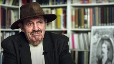
Ed Benguiat, 1927-2020.
Ed Benguiat loved to draw letters. It’s what he did best. When he was not creating a new typeface, he could usually be found working on a piece of hand lettering or logo design for one of his many clients.
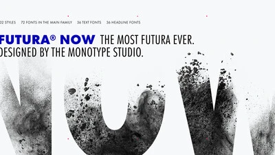
The next century of Futura.
It’s difficult to imagine the 20th century without Futura. Released by the Bauer Type Foundry in 1927, Paul Renner’s Futura was a near-instant hit that quickly established itself as an iconic, immovable piece of our shared culture.
The Monotype Studio talks football
The National Football League has a long history of memorable logo design. We asked the Monotype Studio team to share their favorites, both contemporary and from childhood.
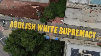
Typography and modern protest.
At its core, type is a storyteller. Letterforms deliver a message. And such messages are perhaps at their purest in the form of community-led designs for protest.
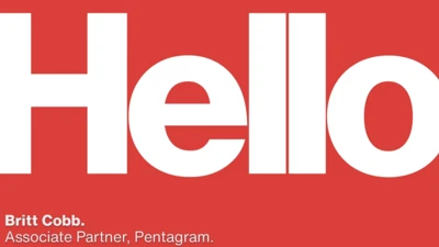
We’re all in this together: The importance building a brand from the inside out.
Everyone knows the saying, “what’s on the inside matters most.” Sure, a person’s character is more important than what they look like, but how does this relate to branding? A brand needs to look and act a certain way to engage with its audience, right?
Is it time to rethink how creative work gets done?
We’ve spent a lot of time thinking about the effect the pandemic has had on the collaborative process that drives creative work at companies everywhere. Here are some ideas about where things could be heading.
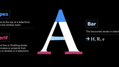
What’s in a letterform?
A letter is more than the sum of its parts, but sometimes it helps to know what those parts are called. And it may not surprise you to learn that in a field as meticulous as typography, every little piece of a letter has a name.
How fonts can help your customers feel right at home.
When it comes to your brand, your customers aren’t just evaluating your logo or your colors or the typography, they’re evaluating how your brand makes them feel. More than anything, brands are built on feelings—all the thought you put into design and the experience is simply in service of creating a feeling.
What’s a store for? Rethinking retail in the lockdown era.
As people—and brands—continue sprinting toward digitally immersed experiences, a human, personal online presence will make a big difference. Here’s how can design help make that possible.
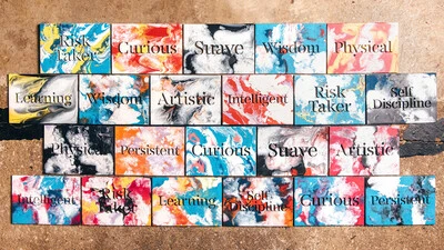
Behind the creation of FS Renaissance, with Craig Black and Pedro Arilla.
FS Renaissance is a handcrafted display font where each letter stands alone as a piece of art. Craig and Pedro recently shared their perspective on the concepts and creative process behind FS Renaissance.