Brand Talks recap: How Domino’s and Walmart are building customer-first brands.

The inaugural Brand Talks on the Terrace in San Francisco attracted an impressive room full of designers, creatives and marketers for an evening of discussion around building customer-centric brands and the role of type and user-generated content (UGC).
Jake Harvey of advertising agency Crispin Porter & Bogusky, talked through how client Domino’s reinvented itself to better serve modern customers, highlighting a custom brand font created alongside Monotype’s Terrance Weinzierl. Afterwards, there was a fireside chat with Walmart’s Kay Streit that explored the retailer’s recent website redesign and a renewed focus on customer needs.
One Dot-Two Dots: a brand font story
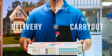
Jake Harvey, Digital Asset Manager for CP+B, opened his presentation with a video highlighting Dominos’ brand evolution – not sparing the negative details like customers’ candid feedback on the pizza, and an established, yet stale visual identity. As part of the Domino’s brand revival, CP+B developed a custom typeface, Pizza Press, with Monotype’s help.
Before coming to Monotype, CP+B was using a version of the typeface developed in house which required their designers to lay out visuals using manual copy and paste, which was time consuming. Harvey enlisted Monotype to modernize the typeface and create a modular version, which could be easily used for print, web and mobile.
Terrance Weinzeirl, the type designer behind Pizza Press, joined Harvey to talk through the process of designing the typeface. Weinzierl explained that it started with understanding the DNA behind Dominos and the qualities they wanted to evoke; asking questions like, “Does this typeface need to be more friendly? A touch more traditional? A touch more sleek?”
Weinzierl worked through several prototypes of details like the spurs on the Gs and the swashiness of the Zs, as well as testing how the typeface rendered on screen and on smaller devices. As Weinzierl pointed out, “They are seemingly small details, but once you see them in context it all makes sense.”
In order to serve an increasingly mobile-first audience, Domino’s needed a series of modular fonts that could be stacked in multiple ways, allowing designers to use them creatively on pizza boxes, in apps and online. The resulting design is modern and contemporary yet evokes American craft. Special considerations were made in how the Zs would appear (it’s for a pizza restaurant) and how the typeface would handle a variety of print and digital environments.
“Once we finally had built a toolkit [of type] that’s when we delivered back to CP+B to make more cool stuff,” Weinzierl explained. He put the typeface and ornaments on a basic keyboard layout so designers could abandon copy and paste formatting. Weinzierl also created a comprehensive user guide, which covers how to use OpenType features, subsets of web fonts and how to pair different weights and styles.
Pizza Press continues to adorn beautiful pizza boxes and add flair to Domino’s digital properties, but today’s designs are simpler than the original intricate layouts. Along with the simpler pizza box designs, the Domino’s brand continues to evolve towards a cleaner, more modern aesthetic.
For the customer, inspired by the customer
Kay Streit, Editorial Creative Director, Content Strategist at Walmart sat down for a fireside chat with Monotype CMO Brett Zucker and discussed the retailer’s recent website redesign.
Zucker opened the conversation by asking how Streit sees customer experience impacting the Walmart brand. She explained that the first step of the website redesign was to build a simple yet fine-tuned style guide. After that, Walmart went straight to their customers for direction. Through a combination of in-house usability teams, ethnographic research and conversations with customers, Walmart had a rich mine of resources to influence the redesign.
There were two purposes behind redesigning Walmart’s website. In Streit’s words, “to look at ways to save the customer time, and to create a truly omnichannel experience.” The homepage is now entirely personalized, with custom photos. On social media, Walmart has also been rolling out redesigned assets and incorporating user-generated content (UGC).
According to Streit, “UGC is our top performing content. It’s a way to expand our network and extend our reach.” Walmart has content specialists across specific product categories, so it’s been helpful to seed their UGC with the types of imagery they’re looking for. Along with seeded UGC and the aforementioned style guide, category managers have a simple way to gather and use consistent imagery – even when it’s coming in from customers all over the world.
In addition to the website redesign and UGC strategy, Walmart has also partnered with brands like Lord & Taylor and BCBG to provide customers with access to premium fashion for less – with free two-day shipping for purchases over a certain price point. Since the redesign, Walmart has maintained sales and increased their NPS, which is in line with their goals. “We’re always looking for a more loyal customer and more brand affinity.”
To learn how Monotype can help you build a customer-centric brand, get in touch with us.
The Studio team.
Terrance Weinzierl.

As a Creative Type Director in the Monotype Studio, Terrance Weinzierl has been creating and modifying typefaces for the Monotype Library and a wide range of brands since 2008. In addition to working on custom projects for PBS, Microsoft, Google, Barnes & Noble, Domino’s and SAP, he’s designed type for video games, professional sports teams and auto manufacturers.


