Can’t find the perfect type? Here’s what to do.
It’s that time again. You’re at your desk, and it’s time to begin your new design project. First, you have to choose a font. To begin, you scroll through a list of fonts online and find yourself bombarded by the multitude of options. The number of fonts available is overwhelming. After several hours of researching, you finally find one type family you like, but you’re not sure how it will translate to mobile view. You jump to another option, but wonder if the font style will align with your target consumer.
Before you know it, what started out as a quick search turned into an entire afternoon of font browsing. By the end of the day, you finally narrow down the list to your top 10 fonts, but you can’t get rid of the nagging feeling that something is still missing. You want to choose the perfect typeface for your brand. What’s your next move?
As a designer, narrowing down your font options from multiple typefaces is one of the most difficult choices when kicking off a new project. Choosing the right font for your brand is a challenge. Whether it’s a campaign, a product launch, or a rebrand you’re working on, the type you choose matters. Type choice has the power to increase positive consumer response by 13% when it’s a good match.
Type can create a sense of trust and have a long-lasting impact with consumers. Of course, type is just one of the many ingredients of good design. You also want to make sure the brand’s visual identity has a solid foundation — consistent branding can increase revenue by 33%.
Part of consistent branding is choosing a typeface that can function across platforms, so you’ll want to choose a multi-purpose font family. Wondering how to choose the right typeface? Design choices are ultimately subjective, so finding the “perfect type” is subjective as well. The way we see it, font choice is 50% about how the font looks, and 50% about your comfort with the decision. So, how can you feel confident you’re choosing the right font for your project?
The sheer number of choices can be overwhelming. If you find yourself stuck or struggling to even get started, take a step back and ask yourself a few basic questions:
- What are the goals you want to achieve with typeface?
- Who is the key audience you want to reach?
- What type of brand identity do you want to establish?
- What might the future hold for your brand?
Considering these key questions will help get you thinking about how your branding decisions can help you reach your project objectives. Along the journey, remember to think about functionality. You’ll want to consider the accessibility, legibility, and emotional connection of the font you select. After all, the most legible typeface can be read 33.1% quicker than the least legible typeface. When you have limited time to make a good first impression, legibility is crucial.
Practice perception mapping through quadrant work.
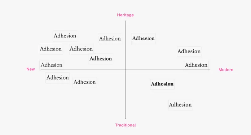
One approach to selecting the type of font you use is to practice quadrant work, a framework to help understand which fonts resonate with brands. The quadrant is labeled on each axis point with a keyword to represent a brand’s positioning (such as traditional or modern) and font examples can be placed in each quadrant to map out their font perception.
Using frameworks for perception mapping is a great exercise to truly understand the stakeholder group you’re designing for and ensure that the final font you choose accurately reflects the brand’s persona, ambitions, and needs. You can also use this framework to experiment with font pairing. You might find that you need a typeface that functions on a large scale for certain applications and a different typeface that functions on a smaller scale for mobile applications. It’s important to make sure the fonts you choose pair well together and are in line with the brand’s core values.
Utilize font libraries.
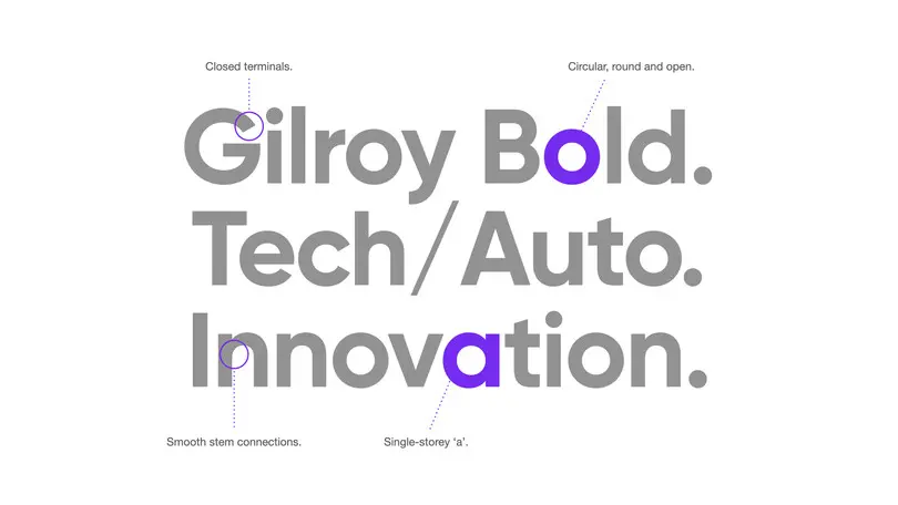
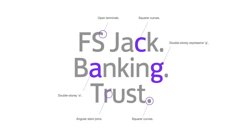
Another source of inspiration for picking a typeface is font libraries, which can easily be filtered based on brand positioning. Rather than digging through endless font options, you can curate your search by setting a few key filters to limit your options from a library of trustworthy, high-quality fonts. Sometimes less really is more. As you’re narrowing down your options, make sure you’re checking on page load time, font readability, and user accessibility to make sure your fonts will actually work where you need them to. Be warned that page load time is key – bounce rate probability increases 32% when page load time increases from 1 to 3 seconds. Your font should also be able to be read on multiple different devices without lagging. This often comes down to large file sizes or stage issues.
Quick tips:
- Preload your fonts and host them on your own server
- Check that you have the most up-to-date file format, such as WOFF2
- When possible, use variable typeface files which are also smaller than having all the weights in one family
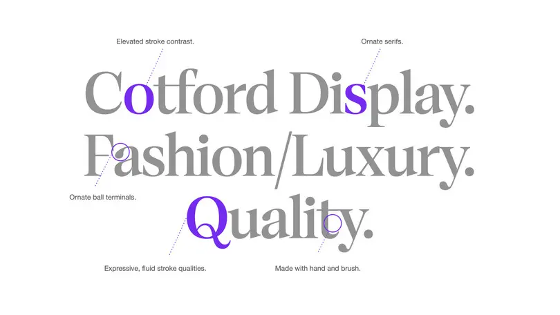
One great example of a variable typeface is Cotford, a contemporary serif from Monotype Creative Type Director Tom Foley. Created for the digital age, Cotford allows designers to adjust the typeface until they find the weight, contrast, and optical size for their project.
Tap into emotional values.
Creating an emotional connection is another avenue from which to explore font selection. The font you select has the power to resonate with consumers and can even encourage them to perceive a company logo in a more positive light. Monotype recently partnered with Danish behavioral sciences research company Neurons to study our behavioral response to fonts and found that the right font can have a 9% increase in trustworthiness and a 10% increase in memorability. Experiment with sans serif and serif fonts and see what resonates most with your target audience.
Channeling the emotional values of the brand you’re designing for can help bring awareness to the importance of emotions in typography and help you find the font that matches the brand’s long-term vision. Look at the M&Ms recent global rebrand with agency partner Jones Knowles Ritchie, which was the brand’s first custom typeface design. The typeface, All Together, accurately captures the brand’s playfulness. The custom display font will be visible across brand packaging, so it must embody the brand’s values.
Outsource your inspiration.
If you find yourself feeling stuck, look outside your design bubble. Spend time at the library, the park, or the gym – anywhere besides your desk, really, and use the outside world for inspiration. Perhaps you’ll see a font in a book that sparks a new idea or have an “aha moment” when you finally let your mind wander, like Monotype Brand Designer Marie Boulanger. She recently designed a custom set of 36 fruit stickers for each letter of the alphabet after having a spark of inspiration while on a walk.
Wherever you go, bring a notepad or your phone to document things that inspire you. Sometimes the best inspiration comes when you’re least expecting it.
Find the right type, not the perfect type.
Finding the perfect type might be elusive, but finding the right type is absolutely achievable. Rather than getting stuck in option paralysis when it comes to font selection, narrow down your options. Chances are you’ll feel much more confident in your decision if you’re picking from thousands of options rather than just five. Font libraries are an easy way to narrow your options to a trusted handful of fonts so you can choose a typeface that works for your brand.
Next time you run into a font decision, try one of the strategies above and see what works best for you. Like with all aspects of design, font choice is an evolution; as brands continue refining their identity, their needs and core values will also grow. It’s up to you to make the best decision given the information you have. As a designer, you hold the key to helping brands maintain the balance between brand persona and brand needs.


