Together Sans: The reimagining of Trussell Trust's identity.
— Phil Garnham
In a recent collaboration, OPX Studio and Monotype embarked on a transformative journey to refresh the branding of the Trussell Trust, a charity organization committed to ending hunger in the UK. This exciting project was spearheaded by David Bennet, Creative Director of OPX Studio, alongside Emilios Theofanous, Creative Type Director at Monotype, and Phil Garnham, Executive Creative Director at Monotype.
Trussell Trust’s identity.
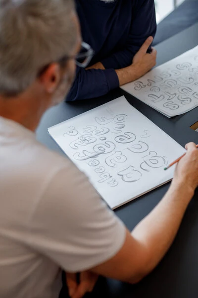
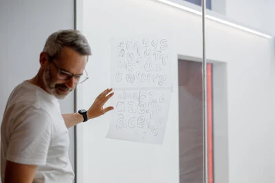
The cornerstone of the rebranding initiative was the concept of ‘Together’, encapsulated by the creation of a custom typeface named ‘Together Sans’. The development of this new visual language was a crucial element in redefining the Trussell Trust’s identity. David Bennet emphasized, “We needed a core concept, and that is where the ‘together’ came from. The ‘together’ was the hat that we held everything upon.”
Custom font and logo.
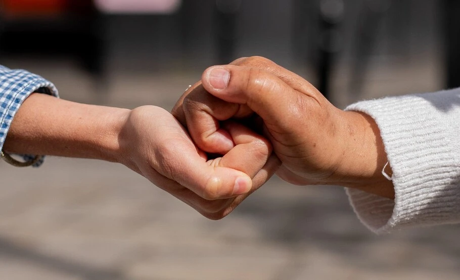
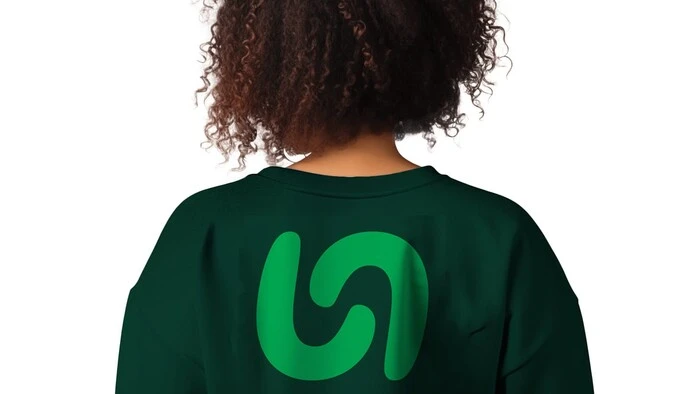
The team set out to build a typeface that was not only unique but also embodied the spirit of community and support that the Trussell Trust represents. This sense of unity was beautifully symbolized in the new logo, which features interlocking hands, representing both the ‘T’ and the ‘F’ of Trussell Foodbanks. Emilios remarked on the typeface’s design, saying, “It’s quite stable, but still quite human in a sense.”

Collaborative journey.
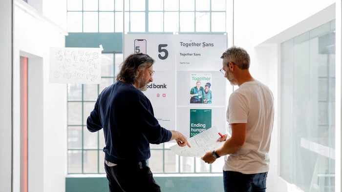
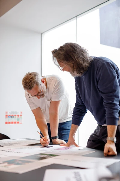
The rebranding was a testament to the power of collaboration. As David noted, the project involved every designer in the studio, working together to bring the new identity to life. This dynamic partnership was mirrored at Monotype, where Emilios and Phil led the type design efforts.
Phil described the balance achieved in the typeface design, stating, “It’s about creating something that had a sense of worthiness and just stability as a logotype.” This balance was crucial in ensuring that the new branding was both approachable and credible.


Comprehensive rebrand.
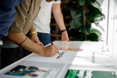
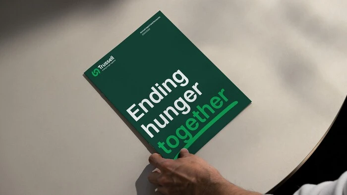
The scope of this rebranding extended beyond the creation of a new typeface. It was a comprehensive overhaul touching on everything from logos and icons to photography and color palettes. David explained the interconnected nature of these elements: “Once you’ve got it, it all links together, right? Everything is based upon the type.”
This holistic approach ensured that every piece of the brand was consistently aligned with the Trussell Trust’s mission and values. The reimagined visuals were not just about aesthetics but were designed to foster a sense of community and belonging, reinforcing the charity’s commitment to ending food insecurity.
Typography's impact.
Discussing the broader importance of typography, Phil commented on the transformative power of type, stating, “Typography can enforce an overarching visual sentiment across everything.” This project underscored how critical typography is in crafting a brand’s identity and conveying its message.
The highlight reel accompanying this post delves deeper into the nuances of this project. It features key insights and behind-the-scenes stories from the team, capturing the essence of their creative process.

— Phil Garnham
The T.
The success of the Trussell Trust’s rebrand is a vivid illustration of the magic that can be created through the art of typography. As David Bennet succinctly put it, “It’s amazing what a typeface can do.” Through thoughtful design and collaboration, Trussell Trust now has a brand that truly embodies its mission of support and togetherness.
Collaborators: Friedrich Althausen, Phil Garnham, and Emilios Theofanous
Photo Credit: Sam Bush Photography
FAQs

Friedrich Althausen.
—Type Designer
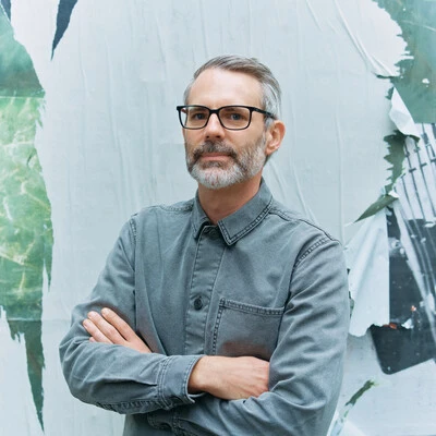
Emilios Theofanous.
—Creative Type Director.
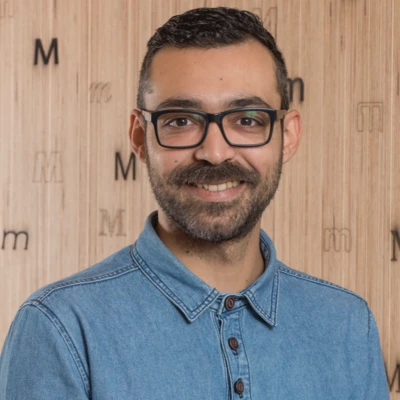
Phil Garnham.
—Executive Creative Director.


