The challenging game of designing for sports.

The World Cup is here again, which means the eyes of the world are zeroed in on some of the planet’s best footballers—and their jerseys. Some of this year’s jerseys have caused a stir, with many observers questioning the legibility of the names and numbers on the back.
But while it’s easy to criticize some typographic missteps, the truth is that designing for sports is more complicated than some may think.
Wild or traditional?
With exceptions, sports fonts fall into two general categories. Sometimes teams will choose something wild in the hopes of standing out. Think: a font that looks like a lightning bolt, or that has ragged edges to evoke a savage animal, for example.
The alternative is to choose something very traditional. Think of those traditional blocky numbers on the back of so many jerseys. Octagonal shapes and simple slab serifs are easy to read, easy to see on the TV, and quite frankly easier to sew onto a jersey than curved or uneven letterforms.
“Wild” fonts may look good in a logo but can easily fall apart in real-life applications, such as a jersey. Sometimes it takes decades to find the right balance, as in the case of the National Hockey League’s Tampa Bay Lightning, who went through several jersey iterations before settling on a lasting design.
This, of course, is the general challenge of type design. How do you create interesting and unique variations without deviating too far from the traditional shapes needed for legibility? You can only alter an “R” in its design so much before it no longer looks like an “R.”
At the same time, those traditional proportions might be cumbersome in a very long player’s name. But when designed thoughtfully, perhaps slimmed down or paired with a fresh logo or contemporary font, these letterforms can look clean and modern while still evoking “sports” in all its glory.
Designing at speed
Sport is all about motion, so fonts need to be reasonably legible as they zip by on the field, ice, or on television. Back in the nineties, the New York Islanders hockey team experimented with a new design featuring names and numbers that followed a curved line. Turns out this isn’t the easiest thing to read on the back of a moving hockey jersey, and needless to say, this experiment only lasted three seasons (the fisherman-themed rebrand was unpopular in general).
And while most font considerations focus on the fan experience, speed is actually a gameplay issue. Players, coaches, and referees need to know who is involved in the play. They should be able to glance at a ‘1’ and know immediately that it’s a ‘1’ and not a ‘7,’ for example, and do so amidst the hectic, high-stakes atmosphere of a game.
Beyond the playing field
Yes, the names and numbers on player jerseys are important, but let’s not forget that major league teams and league associations are global branding powerhouses.
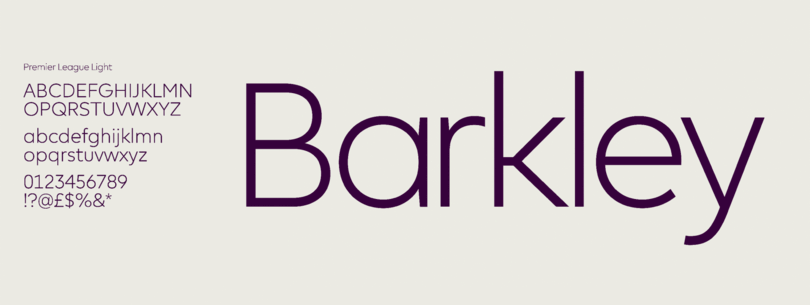
Fans all over the world watch the games, buy merchandise, and follow their favorite teams online, so the font or font system needs to transcend those myriad touchpoints. That was exactly the challenge presented when Monotype developed a new typeface for the Premier League, a truly international brand with followers in every corner of the globe.
Different weights and styles allow Premier League to use its typeface on everything from mobile apps to apparel
“We knew that it would be used a lot on TV and mobile, so it was essential that numbers be different and distinct,” says Monotype’s Toshi Omagari, who developed the font.
Premier Sans needed to be a workhorse that could cross every touchpoint—TV, broadcast, print, website, apps, and everything in the grounds. And not only did the typeface need to be able to work at a large size, but it needed to function at a much smaller scale when used in tables, and as condensed cuts to allow for especially long player names.
In the end, as with all brands the success of a design ties back to the customer experience—in this case, on TV or online, in person at the arena or stadium, and at the sporting goods store. The right font choice means a team’s fans can wear their colors proudly, regardless of wins and losses (well, maybe not every loss).


