How custom variable fonts supercharged Boehringer’s global rebrand by Interbrand.
Dr. Julien Dolenc, Lead Corporate Brand Management & Governance, Boehringer Ingelheim
BOEHRINGER INGELHEIM, has been transforming the lives of animals and humans around the world for over a century. Last year, the German pharmaceutical company underwent a transformation of its own which included a complete rebrand spearheaded by Interbrand with Monotype as its partner in type. Here’s how custom variable fonts played a critical role in Boehringer’s metamorphosis.
Like good health, fonts are often taken for granted until they break down. Pharmaceutical companies face a unique challenge of finding fonts that maintain their brand’s look and feel across a wide range of type sizes – from macro text on billboards to micro text on medication pamphlets. For Boehringer, this was the number one font issue that they wanted to solve as a key part of their rebrand, and why the research-driven organization reached out to Monotype as a trusted expert for a reliable font solution.
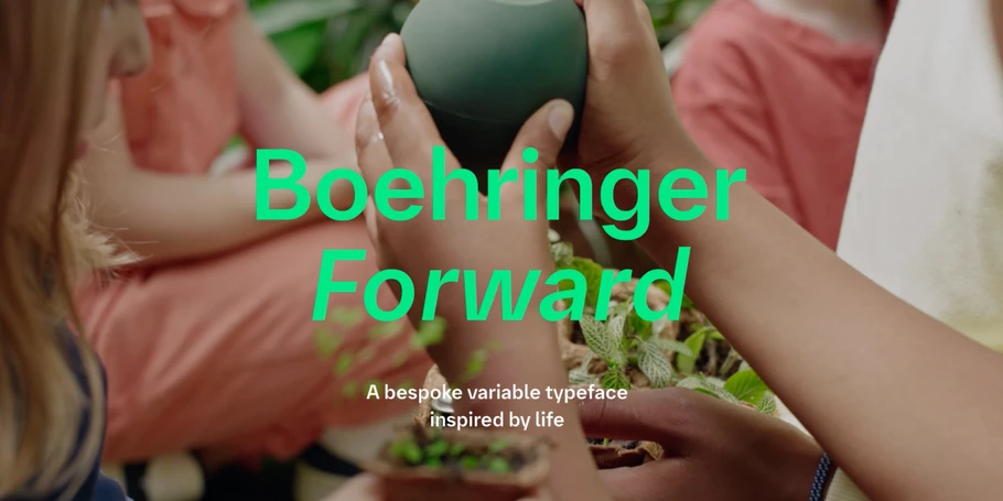
Enter Boehringer Forward, the biopharmaceutical’s newest font family. It’s custom, it’s variable and it’s comprehensive – evoking a theme of unwavering optimism across a wide range of sizes and language character sets. Its name also echoes the international brand’s first ever slogan “Life Forward”.
Dr. Julien Dolenc, Lead Corporate Brand Management & Governance, Boehringer Ingelheim
Variable fonts are vitally flexible.
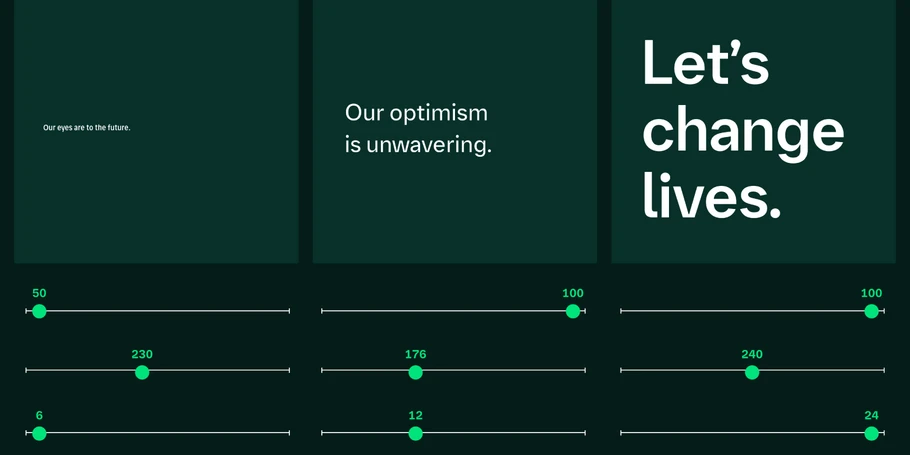
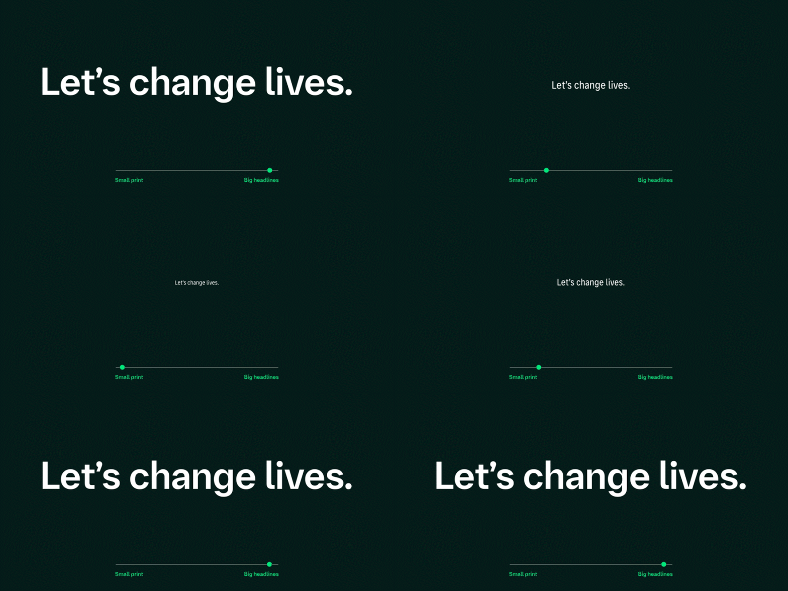
Variable fonts solve more problems that most people realize. They are relatively new, introduced in 2016 and taking off over the last few years. Variable fonts refer to the formatting of a type design into a single font file which gives the font user the flexibility to adjust size, weight and slant. The result? An easy-to-use font family that can be typeset easily, maintaining legibility even across the tiniest text.
Eva Olk of Interbrand described the experience of working with variable fonts,“like playing with a new toy.” The process alone was “freeing!” Instead of being restricted to a set list of sizes, slants and weights, variable fonts give flexibility, control and freedom to font users in a new way. On a more serious note, “It’s not only fun, but also purposeful,” added Eva. “You’re working towards improving the brand, the better it works, the more resources for innovation and improving lives.”
Overhauling a brand usually involves changing the fonts. Naturally, the bigger an organization, the more complex the transition, but despite the weight of the undertaking, it offers a real chance to boost a brand’s reliability. For a global pharmaceutical company, the risks that come with a font overhaul are heightened. Administering medication carries inherent risks, and these risks can become very real. In critical moments, the readability of life-saving advice on medication labels and pamphlets cannot be underestimated.
Emilios Theofanous, Creative Type Director, Monotype
Custom fonts need quirks that work.
Before this rebrand, Boehringer had a custom font in use, but the font family had grown outdated in style. The old font was struggling to perform uniformly across print and digital channels and, as a result, was being used inconsistently across the global organization. “The new typeface opened new doors in staying within identity system while exploring new freedoms” said Eva. The resolve to update Boehringer’s fonts for micro text evolved into a unique branding opportunity that called for a custom variable font family that would perform reliably across a wide range of languages and optical sizes. Here are a few ways in which Monotype’s experts rose to the challenge.
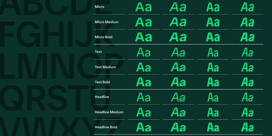
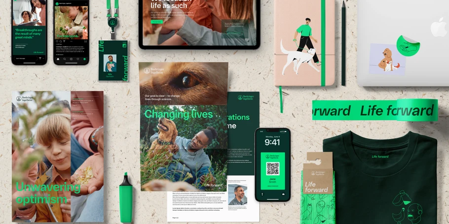
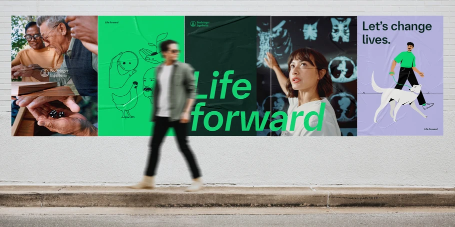
The new custom font was a key component in the rebrand – intended to be used across all touchpoints, including Boehringer’s first ever company slogan “Life Forward”. Giving a look and feel that resonates with the core branding strategy of “Unwavering Optimism”. Two words which embody the human characteristics that drive the medical industry, hope and perseverance. But how does a visual representation of these qualities translate to fonts? In this case, the result was 36 multi-language font styles compatible on online and print platforms, and across three optical sizes: Display, Text and Micro.
Dr. Julien Dolenc, Lead Corporate Brand Management & Governance, Boehringer Ingelheim
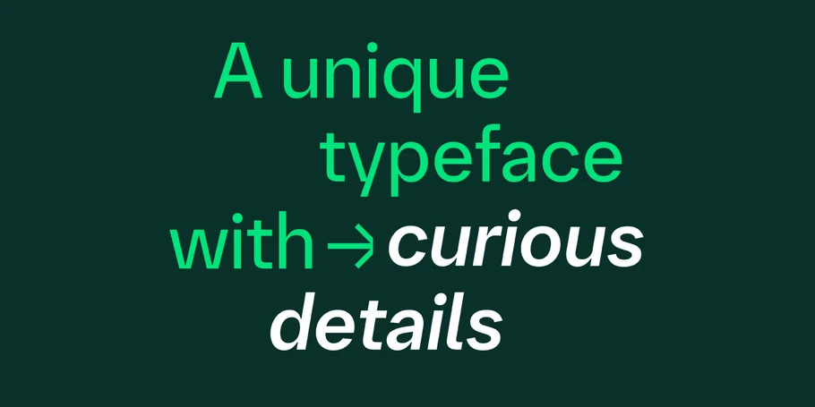
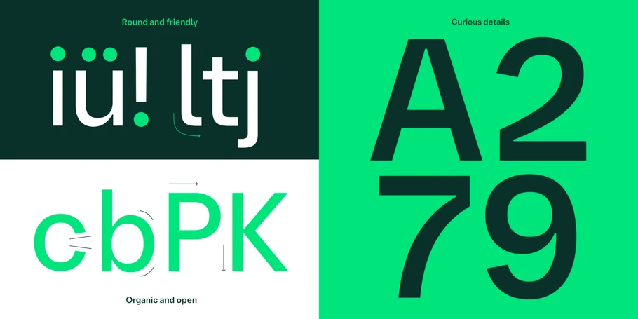
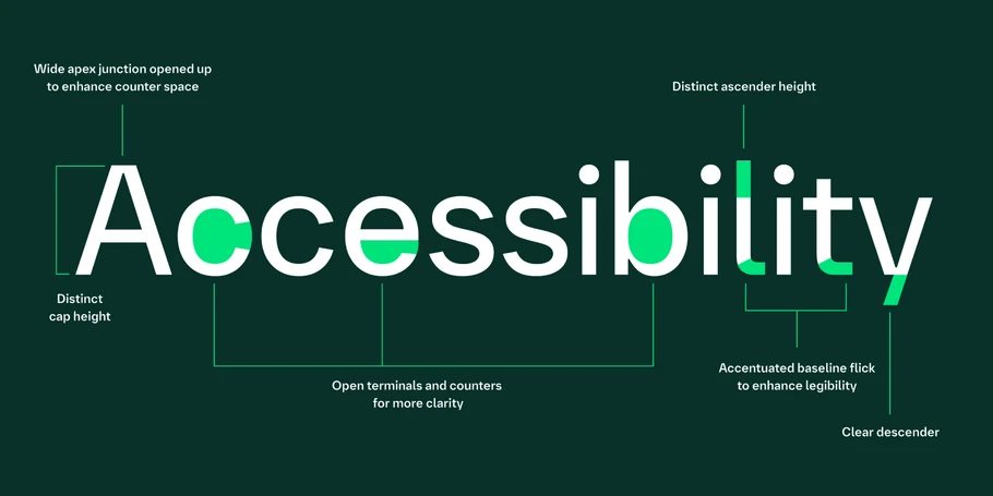
Typographically, finding significance in the smallest moments is portrayed with certain details, such as precise cuts, ink traps and curious details that evoke personality, exploration and innovation. Notice for example the uppercase A, W, B and lowercase y and l with their optimistic shaping.
Emilios Theofanous, Creative Type Director, Monotype.
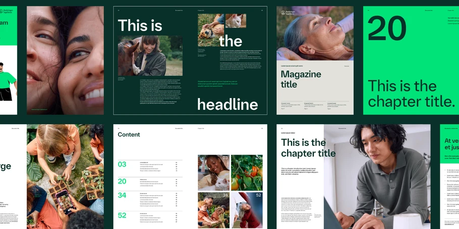
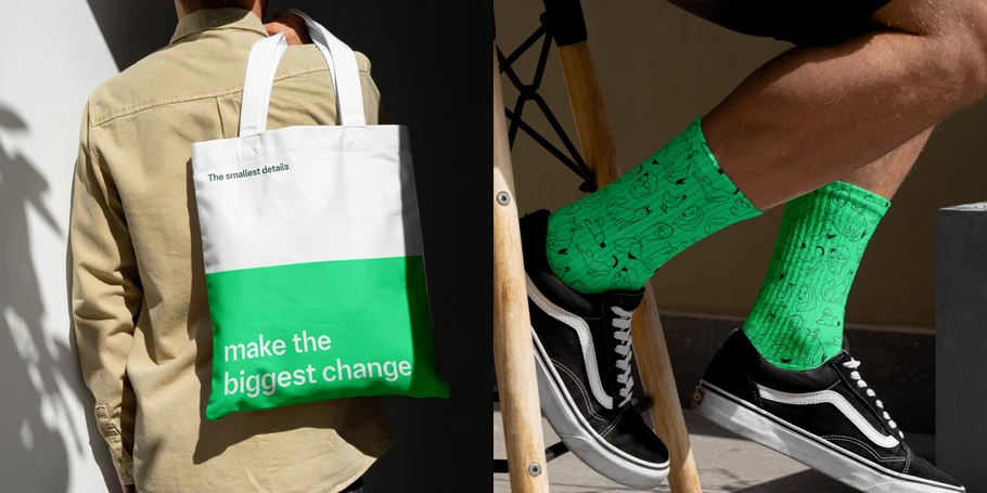
The brand new font family, “Boehringer Forward” was delivered with branding guidelines designed to be fit for a leading biopharmaceutical organization. Up close, each particularity tells a story. Stepping back, the fonts harmonise with other key visual branding elements, including colour palette, imagery and layouts.
Eva Olk, Associate Creative Director, Interbrand
Bright greens evoke optimism and contrasting with stable dark greens alludes to the partnership between science and nature. Macro photos of animals to evoke the beauty in the wild world of biopharmaceuticals. And the layouts – well, the layouts deserve their own paragraph.
Comprehensive fonts go the distance.
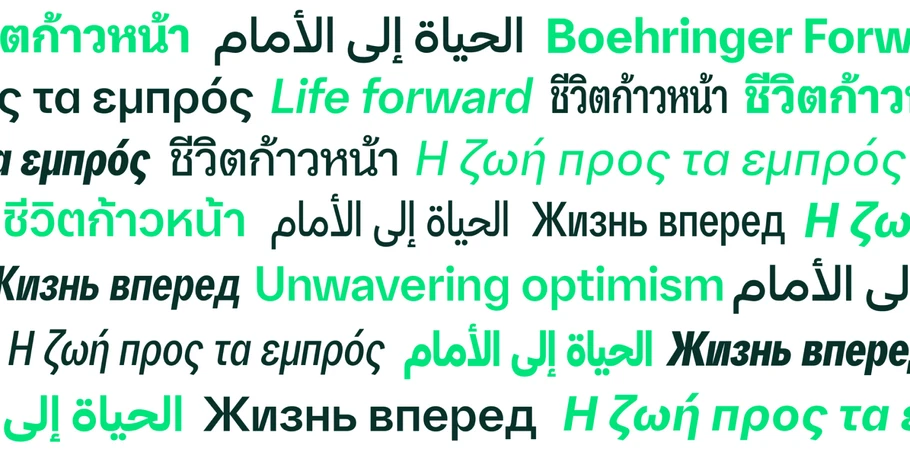
All global organizations face a common font challenge – achieving consistency in their visual voice across languages. The font family needed to have certain brand feel across character sets, consistently evoking the same tonality. While headquartered in Germany, Boehringer has an international presence, so the Monotype Studio team, with type direction from Emilios Theofanous, firstly worked with Interbrand and Boehringer to establish the design of the Latin characters.
Afterwards, Monotype’s network of type experts and creative partners helped to extend Latin alphabet letters, as well as scripts in Arabic with longtime collaborator Toshi Omagari, Greek with Parachute and Thai with Cadson Demak. This collaborative approach allowed the final product to be bullet-proofed by the expertise of specialist font designers in those particular languages. The result was a font family with rich cohesion able to overcome geopolitical branding challenges. In addition to extending Boehringer’s branding success beyond borders, the new fonts improved internal process.
For a grand organization with 53,000 employees across the globe, ensuring the fonts translated across certain languages was important but equally so was the need for the font management process to be easily adopted. “To have a great brand outside you have to have a great brand inside and be able to use and activate it.” Eva described how the transition and the end result was a simple and joyful new process.
Eva Olk, Associate Creative Director, Interbrand
The positive ripple effect of a true font solution
Certain font elements also aided in improving accessibility by keeping legibility requirements a priority from the start of the design process. For example, the little curve on the lower-case l was designed after three different testing routes to distinguish it from the capital i while fitting in aesthetically. “Designing with legibility in mind and for different visual abilities due to health and age is very important,” noted Emilios.
When brand and functionality in type work together, the result contributes to the trust built between the audience and an organization. For pharmaceutical companies that work in healthcare, readability and branding build trust so more health-product seekers look to the brand, generating more resources for them to achieve more and help more.
Dr. Julien Dolenc, Lead Corporate Brand Management & Governance, Boehringer Ingelheim
As we have seen, Boehringer’s partnership with Monotype exemplifies how custom variable fonts can solve complex typographic challenges in the pharmaceutical industry. By leveraging Monotype’s expertise, Boehringer not only enhanced its brand consistency and communication clarity but also achieved greater operational efficiency and regulatory compliance. This case study underscores the transformative impact of typography in modern branding and communication strategies.


