Australia’s Hulsbosch empowered by Monotype.
Mikey Hart, Creative Director, Hulsbosch.
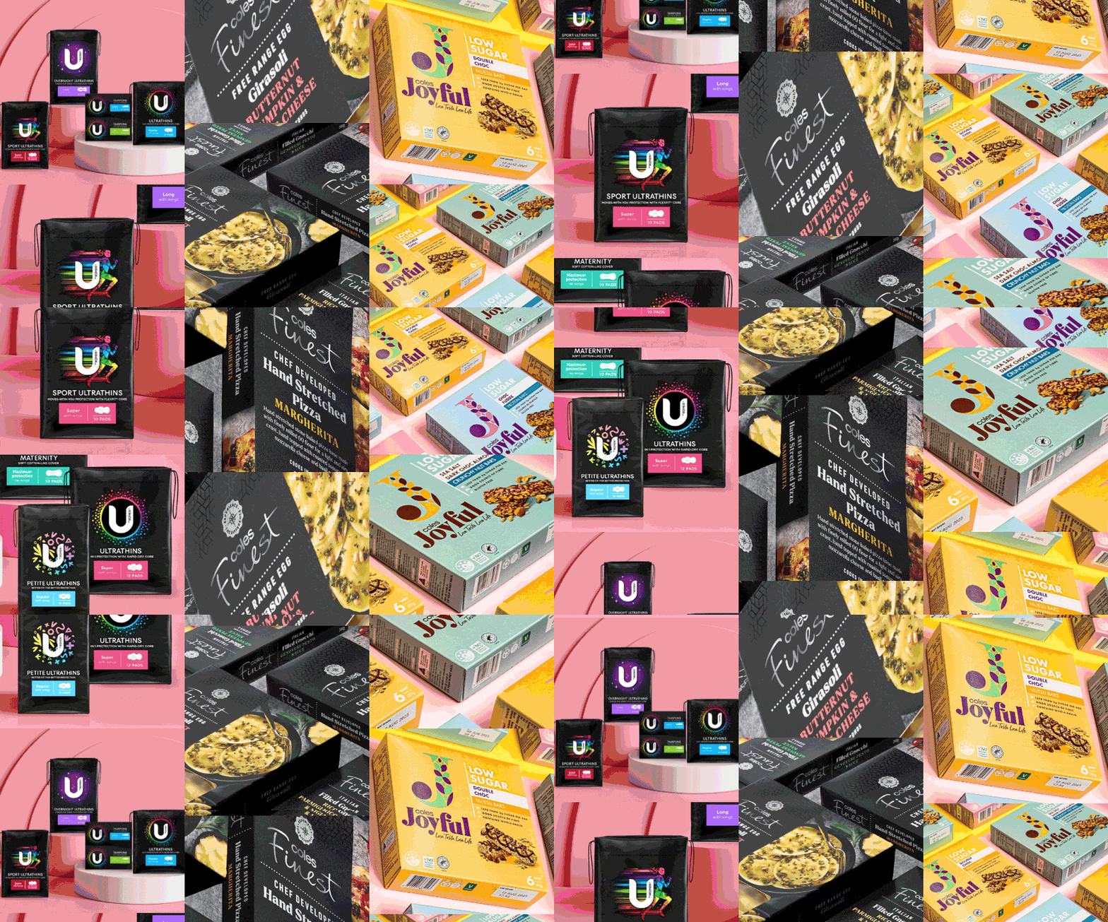
For the past forty years, Sydney-based strategic branding and design agency Hulsbosch has been delivering excellence. As the leading branding and design agency in Australia, Hulsbosch is behind some of Australia’s most iconic identities and consumer pack designs for brands like Coles, Woolworths, Kimberly-Clark, Virgin Australia, Qantas, and Tennis Australia.
They believe that a powerful brand carries meaning - not only in an aesthetic sense, but also as a system that can drive ROI for the company. The agency’s ability to consistently deliver on-point, different and innovative designs is made possible by the talented minds it employs, and equally by the tools that they use.
One such a tool is Monotype Fonts. But how exactly does it help an agency like Hulsbosch? Turns out, it’s more than just fonts. Hulsbosch Creative Director Mikey Hart told us about the ways his team is empowered with Monotype.
Expanding creative possibilities.
Clients love to see options. Hart, who has been with Hulsbosch for five years, is upfront about the fact that client presentations can, and often do, showcase typefaces that the client will need to pay to license.

This is why discovering Monotype was “kind of a bit like a Hallelujah moment for me,” Hart said. “In our concept presentations, it’s a real rich resource.”
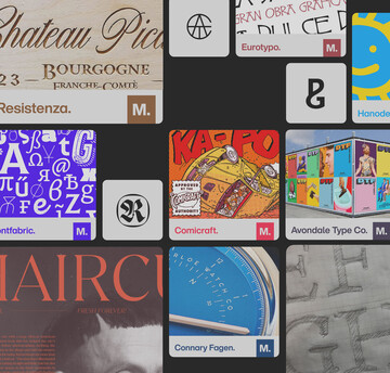
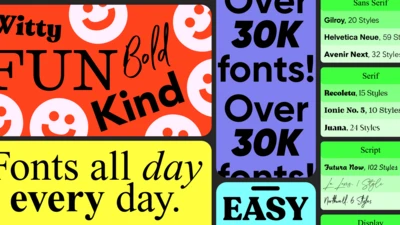
Not only does Monotype Fonts give him the ability to “try on” 150,000 fonts like a new pair of jeans, it makes life easier on the client side from a production and licensing perspective.
This vast font library brings the extra layer of design freedom that creatives like Hart embrace. “As a designer you can never have enough fonts, right?” he said.
Buying back creative time.
Ask anyone in the creative department, and they’ll surely admit it: They’d much rather spend time on ideation versus logistics or tech. After all, time is precious when you’re under deadline, and moments wasted on logistics add up.
With Monotype as a part of their workflow, Hart and his team have seen a productivity increase.
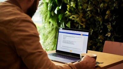
Not only does the team spend less time (and deal with fewer open tabs) trying to hunt down a font of a particular style, they also experience seamless, automatic loading of a font into their design programs.
“It’s just streamlined a lot for us,” Hart said. Every designer now has access to the Monotype font library, eliminating the hassle of back-and-forth file sharing. That extra spent time chasing down font files, sending and installing them on different machines is gone.
“The aha moment for me was when I saw a font [I liked] on Creative Market, and instead of doing what I normally do…I said, alright, I’ll give this Monotype thing a go. To my surprise, it was there.”
It’s also bought back time on the production and artwork side. “They’re not going, ‘Mikey, where’s the fonts? They feel confident and then they can go,” Hart said.
Bringing the freshest fonts in town.
As an agency leading the charge for distinctive design, working with leading brands like Coles Supermarkets, Virgin and Woolworths isn’t just a cool opportunity. It comes with a responsibility to bring best-in-class thinking to the boardroom.
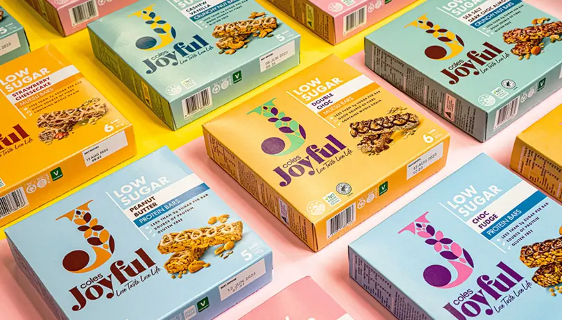
Hart and his team take that role seriously, especially as they oversee consumer packaged goods. From creating the international award winning skincare brand, KOi to the naming, logo and pack design of dog food brand Woofin’ Good!, to the food and beverage industry - he and his team handle customer-facing brands that rely on typeface to create the right impression.
“When you’re working with consumer brands, you really do need to reflect the personality of the brand, and the font is a great way of doing that,” Hart said.
But just like styles on the runway or the latest TikTok dance, typeface trends come and go, sometimes in a matter of months. Bringing the best to their clients means having their finger on the pulse of what’s popular and distinctive, while also creating identities that have staying power.
He brings up a recent—albeit confidential—example of a client project that came to life with an eclectic font. “I don’t think we would have found it if we didn’t have Monotype.”


