


字体设计术语和定义。
术语定义 A-Z。")
Fonts for good—a project to reimagine the crumbling signs around Soho into a collection of fonts to raise money for London’s homeless by Fontsmith (now part of Monotype Studio) and M&C Saatchi.
The world’s first variable font logo for WPP.
In an innovative and dynamic approach to the new Variable font format, Fontsmith (now part of the Monotype Studio) and Dutch branding agency VBAT created a responsive logo font for Amsterdam’s new WPP campus — a logo which changes according to interaction and time, as people move throughout the space so do its letterforms.
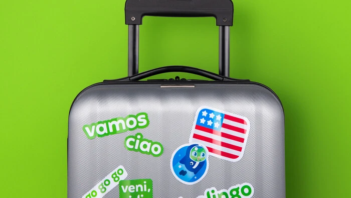
A distinct custom font (with wings) for Duolingo.
Taking inspiration from Duolingo’s iconic owl mascot ‘Duo’, agency Johnson Banks had begun to explore how the shapes inherent in the mascot’s design could influence the typography. Together we began to look at how to incorporate the shape and spirit of an owl’s wing into a unique custom font.
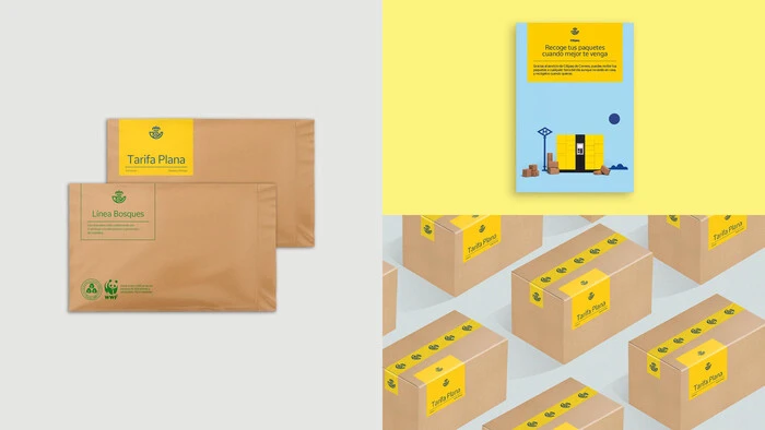
Correos, national postal service, is a brand of more than 350 years. Together with branding agency, Summa, we designed a new font exclusively for Correos, named Cartero (Postman) in honour of the emblematic professionals that has shaped the company since its early days.
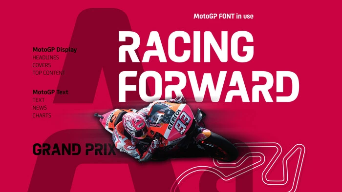
New custom type family for MotoGP™, the biggest motorcycle road racing competition in the world.
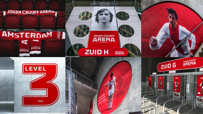
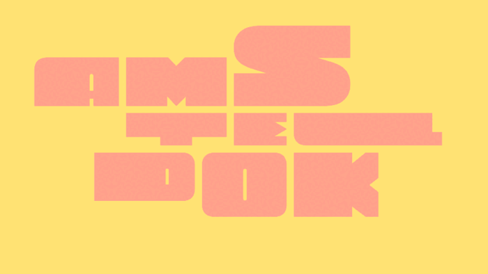
A custom typeface for the Johan Cruijff Arena in Amsterdam and a logotype to symbolise ‘The Home of Legends’.
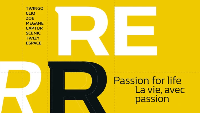
Two custom typefaces for Renault: a unique semi-serif, and a bold italic caps-only custom face.

赫斯特媒体旗下拥有数十家标志性的报纸和杂志。了解Monotype通过提供更多的设计灵活性和自由度,如何帮助他们发展以满足不断增长的数字受众的需求。
。")
Inspired by history. Created for contemporary design.
Macklin is inspired by the era when type leapt off the pages of books and onto large-scale posters and advertisements. With a distinct twist on its typographic predecessor, Macklin’s sharp yet elegant forms push the superfamily to a place that’s more suited to contemporary use and modern design. Macklin comprises 4 sub families and 54 fonts with 9 weights from hairline to black, offering a broad palette for visual expression.


在增强现实(AR)与虚拟现实(VR)中排印文本面临着新的设计挑战,这些挑战几乎与其他任何现有的媒介截然不同。Monotype 字体团队筛选了可辨识度高、风格多样的字体,为 AR 及 VR 游戏、应用程序或者用户界面提供了可信赖的选择。