Renault.
Two custom typefaces for Renault: a unique semi-serif, and a bold italic caps-only custom face.
Two custom typefaces for Renault: a unique semi-serif, and a bold italic caps-only custom face.
Designers
Brief.
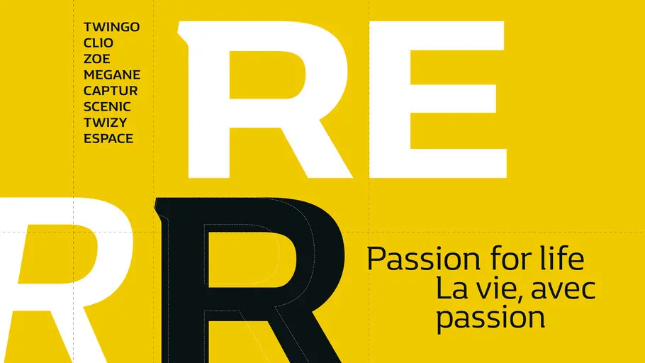
Renault cars have changed massively since the marque was introduced in 1899 – from the iconic 2CV, Fregate and Floride to the more recent Clio, Espace and Scenic. The brand has always stood for a blend of heritage and innovation, and our job was to capture this in a new typeface. A Brandfont that retained the legacy of the logotype, but also felt contemporary and forward thinking.
Approach.
Collaborating with the team at Interbrand, we wanted to create something that captured Renault’s heritage yet felt forward looking, vibrant and human.
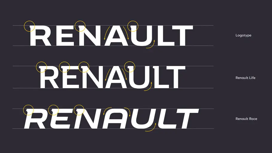
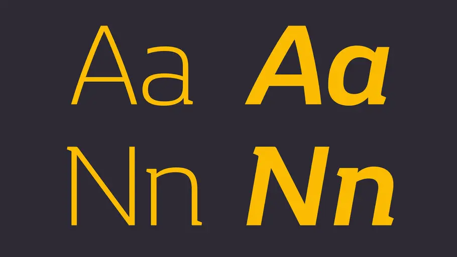
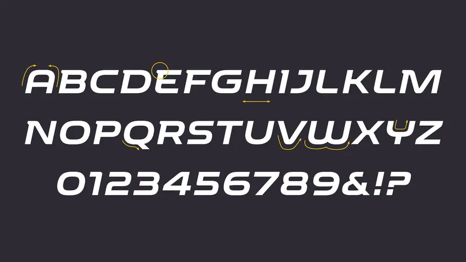
FS Hackney was chosen as the skeleton font – a starting point for us to strip back and rebuild. We began working on different variations by adding layer upon layer of detail until we had created something that felt uniquely Renault. Dynamic semi-serifs were added to create synergy with the logotype alongside squarer lower curves in the letterforms.
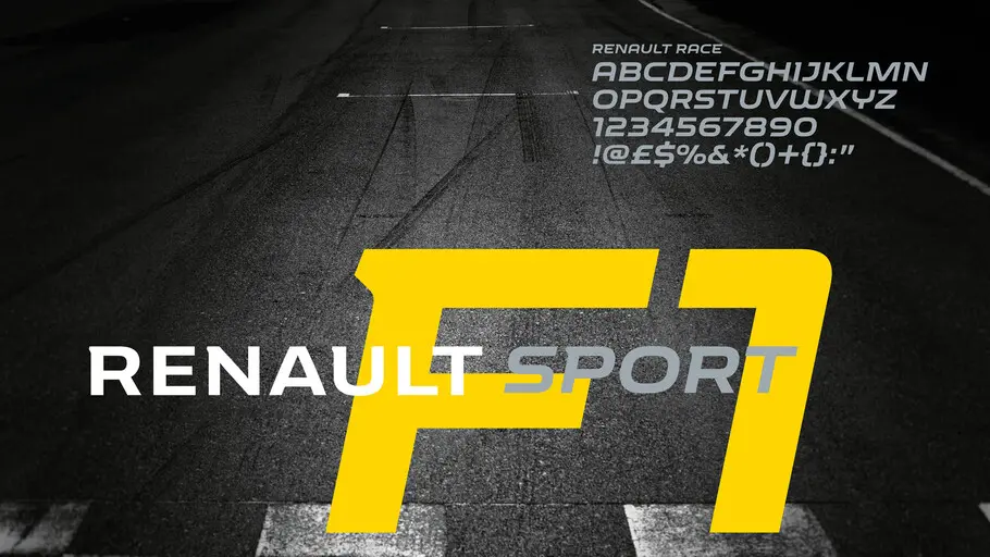
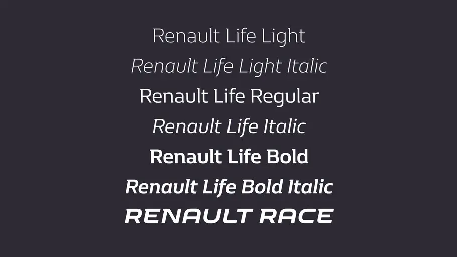
We also created a custom font for Renault Sport, the performance car division with close ties to the F1 team. Building on work that Renault had started themselves, we created the missing letters and crafted the characters to ensure consistency with the brand font and the logo. Experimentation with serifs on certain characters like the P and the R added momentum and increased consistency with the Renault Life font.
Result.
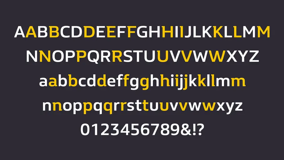
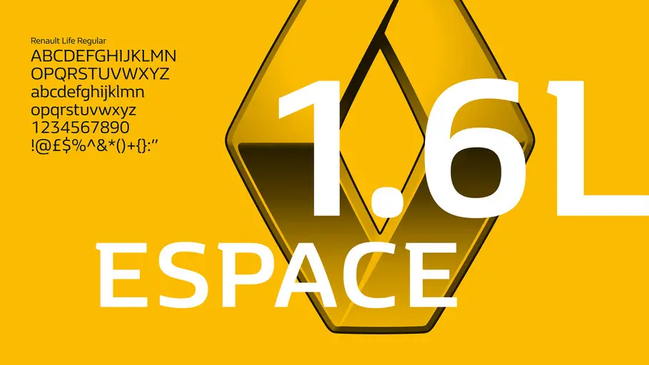
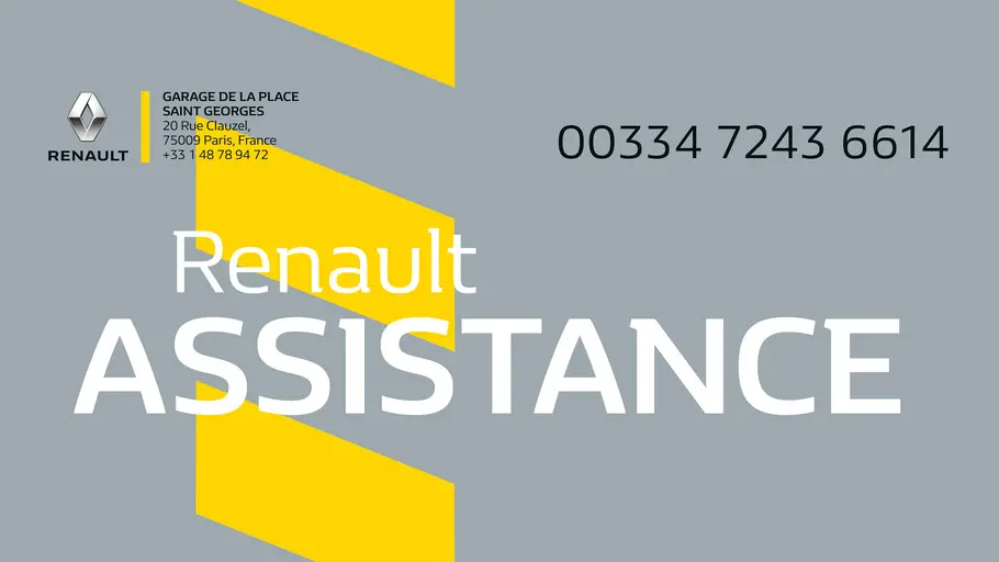
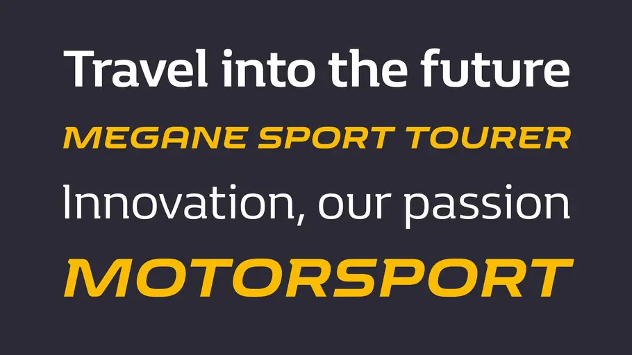
The result is two brand new fonts: a unique semi-serif called Renault Life, and a bold italic caps only custom face called Renault Race. Both typefaces sit perfectly under the Renault logo conveying a sense of precision and performance alongside a premium feel. They are being used at full speed on racing helmets, online, brochures, billboards and the cars themselves.
We could spend hours talking through the subtle tapering of certain serifs, the monolinear strokes and the robust proportions, but it’s all summed up perfectly for us in the characters, which we believe are every bit as distinctive as the cars themselves.
Learn more about the Monotype Studio.

Phil is a Creative Type Director and type designer with many years of experience in the design and engineering of fonts for global brands. Working in collaboration with design studios and global clients, Phil understands the creative and business needs of brands looking to build continuity with type.