Good Type part 9: Good type has secrets.
Much like people, typefaces are multifaceted. They can be practical and straightforward, or they can be expressive and full of contrast, depending on how they’re used. Making the most of a typeface means knowing how to unlock its secrets.
OpenType allows designers to find alternate characters, which can do everything from fundamentally changing a design’s tone of voice, to adding in just a hint of playfulness. Alternates have existed as far back as metal type, but as technology progressed and photographic techniques were developed, designers had more freedom to experiment. While the physical body of the metal created constraints, later designs could have letters that overlapped in more extreme ways – for example Herb Lubalin’s ITC Avant Garde Gothic typeface.
Ligatures are another typographic ‘secret’ that date back to physical type, when two letters, such as an ‘n’ and ‘k’ would be placed on the same piece of metal. Ampersands are perhaps one of the most often used ligatures, and their origins lie in ‘et’ - which is the Latin word for and.
“It’s not so much a time-based evolution for ampersands, it’s more like there’s been a period of constant tweaking where type designers are trying to find the right form for the ampersand to fit the voice of the letters they’re designing,” explains Monotype Director of Product Design Jamie Neely. “I think that’s partially what makes it really interesting for designers and people in general – we all love an ampersand. They can look rigid, or freeform, or fancy.”
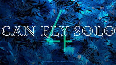
For designers wanting to embellish their letters, flourishes can add some extra detail – often transforming the typeface into something quite decorative and intricate. These are generally best used in display copy rather than running text, where they can slow down reading time.


