Meet VAG Rounded Next, a classic geometric sans serif font expanded for modern use.
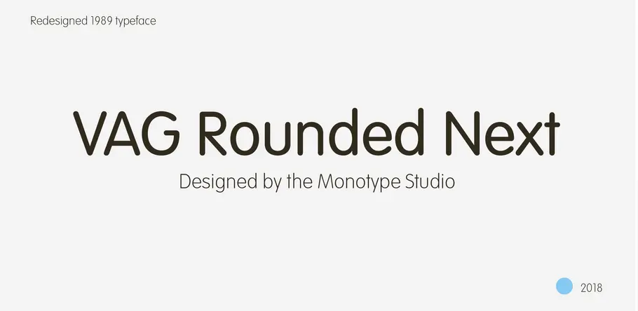
This extended version of the VAG Rounded typeface by the Monotype Studio brings the 1970s design up to date, expanding its language support and adding two new display fonts.
Although the history of this 1979 design is a little convoluted, with several designers having a hand in its creation, one thing is certain – its approachable personality and easy going shapes have never gone out of style. It was originally commissioned as the corporate typeface for Volkswagen, and remained in use by the brand until the early 90s. Other companies that would later go on to adopt the typeface, once in the public domain, include Skype and Myspace – which have both used the design in their logos – and Apple, which put it on the keyboard of its iBooks and PowerBooks.
VAG Rounded Next’s lighter weights work especially well in text, particularly in situations where companies need to convey key information, but with a softer tone of voice.
“When you look at the Volkswagen Beetle it has these curves that are timeless and legendary,” says Steve Matteson, who led the creation of VAG Rounded Next. “I think that’s what stands out in this design – that friendly aesthetic, and the simple line and circle.”
“It’s geometric, so it has that sense of friendliness like a school bus, and that quirky familiarity,” he adds. “It also has an industrial look to it, because of how it’s constructed, but it doesn’t have the edginess of something like DIN which is more mechanical. VAG Rounded has a much more elementary school playfulness to it. I think that informality is hard to find in a lot of typefaces.”
However despite its outgoing personality, the original VAG Rounded offered just four weights – leaving the possibilities for this geometric sans serif somewhat limited. VAG Rounded Next tackles this lack of versatility, keeping the same familiar tone of voice and distinctive rounded terminals but with a number of extra options for designers working on more demanding projects.
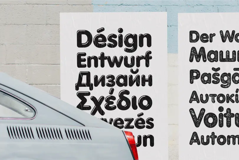
This new version contains over 700 glyphs with pan European language support, including Greek and Cyrillic, as well as OpenType features such as stylistic alternates, ligatures, fractions and localised forms. It opens the typeface up for all the graphic designers that know it and love it for its warm personality, but need to tick a few more boxes with their choice of typeface.
“People expect pencil thin shapes in their light designs now, so we made a weight that’s truly light, and a bold that’s quite a bit bolder than the original,” explains Steve Matteson. “The shapes are quirky and retain all of the flavour of VAG Rounded.”
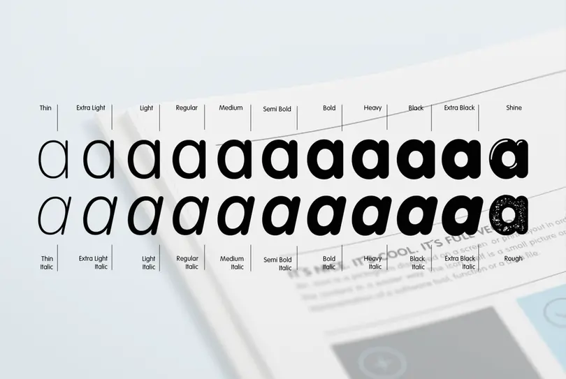
In addition to its extended set of light and dark versions, VAG Rounded Next also offers two extra display weights – Shine and Rough.
VAG Rounded Next’s lighter weights work especially well in text, particularly in situations where companies need to convey key information, but with a softer tone of voice – Matteson suggests its refined appearance would work well on packaging. Its heavier weights amp up the design’s personality, offering instantaneous impact and working as a powerful counterpart to the lighter versions.
In addition to its extended set of light and dark versions, VAG Rounded Next also offers two extra display weights – Shine and Rough. Both offer a slightly different take on VAG Rounded’s amiable nature, with highlight weight Shine creating a “chocolate popsicle” effect, and the “rusty” textured Rough recreating the appearance of rubber stamps.
Both are designed with branding in mind, and lend themselves to a wide range of uses – packaging, logos, and even being stamped into products.
Get the VAG Rounded Next fonts
VAG Rounded Next by the Monotype Studio is included in the Mosaic font service.


