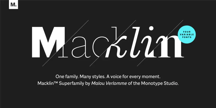
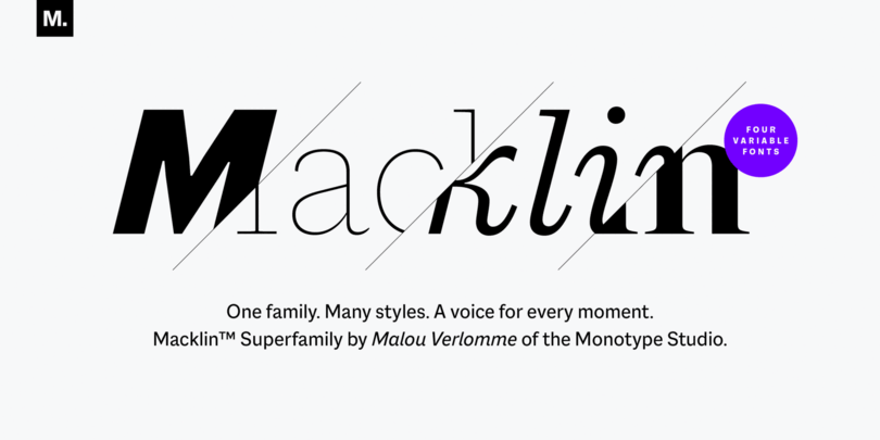
One family. Many styles. A voice for every moment. Meet Macklin.
Malou Verlomme’s Macklin superfamily is a gently irreverent take on the display type of the late 19th century, with an elegant twist that updates these letterforms for modern use. Choose one style, or use the entire variable family as a type toolbox.
One look at Macklin and it’s easy to imagine its sharp yet elegant forms being used in branding, whether in a corporate identity system or for more expressive environments such as packaging and editorial. Its refined appearance would work well for luxury or beauty brands, as well as the publishing world. Designers working with the text style will also note the crisp texture it brings to long copy, thanks to the design’s high contrast.
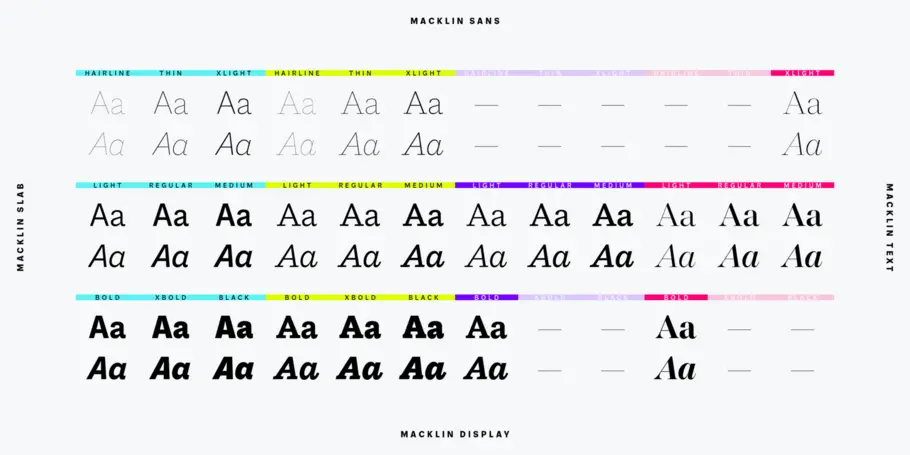
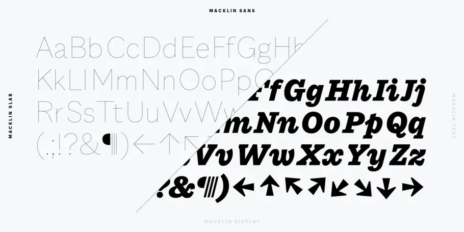
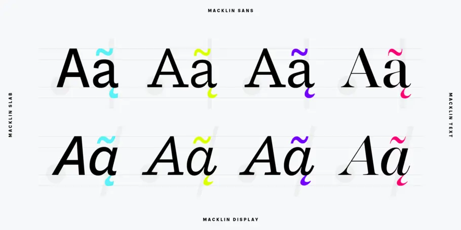
Macklin also offers a broad palette for expression. Styles that would have been treated separately in the past are brought together in one family, letting designers use them as a single system. This includes a sans, slab, text and display, covering 54 different fonts in total. And because they’re designed with the same underlying skeleton, they pair together seamlessly, allowing users to get creative with contrast and expression without worrying about awkward pairings.
Macklin was inspired by the work of British typographer Vincent Figgins - who might not be familiar for those outside the world of type, but played a key role in the evolution of typography in the late 19th century. He’s responsible for developing several type styles that emerged during that pivotal period, when typography moved off the page and into the street, in the form of adverts and posters.
Previously, typefaces had been largely constrained to books, but the arrival of advertising meant businesses were clamoring for typefaces that could grab the attention of passersby and help sell their wares. As Macklin designer Malou Verlomme explains it: “Suddenly typefaces became something that had to scream and shout.”
Verlomme delved deep into Figgins’ work while researching Macklin, blowing the dust off of drawings that date back over a hundred years. However this typeface is explicitly not a historic revival. Macklin pays respect to Figgins, but puts a distinct twist on its typographic predecessor, pushing the family to a place that’s more suited to contemporary use.
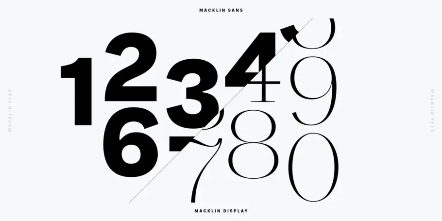
“It’s rooted in this era, but I’ve taken some of the older rusty bits and made it into something completely new,” explains Verlomme. “It’s respectful, with a touch of defiance.” Designers looking for the purest representation of Figgins’ typographic flavor will find it in the family’s punchy set of numbers, which really bring out the underlying elegance of Verlomme’s design.
“Macklin captures that moment between the very straightforward printing faces and the boom of advertising and the industrial era,” says Monotype Senior Director, Creative, James Fooks-Bale. “But it’s not a revival or a classic. It’s got the Malou twist on what modernity is now.”