The Monotype Studio talks football: Our favorite logos and wordmarks through the years
Charles Nix.
The National Football League has a long history of memorable logo design. We asked the Monotype Studio team to share their favorites, both contemporary and from childhood.
NFL logo design has changed quite a bit over the decades, from the colorful and sometimes cartoonish designs of the early NFL to the modern, crisp looks of today. Whether you watch football or not, many of these designs are entrenched in the public consciousness. Classic logos for the Eagles, Cowboys, and Patriots, for example, have become part of their region’s identity, reflecting both the attitude and aesthetics of a city or state. They can also speak to a specific place and time, embedded in the shared memory of stunning victory or heartbreaking defeat.
We asked the Monotype Studio team to share their favorite NFL logos and wordmarks, either current or from childhood. Here’s what they had to say.
Tom Rickner, Director, Monotype Studio Design
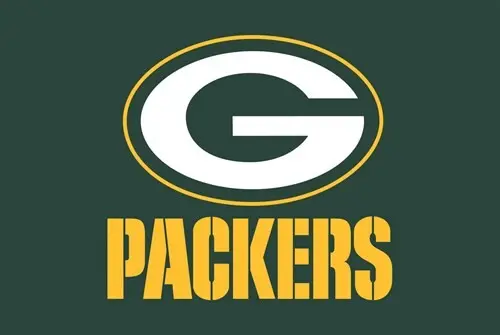
When it comes to consistency of branding, no one in the NFL can top the Green Bay Packers. They have the longest running and the most typographically simplistic logo since the introduction of their unmistakable “G” in 1961. This kind of consistency and respect for their heritage could have something to do with them still having won the most National Championships in the league!
Charles Nix, Type Director
Typography had everything to do with my becoming a lifelong Cincinnati Bengals fan.
It was 1974, during one of the two annual meetings of the Browns and Bengals. My dad, uncles, and my grandfather were coaching the game from the comfort of their chairs via the grainy black-and-white television parked next to the fireplace in my grandparents’ living room. My boyhood northeast Ohio was rife with Browns and Steelers fans, but when my dad asked me who I was rooting for, I said, “The ones with the type on their helmets.”
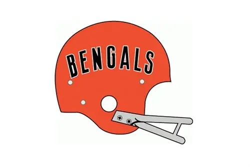
Paul Brown was the Bengals’ co-founder and first head coach. After having been unceremoniously fired from his namesake Cleveland Browns in 1963 (during a newspaper strike, no less), he resurfaced at the opposite end of the state to lead the Bengals in 1967. Their helmets were very purposely the same orange as the Cleveland Browns, but embellished with the franchise name across each side.
The all-caps type is a very sturdy, workmanlike, condensed sans—not unlike Trade Gothic Bold Condensed No. 20 or Alternate Gothic. The high waistbands on the B, E, G, and S combine with open spacing, a gentle arc, and a thin white outline to give the whole thing an optimism and flare. But it’s the provocative frankness of the visual message that I love most all these years later: “This is Paul Brown’s new team. It’s called the Bengals.”
Jim Ford, Senior Type Designer
Oakland Raiders. The classic pirate shield with Futura is so tough. This logo has barely changed since the early 60s, and it remains an image that strikes fear into its opponents.
The Raiders have always had an austere presence and a reputation as the “bad boys” of football, and I’m convinced their branding is part of the reason why. Thanks to “gangster rap” pioneers of the 1980s, this branding has been adopted on the streets as an identity. That logo sure makes a statement.
I’m not a Raiders fan myself, but I love things that stand the test of time and never fade. Futura is so discreetly used, yet iconic, it’s a tasteful whisper in this logo. The Oakland Raiders don’t need their type to shout; the combination of illustration, color and type makes their logo untouchable.
Best Color combination: Seattle Seahawks. The neon green is energetic and contemporary, almost futuristic.
Best typographic pants award: Cleveland Browns. They don’t have a symbol beyond an orange helmet, so this starkness allowed the team to experiment with bold typographic applications.
Best lockup: Philadelphia Eagles. They have a nice curved baseline lockup. Equivalent of typographic fireworks.
Classiest wordmark: Arizona Cardinals. The serif flares mimic the feather peak of the symbol. More refined than the Atlanta Falcons’ wordmark that is similar, but super square.
Logo fumble: The updated Detroit Lions wordmark in 2017. The proportions could be improved, and the severe geometry lacks optical adjustments resulting in a reversed contrast appearance. Luckily, the pouncing lion illustration is good enough to carry the identity as a whole.
Best swash capital: The Rams have a nice swash-cap R that mimics the horn curl from the logo, but the lowercase s ruins the rest of the wordmark.
Best on-field graphics: Cincinnati Bengals because of the tropical greens they add, contrasting with the orange tiger stripes.
Bill Davis, Director, Type Product Management
The Chicago Bears are a historic team in the NFL, and have a well-earned nickname as the “Monsters of the Midway.” Over the course of their 98 years, they have put Bears fans through periods of desperation and hibernation, and also given us times of domination and celebration.
One thing that has been consistent since the 1960’s is their classic wishbone-style letter “C” logo. This C decoration has stood the test of time and now sparkles in orange with a distinctive white outline. This logo has served as a beacon of pride on their dark blue helmets for all my years following the team.
The “BEARS” wordmark compliments the C logo, and along with the bear’s head image appear on all kinds of Bears merchandise and clothing. It famously appeared on the sweater vest worn by Mike Ditka when the “da Bears” won Super Bowl XX. The typeface used for the BEARS wordmark appears to be a customized/modified design similar to Filmotype Ford or Antique Olive Nord. This font is bold, strong, loud and resilient – much like the Bears franchise and its fan base.
As all sports fans know, it takes tenacity to love your team through long droughts without a championship. Having a classic, long-lasting logo and wordmark are hallmarks of a team that believes that next year… is our year!
Team logo images from sportslogos.net.


