Creative Characters Ep. 14: Landland.
-Dan Black, Landland.
On Creative Characters, we meet the people and personalities behind the brands, campaigns, and designs we love. You can listen to the podcast on Apple, Spotify, Google Podcasts, and wherever quality podcasts are available.
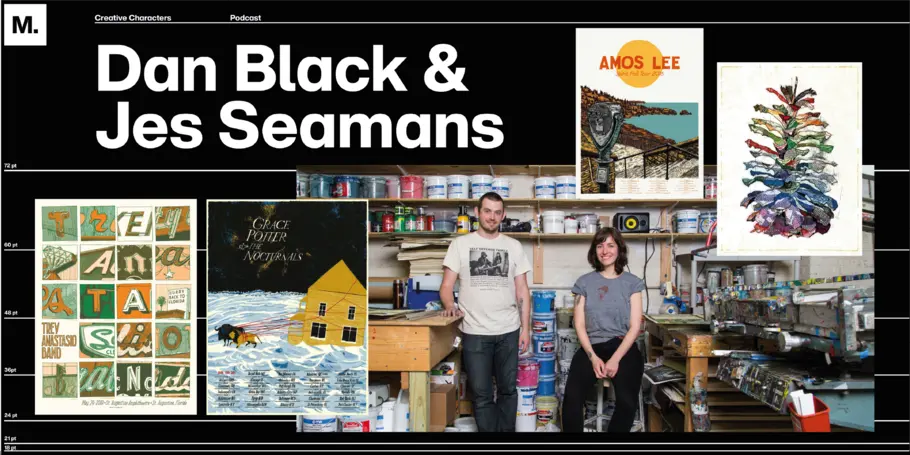
This week, Creative Characters travels far into the upper Midwest to talk with Jes Seamans (IG: _jseamans) and Dan Black, who together comprise the small but mighty print and design studio Landland (IG: @landlandcolportage). In addition to her work with Landland, Jes is also a member of the THE VACVVM (IG: thevacvvm), an artist’s group co-founded by Aaron Horkey and Mitch Putnam.
Landland primarily designs and prints posters for bands and musicians—in addition to art prints—with a range of clients including smaller indie acts like American Football, Jeremy Enigk, and Amos Lee alongside global names like Childish Gambino and Foo Fighters. But even as their business has grown and attracted those bigger names, Jes and Dan remain very connected, both in mindset and practice, to their DIY roots.
“When I moved to Minnesota in fourth, fifth grade or so, I had a cousin who was a bit older and he was into bands,” Dan says. “So I went straight from zero music to receiving constant invitations, as a small child, to [for example] some closed-down department store where punk bands are going to play. It was incredibly addictive to see a community in a small town make a thing that was fun and very, very cool. It completely did a number on me cause now my mindset is that anything I can imagine happening, there’s a route for it.”
Jes found her way to art through music as well. “I was in a band that played a lot of shows and toured and I thought, I also love to draw so why not? So that’s how these two things came together and how I started making posters. It was a way I could combine the two things I was doing, and I saw it as a way that I could contribute to the band because I couldn’t drive a car then so I couldn’t drive on any of our tours!”


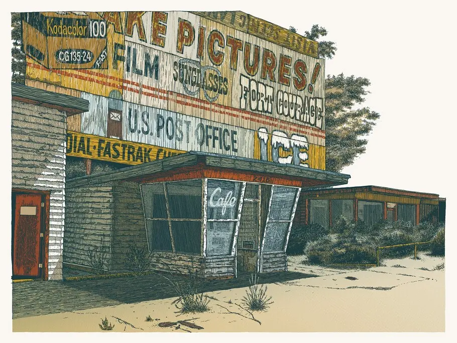


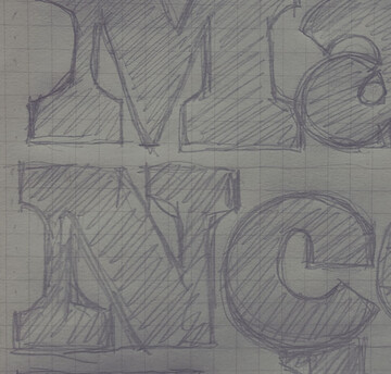
You know a Landland print when you see it—the combination of linework, color, and especially lettering is truly unique and lends incredible depth and detail to the work. For the lettering, in particular, Dan draws inspiration from roadside gas stations, neon signage, and other “junk fortresses” he encounters on road trips throughout the country. A lot of Landland’s aesthetic centers around those forgotten corners of society, the abandoned gas stations, rest stops, and other relics of lived lives
All of this comes together in a screenprinting process that has evolved over time to combine Jes’ delicate watercolors and Dan’s intricate linework. “Screen printing it, it just beats problem-solving into you,” Black says, deftly summarizing his and Jes’ years of test prints, “flukes,” and other assorted humbling experiences. “There’s always something that like makes you feel like you suck at it really bad. But [we’ve] been doing this long enough that all the lower-level problems are pretty diagnosable. Now we’re just onto the bigger scale ones.”
Listen to the episode:

Creative Characters Ep. 12: James Edmondson.
In our twelfth episode, Creative Type Director Charles Nix speaks with James Edmondson, founder of OH no Type Company in California. James shares how he got his start in typography, as well as his perspective on designing a fulfilling creative career.

Creative Characters Ep. 11: Lauren Hom.
In episode 11, Monotype’s Jay Loo interviews Lauren Hom, celebrated designer and hand-lettering artist. The two discuss how to build a creative career, and Lauren shares a new passion she is preparing to pursue.

Creative Characters Ep. 9: Angelina Lippert, Posterhouse.
Creative Type Director Charles Nix talks with Angelina Lippert, Chief Curator at the Posterhouse museum in New York City, about the history of poster design, the unseen hands behind some of the more iconic posters from history, and the finicky wonder of Rubylith.