


CaseCo: A Case for Variable Fonts.

Variable fonts have been around for a few years now and are very well supported. But how much do we know about all the ways they can benefit a brand and its audience? We’ll take a look at how CaseCo, an admittedly fictitious company, has incorporated them throughout their brand identity and web experience: from brand voice and fidelity, to more expressive typographic choices, to being more accessible to more people across more devices — and even some benefits for website engineering and infrastructure teams. Even if only one or two of these use cases make sense for your work — variable fonts are ready to make a huge impact for your organization.

Let’s clear the air
When it comes to typography on the web, there is a lot of different advice about how many fonts make for ‘good typography’ in a user experience. Often it’s defined as best to use only two or three fonts — with the reasons given of consistency and page loading speed. But this conflates the idea of good typography with web performance, and is directed squarely at folks often with little or no formal training in typographic design. This false equivalency has been promoted for years, to the detriment of brand expression, readability, and the overall homogenization of our collective experience on the web.
But since type is the voice of our brand — and our words — that definition is woefully lacking. ‘Good typography’ isn’t about only using two or three fonts — it’s about using the correct font in the appropriate weight at the right size. The necessary variety of fonts to convey voice, maintain legibility, and create the hierarchy necessary to impart the spirit of the brand and the contents of the message. The 400 ‘normal’ weight may be great for body text set at 16 pixels, but the default for bold (700) may be perfect for larger headings, but a touch too heavy at body copy size. And pull quotes might be perfect when set larger in an even lighter weight. So right away that’s at least 4 weights — potentially with an even heavier one for display use on the ‘hero’ element on the home page. And all of that might be just a bit off when set in reverse contrast.
Good typography isn’t a number of fonts; it’s about the correct font in the appropriate weight at the right size to convey your message and brand
Yet we cannot forget that page loading speed plays a critical part in user experience on the web. After all, performance is the first aspect of design that a user will encounter. It doesn’t matter how beautiful the layout or typography if it never shows up on the screen. This is where variable fonts can really shine: giving designers access to the full range of weights in a single file download. The file size tradeoff is typically balanced out with 3 or 4 static weights, which can finally put that bad advice out to pasture. You can read more about the evolution of typography with variable fonts on Monotype.com.
Our cast of characters
For our example company, the brand design centers around the use of two typefaces, both of which are available in static and variable formats: The Cotford™ font software (the static version) has both Text and Display options in a range of weights in both upright and italic. The Cotford™ Variable font software has weight and optical size axes in both upright and italic variants, handling the job of 17 individual font files with only 2 variable ones. The Neue Frutiger® font software in static form is comprised of 43 fonts in an impressive range of weights, with a condensed range as well — all of which are available in both upright and italic. The Neue Frutiger® Variable font software accomplishes all of this in only two files — making for a tremendously dynamic and useful addition to our typographic system.
Brand voice and vocal range
Even today — over a decade since embedded web fonts became widely supported — there are countless examples of organizations still recommending ‘web safe’ fonts like Arial® or Georgia® in their brand guidelines. Still more are relying upon substitute fonts on their websites rather than their core brand typographic choices. This can be for many reasons, such as licensing costs or restrictions, and is further complicated by performance constraints mentioned above that limit the use of fonts to a very small number. But in an ever-more-competitive consumer landscape, maintaining a strong brand identity is a crucial differentiator. Variable versions of core brand typefaces enable use of those typefaces across a wider range of weight, width, optical size, and more. Loading a single variable font allows use of its entire range, so designers can tailor font weight with font size for better legibility — or embrace an optical size axis for more tailored and expressive headlines without compromising body text readability.
Design System Typography and Dynamic Range
Most organizations have moved to embrace Design Systems for their digital design efforts. Design Systems are the extension and interpretation of Brand Guidelines for use in web and mobile app design. Beyond the basics of color usage and typographic hierarchy, the most mature design systems take device size and context of use into consideration to deliver the best reading comfort, editorial expressiveness, and adaptability for data-dense display needs.
Reading comfort
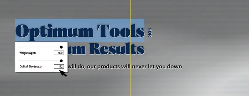
The best typography for reading is going to be impacted by device size and context of use. Beyond the basics of font size, line height, and line length (the classic triad in designing a good paragraph) — there are new contexts of use such as supporting light and dark mode (think: contrast inversion). A small difference in font weight when moving from dark text on a light background to light text on a dark background can do wonders to maintain good legibility in these scenarios (we’ll talk more about that in a bit). Even deciding ‘how bold is bold’ can benefit from some nuance: It may be that a weight of 700 is great when setting bolder headlines, but may close up apertures and bowls too much when bolding text inline within body copy. There a weight of 625 or 650 may work better. It’s even worth considering setting body copy at 95% width on the smallest screen devices in order to balance readability with better line wrapping.
The top line has the bold text set at 700, the bottom line bold is 620. It still shows emphasis without getting ‘muddy’ in the details

Data-dense displays & enterprise applications
Some applications just need to display a lot of text or data. Think sports statistics, data tables, or complex form-based customer service applications. In scenarios like these it is often advantageous to make more use of the whole screen to create more efficient workflows. Having a width axis can tailor typography to display more data without legibility compromise — even allowing the preservation of a bit more space between elements to maintain hierarchy and separation.
Text on the left is set to 75% width, with 100% width on the right
Editorial flair
‘Typographic moments’ like large image-and-type banners and landing pages often require tailoring the typography to the message. Having the entire dynamic range of axes made available within a Content Management System (CMS) editor interface allows design decisions to be made specific to that piece of content and context, without requiring more font assets to be loaded. This kind of content-specific design flexibility can be paired with system-level decisions like applying styled initial letters or lines for specific kinds of pages. With Cotford Variable’s weight and optical size axes, amplifying the editorial feel is a quick task. Add some supporting utility styles available through the text editor and effects like vertically set text is just as easy.
Our hero, with a bit more editorial typographic flair

Content management flexibility
Let’s take that last point further when talking about editorial flair. Let’s explore building typesetting capabilities right into the CMS. Traditional publishing workflows give designers the opportunity to tailor the design to the content, but web publishing has long pushed a single design template onto every article and post. Since utilizing variable fonts doesn’t mean loading more font files to use the full range, building typographic customization of axis settings into web publishing workflows brings true art direction and design flexibility to the company website.
Building variable font styling into Content Management Systems
Accessibility
Often relegated to an afterthought (if thought about at all), accessibility for brands’ web and app presences is crucial to ensuring all customers have inclusive and equitable access to goods and services. This is more than just good sense and good business: it’s a legal requirement that all businesses open to the public conform to ADA accessibility requirements (learn more about these accessibility guidelines on ADA.gov).
The need for inclusive online access was never more apparent than during the pandemic. But just because the pandemic has eased, that doesn’t mean the need for access has lessened. And don’t forget accessibility is about much more than screen readers: site content might be read out by a smart speaker device, highlights might show up in alerts on a watch face, or users might rely upon ‘reading mode’ capabilities built into some web browsers. All of these depend upon live text, rather than words flattened into image files.
More live text rather than images
One large organization contacted on the subject reported that nearly 50% of their iOS app users have their text size preference set to a size other than default. Nearly 25% have it set to ‘XXL’. Setting variable axes in a relative manner with calculations allows the typography to respond appropriately no matter what scale is desired by the reader. Of course this is also a cautionary tale about fixed heights of design elements, content truncation issues, and a generally frequent lack of design support for variable-length copy.
Tailored typography for light and dark mode

The same organization mentioned above found over 50% of their app users kept their device set to ‘dark mode’. It’s important to remember that beyond fads, readers have different reasons for selecting dark mode — light sensitivity among them. Respecting their preference and presenting content appropriately builds trust and demonstrates care. And it’s crucial to remember that text set in a light color on a dark background will tend to ‘gain’ and feel bolder. Using a variable axis to reduce the weight by 30 or 40 (rather than a typical whole step down of 100) will preserve the ‘color’ and legibility of the typography in those inverse-contrast scenarios.
Search engine performance (SEO)
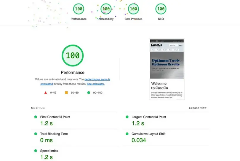
As one friend put it many years ago: ‘Google is the biggest blind reader you’ll ever meet’ — and just as text baked into images is not perceivable by non-sighted users, neither is it searchable. By utilizing ‘live’ text, layouts can be tailored dynamically to deliver on design and search readiness simultaneously. Perhaps even more compelling, mobile performance and responsiveness can carry increasing weight in search rankings. Responsive typography can plays a huge role in improving brands’ rankings in results.
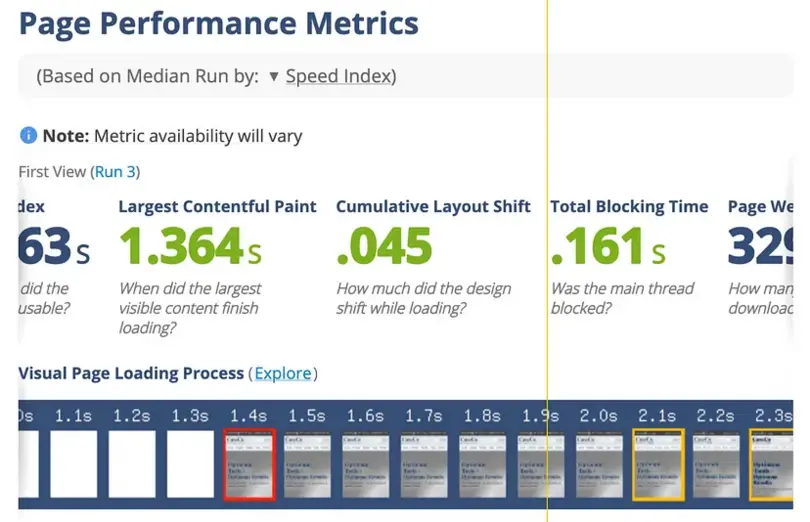
Lighthouse scores on our demo site couldn’t be better
Engineering & network performance
The larger the organization, the more likely it is there will be multiple teams working on different parts of the experience or referencing font files and design system files. Anything that can be done to reduce the number of files to manage will make a big difference and ensure future updates can be rolled out with greater efficiency. In the accompanying demo site, 4 variable font files replace a possible total of 56 individual font files. Admittedly it’s unlikely that all would be used within the design, but it is still a substantial difference.
Fewer font files, even if they’re a bit larger, can mean dramatic improvements in web performance
Reduction in network traffic and data transfer translates to real-world cost reduction
A sports streaming platform in the US converted to variable fonts and saved approximately two terabytes of data transfer per month by replacing 10 static files with 3 variable ones. Fewer files and less overall file size in aggregate can impact Content Distribution Network (CDN) usage just as much.
Our use case is not quite as dramatic, but still saves 40kb in data download per visitor. When CaseCo’s products go viral, that difference will still make a considerable impact as user sessions climb.
-
Static fonts: 13 files/371kb
-
Variable fonts: 4 files/330kb
Front-end performance (including impact on Core Web Vitals, or CWV)
Performance is the first aspect of design a user will encounter (to paraphrase Brad Frost)
Fewer assets to download means less work in the way of rendering the site in the browser. Tuning up fallback fonts can help reduce Cumulative Layout Shift (CLS, one of the main scores part of CWV), and rendering HTML text is faster than images and helps reduce Largest Contentful Paint (LCP, another main score in CWV). In our test site, when testing variable font and static font versions, First Contentful Paint (FCP) and Largest Contentful Paint (LCP) both came in at .9s for the variable font version, and 2.0s for static font version. Admittedly they’re both pretty quick, but production sites will always have a lot more going on. Ensuring that the basics of rendering content isn’t holding your site back can be the difference between a purchase and a bounce.
Faster UI rendering and animating
Fewer files to load and greater degree to which style can be driven by CSS rather than any additional JS will render and animate more smoothly. That means more system-based flexibility (using math in CSS to modulate weight and/or width). These techniques allow typography to scale and modulate relative to itself, making the system more adaptable to varying device screen sizes and requiring less processing power on the part of the viewing device. That means less battery usage overall: good for the user, and for highly-trafficked sites it may translate s into a far smaller environmental footprint.
Putting it all together
There are an increasing number of variable versions of fonts available. Strengthening brand voice delivers value that can often be hard to quantify (and therefore justify the cost/effort), but when well implemented, variable fonts can deliver on brand voice along with many other quantifiable gains for design, accessibility, SEO, CWV scores, and network data transfer costs. Making the jump from static fonts to truly dynamic typography is easier than you think — and the benefits will only become greater from here.
This blog has been written by Jason Pamental (Web typography expert, Principal Designer at Chewy)


