Consistency is the future: A recap of Brand Talks San Francisco.
According to Salesforce, 75% of consumers expect a consistent experience wherever they engage with brands, across both online and offline channels. And yet many brands are failing to deliver on that expectation.
In a recent Monotype survey of brand leaders, while “consistency” was the most highly prioritized element in a brand identity strategy, only 44% of those surveyed report maintaining consistent typography, colors, and imagery within all of their customer touchpoints.
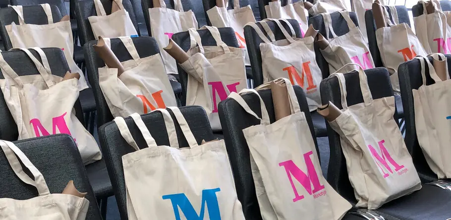
This broad disconnect represents both an enormous challenge and an opportunity for brands, and as such was the primary theme at last week’s Brand Talks event in San Francisco. The event brought together leaders in design and branding for an afternoon of networking and presentations from brands that have tackled the issue of consistency head-on.
Brett Zucker, Monotype’s Chief Marketing Officer, kicked off the day by outlining four obstacles that contribute to these inconsistencies:
- Quantity of touch points: Between social channels, mobile applications, digital ads, and traditional media, there is an ever-growing quantity of relevant touch points where consumers are interacting with brands. As the ecosystem expands, it becomes more challenging to maintain brand consistency at scale.
- Complicated technological obstacles: 25% of the brands we surveyed reported that struggling to integrate technology has eroded their ability to deliver consistent experiences.
- The change never stops: Brands need to go where their customers are, and with shoppable media, as well as emerging environments like AR/VR and voice, the pace of change isn’t slowing down.
- Rebranding is increasingly impractical: Constant change means that brands can no longer re-imagine themselves every few years. Doing so would require far too much investment in resources. Instead, they need to take a new approach.
Zucker highlighted the importance of taking a more agile approach to brand-building, one that involves co-creation with customers and implements design for today with an eye on tomorrow.
Still, this “future-proofing” can seem like a daunting task to design teams. At Monotype, we have found that a brand’s type strategy can be a good place to start the evolution.
Helvetica Now, a recent re-imagination of the world’s most iconic typeface, is an example of how design can help take an existing identity and prepare it for an ever-changing future. Charles Nix, Type Director at Monotype and one of the designers who worked on that project, shared the process behind the redesign.
For Eventbrite, type empowers consistency + independence
Eventbrite is a platform that helps creators produce live events, and makes it easy for individuals to discover and attend them. Since its inception, the stated mission of the organization has been to “bring the world together through live experiences.”
While this is a straightforward mission, it encompasses a wide variety of experiences like music, art, theater, business networking, and more. The brand needed to evolve in order to maintain a clear identity while also supporting the needs of each category it was being used to promote.
At Brand Talks, Tom Censani, Director of Product Design at Eventbrite, shared details about the company’s rebrand, including four characteristics that drove the team’s decision-making:
- Adventurous: “Infectiously bold in the pursuit of brilliance.”
- Purposeful: “Lives, works, and plays with intention and sincerity.”
- Original: “Has a finger on the pulse of culture and a fresh perspective.”
- Welcoming: “Easy to love and a delight to spend time with.”
These characteristics were top of mind when considering a new brand font. The team worked with Monotype to analyze options that would align with the brand’s personality while also working across various systems and technologies. Ultimately, Neue Plak was selected.
Of course, for type nerds like us, this part of the process is particularly interesting. But it also provided an opportunity to connect the other elements of Eventbrite’s complex brand. Neue Plak offers a range of weights and widths, which provided the freedom to adjust the mood and tone to match the type of event being offered, without sacrificing broader consistency.
“A typeface needs to represent who you are,” Censani told attendees. Neue Plak is an extension of the Eventbrite brand, and by playing with other elements like color, the team is able to maintain a unified identity while adapting for unique event categories.
For Thumbtack, type connects the full brand experience
Thumbtack is another brand that caters to a wide array of different audiences—right on its homepage, Thumbtack claims it can help you “find local professionals for pretty much anything.” With more than 500 categories of services, the brand was struggling to maintain consistency while supporting wildly different service offerings, such as dog grooming, carpentry, and massage therapy. Andrew Johnson, Design Director for Thumbtack, spoke to attendees at Brand Talks about the company’s most recent rebrand, and how typography helped the team achieve consistency while working across unique categories.
Thumbtack had a number of concerns to address when it embarked on a rebrand in 2017. For one, its existing logotype used a script font, so it couldn’t scale well. The logo also featured a push pin, not a thumbtack, a subtle miscue that was nevertheless tough to swallow for designers who worked with it each day. Finally, the team wanted an identity that would align with the brand ethos but that would also work across all channels where their customers and service providers interacted with one another.
The company worked with Instrument, an agency in Portland known for its branding prowess, and asked Monotype to help select and modify a brand font that would embody the team’s vision.
Ultimately, the team selected a geometric sans serif, FF Mark, to be the brand’s new font. According to Johnson, there were four reasons FF Mark made sense:
- Weights: As Johnson noted, “designers like a lot of weights.” Similar to Eventbrite, having more variability in the typeface allowed marketers to play with the tone and tenor of messaging, all while maintaining a consistent look and feel.
- Geometry: the geometric shape of the design felt clean and aligned with where the brand was heading.
- Legibility: the font needed to be legible across a variety of touch points, including mobile screens, within the platform, and big outdoor campaigns.
- Character: Finally, FF Mark had just enough character to give the brand some personality without sacrificing the other requirements of performance.
The team tested the font in the platform’s chat messaging system. This was the most challenging component of the brand experience for typography given the various kinds of communications happening on both large and small devices, from long form text to buttons and imagery. The font performed fairly well, but Monotype worked with the team to modify certain elements of the character set so it could be optimized for Thumbtack’s unique needs. These modifications allowed FF Mark to be more legible in very small script and load quickly in an online application, for example.
Eventbrite and Thumbtack are both fantastic examples of how a brand can shift its identity to grow alongside its customers’ needs without sacrificing consistency. The future will continue to change, as will the expectations of consumers and the technologies they use every day. For brands, developing an identity system that can evolve with them will be the key to success.
