Between™
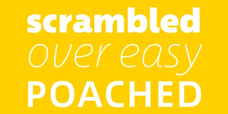
One typeface cooked three ways.

One typeface cooked three ways.
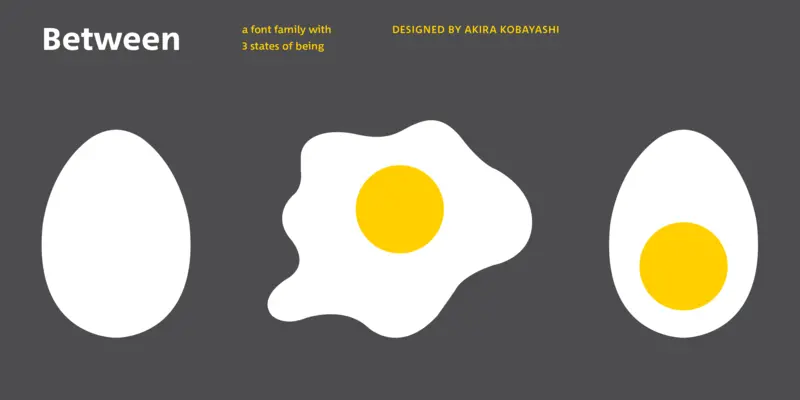
The Between typeface is a delicious typographic concoction: one sans-serif typeface, expertly poached, boiled and scrambled into three new and unique styles by master type chef Akira Kobayashi.
Technical and modern. Between 1 is geometric and modern, ideal for technological brands needing a human face.
Organic and Friendly. Between 2 is round and easy to read, a versatile font for friendly brands, in print or online.
Cheerful and dynamic. Between 3 has a lively, handwritten feel, perfect for artisan brands and natural products.
Designers
Fundidora
Classificação
The Between typeface is a delicious typographic concoction: one sans-serif typeface, expertly poached, boiled and scrambled into three new and unique styles by master type chef Akira Kobayashi.
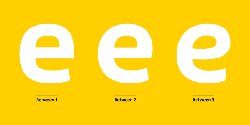
It started with the one in the middle. Between 2 strikes a balance between crisp and highly legible on one hand and organic and friendly on the other. Between 1 pushes towards the more technical and modern, while Between 3 goes the other way, with a lively, handwritten feel. The variations are subtle but telling. All three share the same cap height and x-height, and many letterforms - there’s a fluidity between them. But certain characters, like core components of a dish, make all the difference. Extract the ‘e’s and ‘g’s, for example, and it’s easy to see what the key ingredients are.
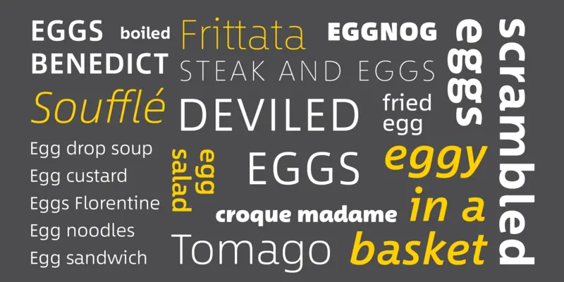
So get cooking with Between 1, 2 and 3, each in eight weights plus italics, and create something eggs-traordinary.

Creative Type Director Akira Kobayashi has three decades of experience, with an extensive background in Japanese typeface design and a deep understanding of calligraphy. After studying at Musashino Art University in Tokyo for four years, Akira Kobayashi accepted his first job at phototypesetting manufacturer Sha-Ken Co., where he was involved in the lengthy and intricate process of designing Japanese fonts.
We offer a number of ways for you to start working with our typefaces.

If you want to license Between to use with your brand or project we can help you.

An all-in-one solution for font discovery, expertise, collaboration and management.

If you want to purchase a single weight or the entire Between font family with a range of licencing choices.

The SST font tackles a central challenge of branding – universality. The SST superfamily supports more than 90 languages including Japanese, Thai and Arabic.
Akira Kobayashi, da Monotype, trabalhou de perto com o Diretor de Arte Chefe da Sony, Hiroshige Fukuhara, para criar uma fonte original preparada para quase 100 idiomas.