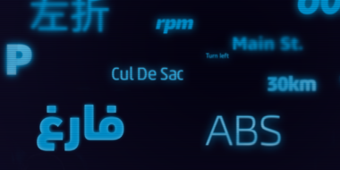
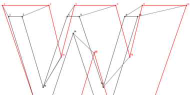
Fonts to fit your augmented and virtual reality designs.

Setting text in augmented and virtual reality presents new design challenges that are dramatically different from practically any other existing medium. Steve Matteson, Creative Type Director at Monotype, has selected fonts that are both highly legible and represent multiple genres, offering reliable choices for AR/VR games, apps or user interfaces.
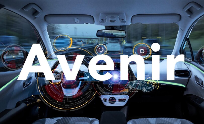
Avenir™
The word Avenir means ‘future’ in French and hints that the typeface owes some of its interpretation to Futura. But unlike Futura, Avenir is not purely geometric; it has vertical strokes that are thicker than the horizontals, an “o” that is not a perfect circle, and shortened ascenders. Avenir represents the most legible of designs within the geometric sans serif genre. The challenges posed by fully geometric typefaces are reduced in Avenir, putting the emphasis on legible shapes, open forms and ample letter spacing. Avenir would work well for extended text in AR/VR or lend modern flair to interfaces for home appliances or IoT.
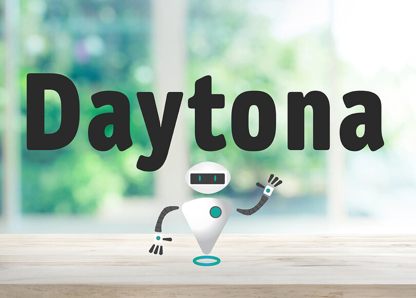
Daytona™
The Daytona typeface family grew out of Jim Wasco’s desire to design a readable typeface for video and on-screen use. Because of its exceptional legibility, it’s also an ideal choice for digital user interfaces and a wide range of print applications. Daytona softens an otherwise modern engineered style, with rounded forms lending an air of informality. This makes it the perfect font for a children’s AR/VR game or app. Originally designed for navigation and wayfinding, the font would also work well for heads-up displays. Daytona can offer the user a friendlier appearance – even in a potentially intimidating futuristic VR experience.
Slate™
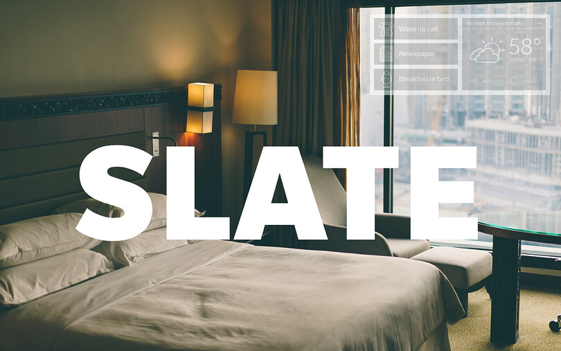
The Slate typeface melds superb functionality and aesthetic elegance into a remarkable communications tool. Slate is the work of Rod McDonald, an award-winning typeface designer and lettering artist. At one point in his forty-year career, McDonald participated in a typeface legibility and readability research project conducted by the Canadian National Institute for the Blind during which he learned the design traits that maximize character legibility and text readability. Slate offers a comfortable reading experience even in challenging technical environments like AR or VR. Slate’s contemporary flair would work well in an app interface, experiential walkthroughs or AR app filters.
Halesworth™
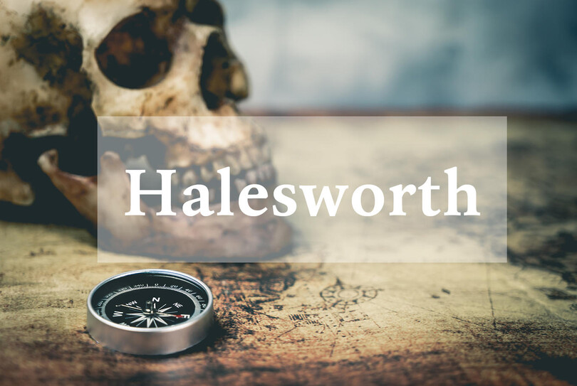
Designing a virtual experience that needs to evoke a historical or academic theme? Halesworth is a Venetian Old Style book typeface designed by Carl Crossgrove, crafted specifically for comfortable reading on screen. Halesworth preserves the beautiful, generous proportions of the Venetian genre and optimizes the details for best performance, making it an excellent choice for long-form text in a VR environment. The typeface has reduced contrast in hairline strokes, generously open counters, ample curves and sturdy serifs. Halesworth has an elegant, antique flavor but can be read comfortably on screen at any angle making it ideal for AR/VR.
Akko™
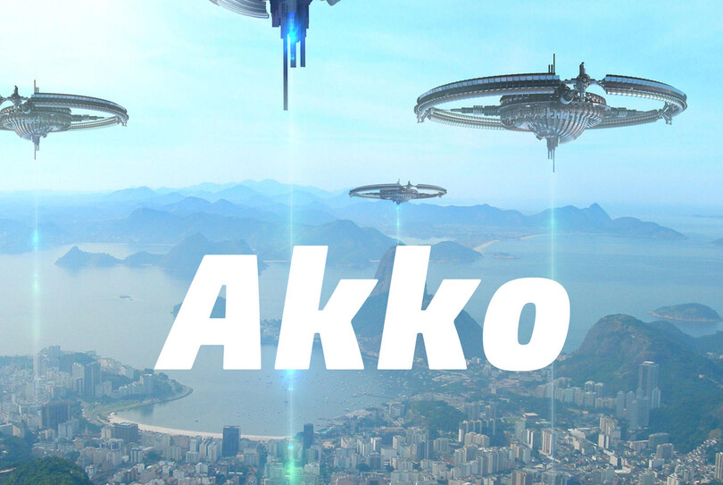
Need to design a UI for the future? Look no further than the Akko typeface. Akko’s contemporary and open design aids in reading from severe angles that can be found in VR situations. Akko was designed with very open counters and a tall x-height following market research indicating the need for a new sans serif with a “tech” look. The resulting letters are characterized by their simplicity and compactness and can be employed to save space within a layout. Akko’s tech-forward appearance combined with its space-saving qualities also make it a reliable choice for futuristic AR/VR games or experiences.
Helvetica eText™
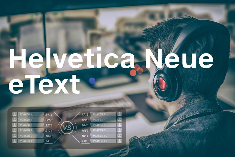
Helvetica™ is the ubiquitous flagship of the Swiss Grotesque genre. The ‘e-text’ adaptation reduces hindrances to legibility commonly found in the style by offering advanced font hinting, expanded characters and modified line thickness and x-height to optimize legibility across smartphones, tablets or e-readers. Helvetica eText aids the reader while delivering style, and is particularly well suited to anything on a grid, for example to display scores or health metrics in games or for virtual eCommerce experiences.
Get the fonts
Get Avenir, Daytona, and thousands of other fonts in Monotype Fonts, Monotype’s Enterprise font solution.


