On Air
Centered around a theme of ‘oxygen’ in type, we created a range of ideas that looked to geometry and circularity, accessibility, clarity, joyful liveliness, and warmth.
Centered around a theme of ‘oxygen’ in type, we created a range of ideas that looked to geometry and circularity, accessibility, clarity, joyful liveliness, and warmth.
Part of O₂’s rebrand strategy was to ensure alignment and consistency across their messaging, and type was identified to be at the center of this transition. O₂ wanted to achieve greater coherence and ownability with a new custom typeface; one that would bring an intangible charisma across all platforms and touch points.
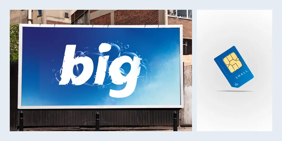
Background.
Frutiger has been the voice of O₂ since their inception in 2002, but much like the world around us, the telco market is changing. Brands are adapting to the increasing demands of digital, as the reach of digital touch points grow, so does the need for continuity and authorship in every medium. O₂’s long relationship with Frutiger is testament to how great a design Frutiger really is, it’s a font that excels in clarity. It was very much on-trend when the brand launched, it’s a reliable workhorse but has become a bit predictable — not a distinctive brand maker.
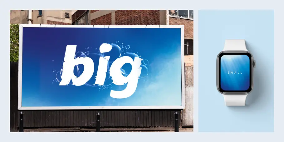
As the O₂ brand looked to move forward, pivoting to the new normal, O₂ and their brand design agency contacted the Monotype Studio to discuss the design of a new typeface that could introduce a distinct and more human centred voice. A pared-back and simplified approach to a font family which has the ability to meet the broad demands and challenges that brands are facing today.
Solution.
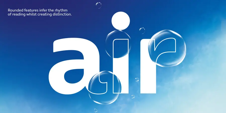
From outset it was clear that a sense of openness and ‘breathability’ was going to be key to the new font’s success. Playing on this theme of ‘oxygen’ in type, we created a range of ideas that looked to geometry and circularity, accessibility, clarity, joyful liveliness, and warmth. This font needed to celebrate the human side of digital. We locked our new font ideas into ads using key phrases ‘Breathe it all in’, ‘Magical realism’, ‘Priority’ and asked the most basic of questions — ‘What feels right?’ ‘Does this type speak O₂?‘
Three ideas struck a chord and helped us firm up the brief. A sense of roundness was important, the letterforms needed to feel open. The O₂ brand gives peace of mind and therefore the design needed to be structurally simple. However, with Frutiger so firmly embedded into the brand, a fully open circular approach wasn’t an entirely viable option. Proportionally, the design needed to function company wide in new and old templates already using Frutiger as a placeholder, we needed to harmonise reflow whilst also evolving the letterforms tonally.
The typeface started coming alive, the character set grew and with it we spent a lot of time ensuring the font would resolve concerns around proportions, scaling, reflow, accessibility and distinction. We provided multiple creative options for all characters, added in figure sets and intelligent OpenType features that automate logo usage from within the font file. The font moved to brand team testing.
Result.
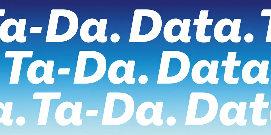
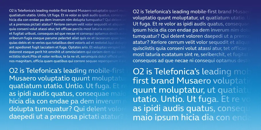
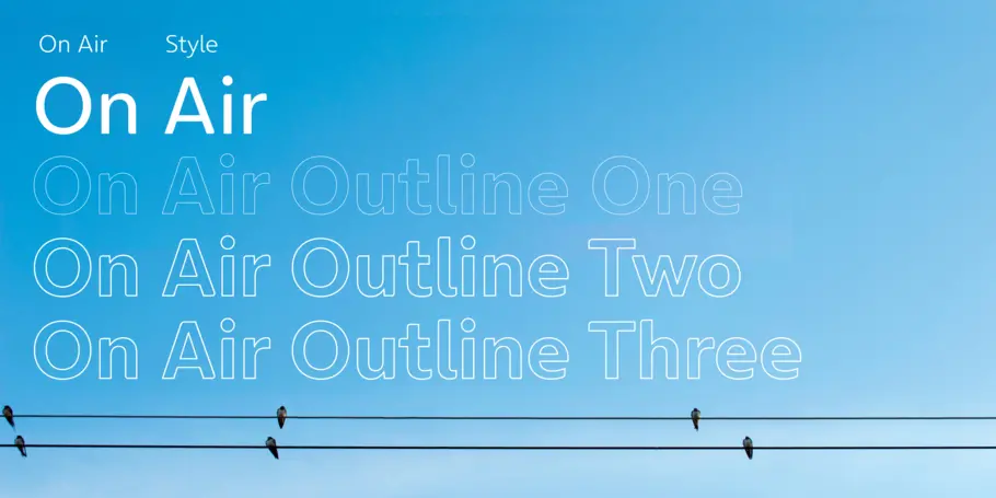
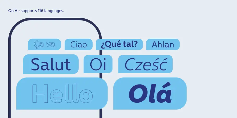
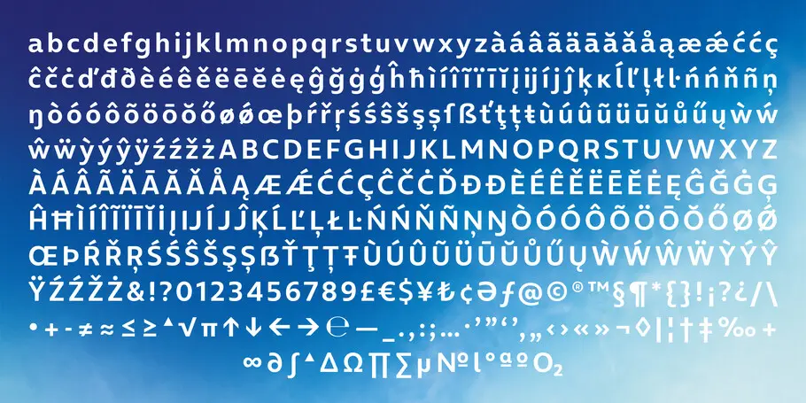
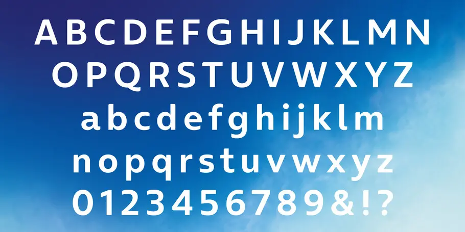
The final custom fonts are named ‘On Air’ and ‘On Air Outline’ and create a cohesive brand language, aligned to the heart of O₂’s values of openness and trust.
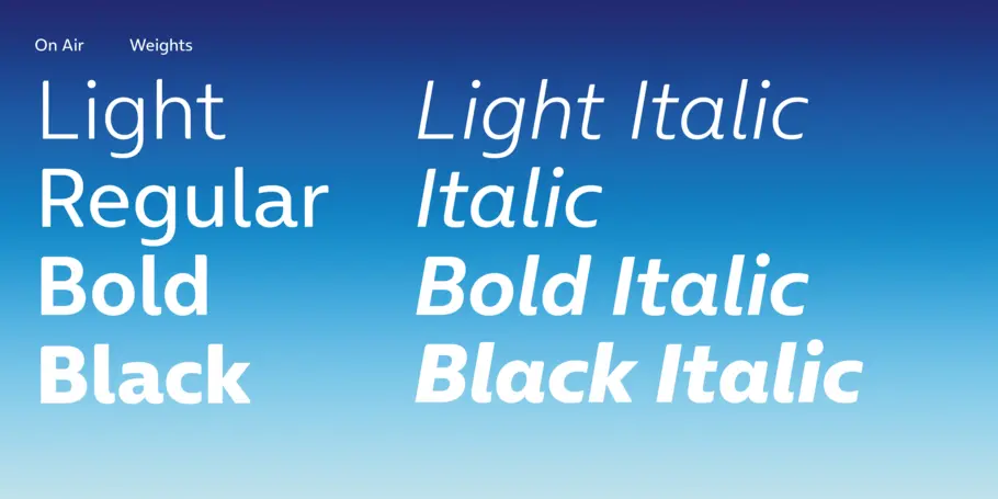
On Air is an exclusive family of four weights of Light, Regular, Bold and Black plus Italics and On AIr Outline is available in 3 styles.

Phil is a Creative Type Director and type designer with many years of experience in the design and engineering of fonts for global brands. Working in collaboration with design studios and global clients, Phil understands the creative and business needs of brands looking to build continuity with type.