Gill Sans Nova®
The Eric Gill Series.
Discover, manage, and use fonts with a subscription.
Individual font purchases for any project.
Discover, manage, and use fonts with a subscription.
Individual font purchases for any project.
The Eric Gill Series.
The Eric Gill Series is a collection of 77 fonts in three families: Gill Sans® Nova, Joanna® Nova and Joanna Sans Nova. All the typefaces are derived from the original work of the influential British artist Eric Gill (1882-1940), acclaimed in his lifetime as a sculptor, letter-cutter and type designer. These are contemporary digital typefaces – with a wide range of weights, alternate characters and extended language support – that pay homage to Gill’s original designs.
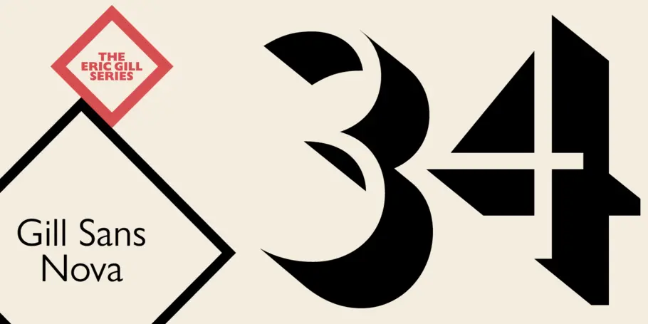
The Gill Sans® Nova typeface, by Monotype Studio designer George Ryan, expands the much-loved Gill Sans family from 18 to 43 fonts and features a coordinated range of roman and condensed designs. Several new display fonts are available, including a suite of six inline weights, shadowed outline fonts that were never digitized and Gill Sans Nova Deco that was previously withdrawn from the Monotype library.

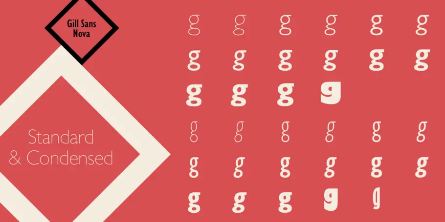
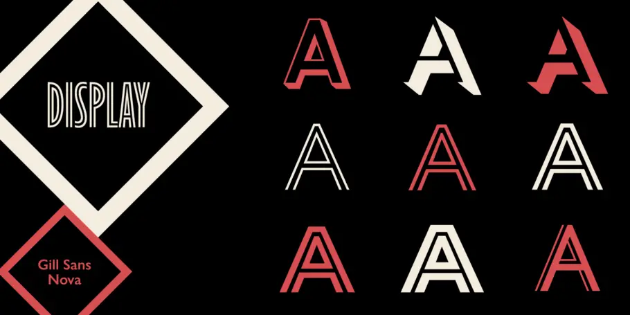


The Gill Sans® Nova typeface, by Monotype Studio designer George Ryan, expands the much-loved Gill Sans family from 18 to 43 fonts and features a coordinated range of roman and condensed designs. Several new display fonts are available, including a suite of six inline weights, shadowed outline fonts that were never digitized and Gill Sans Nova Deco that was previously withdrawn from the Monotype library.
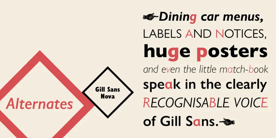
A variety of OpenType® features are supported that make it possible to include experimental characters from different points in Gill Sans's long history, including pointed diagonals on 'A', 'V' and 'W' and alternatives for 'b', 'd', 'p' and 'q.' Proportional figures are also available as an alternative to the tabular designs.
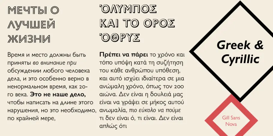
The Gill Sans Nova family has a large character set that supports Latin, Greek and Cyrillic languages. The display weights support Latin only.
"Gill Sans was fast to strike a chord with people after its initial 1928 release and quickly became popular," explained Ryan. "It's been adapted for every publishing technology, from mechanical typesetting to digital imaging - always receiving the best treatment from Monotype in each iteration. This is especially true with all that we've added to the new series, while still retaining the familiarity of Gill Sans. My goal was to ensure clarity across digital environments, add missing weights, and bring more personality to the family with new display fonts, as well as Gill-inspired alternate characters."
The Gill Sans Nova typeface family is part of the new Eric Gill Series, drawing on Monotype's heritage to remaster and expand and revitalize Eric Gill's body of work, with more weights, more characters and more languages to meet a wide range of design requirements. The Series also brings to life new elements inspired by some of Gill's unreleased work, recently discovered in Monotype's archive of original typeface drawings, designer correspondence and documents from the last century.

Before starting his career in type, George Ryan spent three years in the US Army, serving in Germany and Vietnam. He was heavily involved in the early development of digital font production tools, working for Bitstream in the 1980s and for Galapagos in the 90s. He calculated that he had spent more than 35 years ‘drawing letters.’ Ryan also had extensive experience as a software programmer and computer network troubleshooter. From 2004, he was a type designer at Monotype. Ryan designed the Oz Handicraft typeface, based on the work of Oswald Cooper.
We offer a number of ways for you to start working with our typefaces.
You know what they say, “classics never go out of style.” Maybe this is true, maybe it isn’t. But one thing is certain: When sans serifs took over typography in the early 1900s, they weren’t just a fad. They came to stay.
Fonts play an indispensable role in shaping your experience of published media, working in a deliberate way to communicate the information clearly and legibly.

