Discover, manage, and use fonts with a subscription.
Individual font purchases for any project.
- 字体
- 产品
- 字体工作室
- 资源
- 蒙纳公司
Discover, manage, and use fonts with a subscription.
Individual font purchases for any project.
- 字体
- 产品
- 字体工作室
- 资源
- 蒙纳公司
Discover, manage, and use fonts with a subscription.
Individual font purchases for any project.
Discover, manage, and use fonts with a subscription.
Individual font purchases for any project.


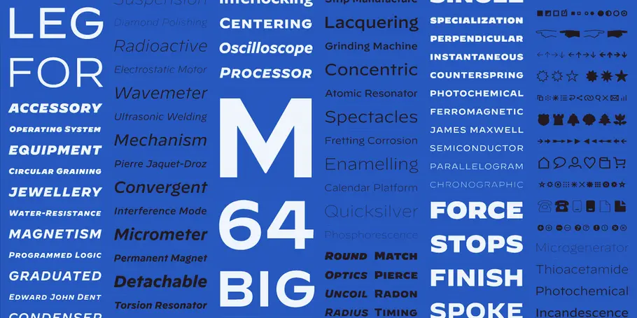
灵感源于手表表盘,Decimal 字体唤起了人们对经典钟表刻度文字的记忆。此外,Decimal 还融入了诸多设计巧思,让字体适应信息密集的环境。
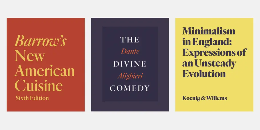
Quarto is a seriffed display family marked by controlled contrast. Its fluid motions are checked by a steadfast rhythm, its density invigorated by sudden geometric turns and sharp corners.
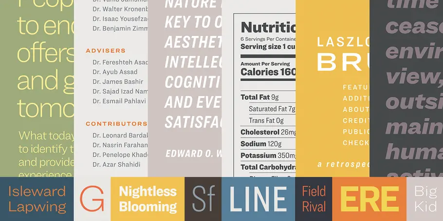
Designed as a text-size complement to our Knockout family, Ringside is a powerhouse sans serif in six widths, each in eight weights, with both romans and italics.
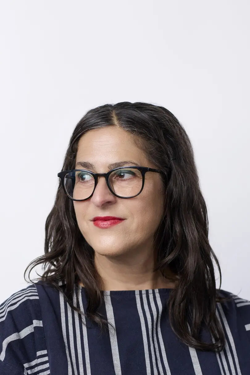
作为字体创意总监兼设计师,Sara Soskolne 痴迷阅读,这也是她字体设计作品的灵感来源。Sara 的字体作品不仅服务于阅读,还让阅读体验变得更丰富多彩。Sara 最初是一名平面设计师,对字体的热爱让她进入英国雷丁大学深造字体设计,学成后在 Hoefler&Co. 继续她的字体设计事业。
Prior to joining Monotype, Sara played a part in nearly every H&Co typeface after her arrival there in 2005 — as a designer, and later also through her oversight of the type design team. Among those, she contributed to the development of the Verlag, Chronicle, Gotham, Tungsten, Idlewild, Numbers, Sentinel, and Whitney families, and played a formative role in the design of Quarto, Ringside, and Decimal.
Her master’s dissertation research sparked an ongoing project exploring the evolution of the sans serif in the types of the 19th century, and she was one of the founding instructors of the Type@Cooper Condensed certificate program. As an only partially reformed Torontonian living in New York, Sara still spells like a Canadian and can’t really think in Fahrenheit.
