Correos, national postal service, is a brand of more than 350 years. Together with branding agency, Summa, we designed a new font exclusively for Correos, named Cartero (Postman) in honour of the emblematic professionals that has shaped the company since its early days.


Designers
- Emilios Theofanous.
About Correos.
Correos new reality.
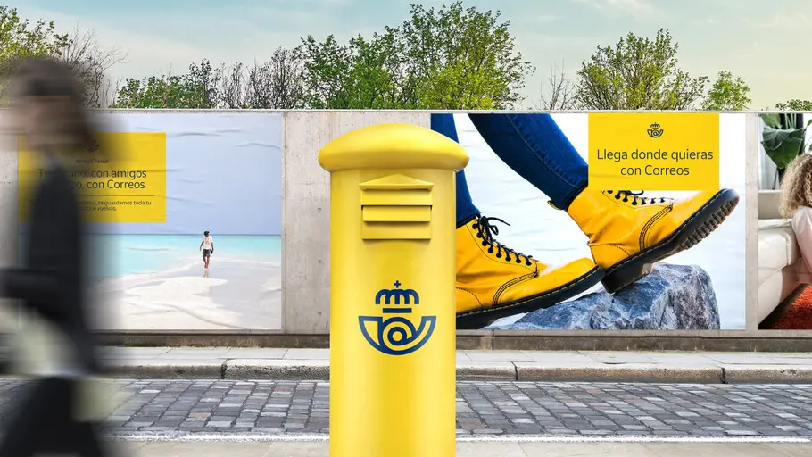
Correos, national postal service, is a brand with more than 350 years. Witness of all the changes that spanish society has undergone, it has evolved to adapt to them and to technological advances by launching new courier and parcel services. However, society felt Correos as an endearing brand, traditional but not at all innovative. That's why Correos needed to adapt its identity to reflect its own reality: a company that has been innovating in services since 1756 and continues to do so.
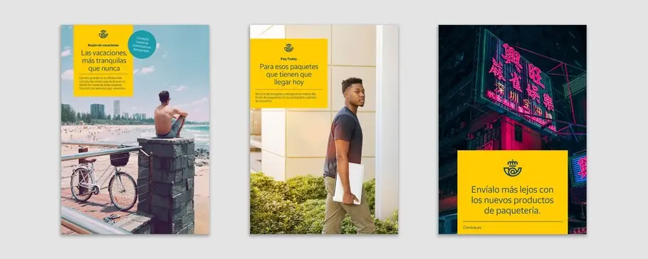
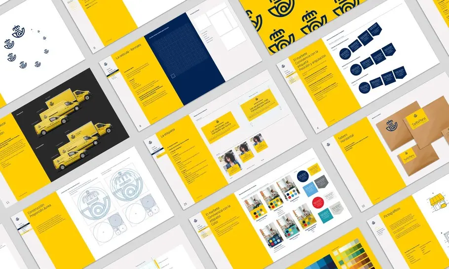
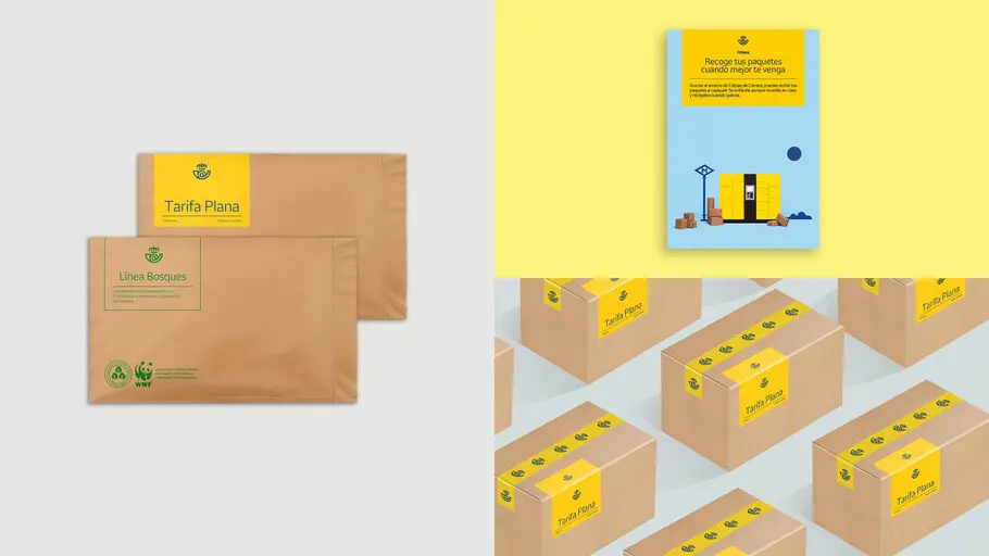
To embrace its essence and communicate it in a more contemporary and direct way to its audience, Correos counted on Summa to develop the brand project. Our task was to update the brand and position Correos as another player in the current industry, leaving behind the times where the brand expressed itself only in its fleet, facades and mailboxes, and covering every outcome across physical and digital media.
A typeface for Correos.
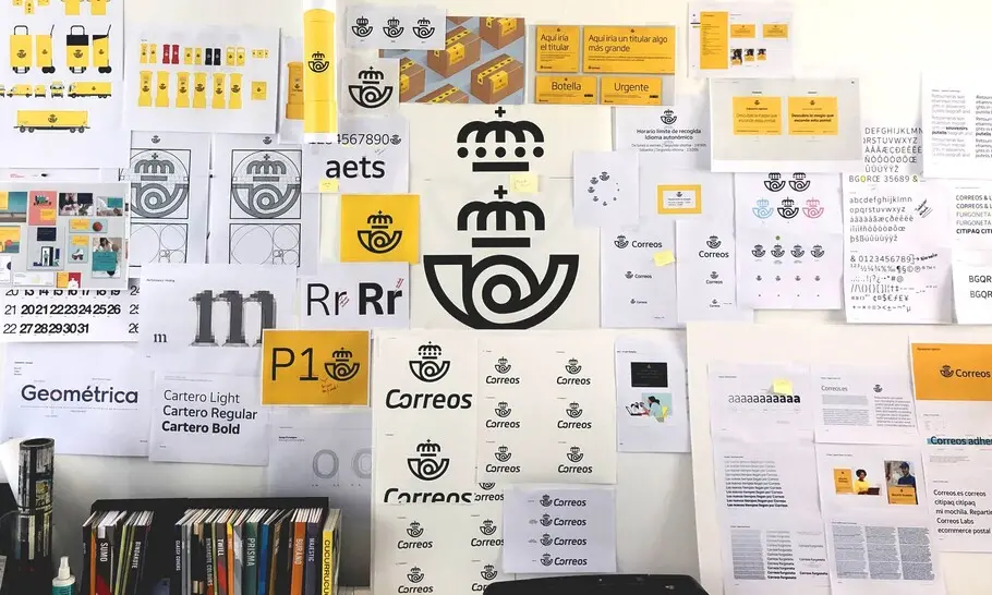
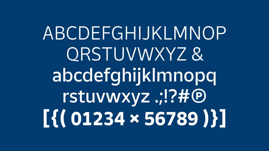
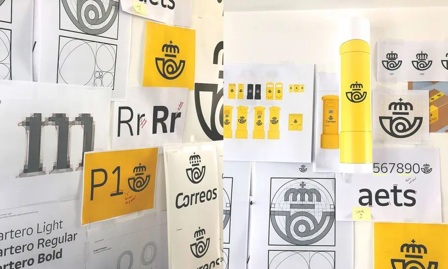
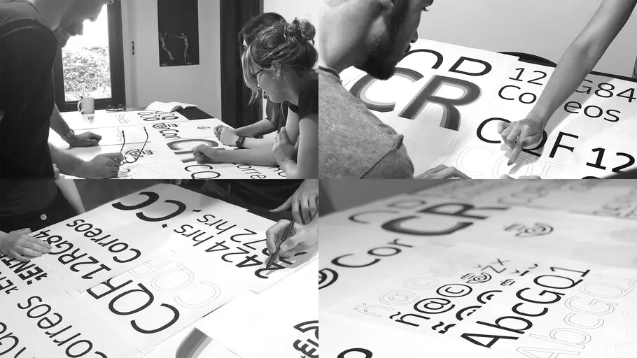
An important element in the renewal of the visual identity for Correos is its new typeface. Together with Monotype, we designed a new font exclusively for Correos that we have named Cartero (Postman) in honour of these emblematic professionals that has shaped the company since its early days.
The new typeface brings elegance and modernity, and reinforces the essential attributes of the new Correos. Its simplicity ensures the proper functioning of it in all types of messages (from corporate to commercial, from digital to traditional environments) and at the same time will make it last over time without losing relevance.
Designers

Emilios Theofanous.
Born in Cyprus, Monotype Senior Type Designer Emilios Theofanous, has a soft spot for quality Greek and multilingual typography. Since joining Monotype, he has worked on multiple custom and Library projects. Prior joining Monotype, he collaborated with international foundries and contributed to large-scale projects such as Source Serif Greek Italic for Google Fonts and Adobe.