Creative Characters S2 E16: Craig Ward: From metal type to the digital unknown.
Craig Ward.
From big brands to Lego bricks, Craig Ward has left his mark all over the world of typography. This week, host Charles Nix sits down with Craig to talk about his career, his myriad side projects and quirky pastimes, and how technology could revolutionize the way we use type and ensure the rights of ownership for designers.
The eclectic nature of type.
Craig’s entry point into the design world was studying graphic design at Buckinghamshire New University. Not long after, he found himself working on a winning project pitch for Porsche at Stack Agency in London.
Upon graduating he joined Stack full-time, and bought himself a small printing letterpress so he could start experimenting more with typography.
“There was a guy who used to run a stall at Covent Garden market who would sell individual letters, a really ineffective way to buy type, but I quite like the eclectic nature of having different letters from different alphabets at different sizes and I would just noodle with that in my spare time and just make little illustrations for myself, posters for friends, business cards and Christmas cards, that kind of thing.”
Having a medium that was focused on discovery kicked off his passion for the world of type.
“The setup that I had at home was not professional level, but the process of it and the way that you could set the same piece of type and print it 25 times and get a slightly different result each time. That randomness was really exciting to me.”
From the UK to the Big Apple.
While working in London, Craig was also building up a typography portfolio on the side. He entered the Young Guns portfolio competition through the Art Directors Club and was selected for the class of 2009. At the awards ceremony, a recruiter approached him with an offer to work in New York.
“I came home with a job offer, which was very unexpected and I was there two months later, and Grey [New York] was a big ship. The big agencies in London, even the very biggest, are 400 or 500 people, and Grey at that point, in 2009 was I think 1,200 people, this literal skyscraper…it was a big step up.”
The transition came with an amazing series of new projects and its own set of unique challenges. Working as Grey’s design lead, Craig oversaw the design and creative campaign visuals for big name brands from Canon to the NFL.
“I struggled with the drop off in pace. I think that was my big hurdle because you come from these sort of smaller, more nimble London agencies where you have to wear a lot of hats, and then suddenly I was working with these Fortune 500 monsters and project length just went up exponentially.”
After a few years, Craig decided to take a break from agency life and focus on building his portfolio with his own clients.
Creative side projects.
Working on contract design projects over the years, Craig has done work for well-known companies including The Wall Street Journal, The Guardian, Aesop, and Verizon. He looks back fondly on his projects for editorial companies.
“I feel like there’s always going to be a need or a want for that sort of work, that aesthetic, that sort of gritty kind of textured letter pressed aesthetic. I think people just have such a soft spot for it in editorial.”
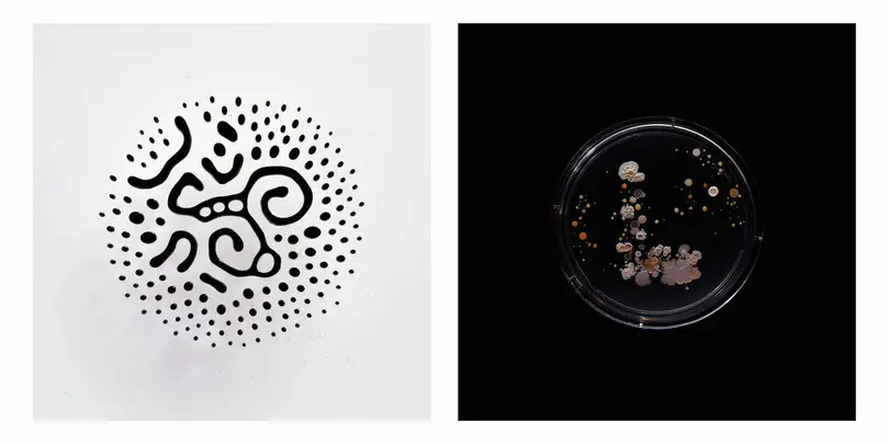
Even while doing this contract work, Craig found himself continuing to tinker with type projects in his spare time. During the pandemic, he tried out a type project with his kids which turned into the Brikfont project, an experiment to create the perfect Lego typeface. The type study quickly gained traction with a 13K+ following on Instagram, and the project was recently named a winner in the 2023 Communication Arts Typography Annual.
“I feel like probably the work that’s done best for me in terms of promotion or sort of getting my name out, it’s always been sort of self-initiated projects, and I guess I’ve just got a good filter for knowing which ones are worth pursuing.”
Revolutionizing type.
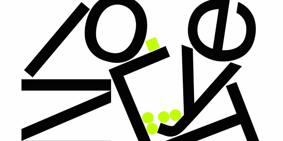
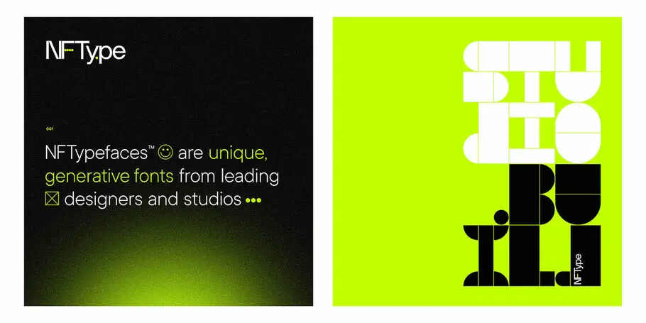
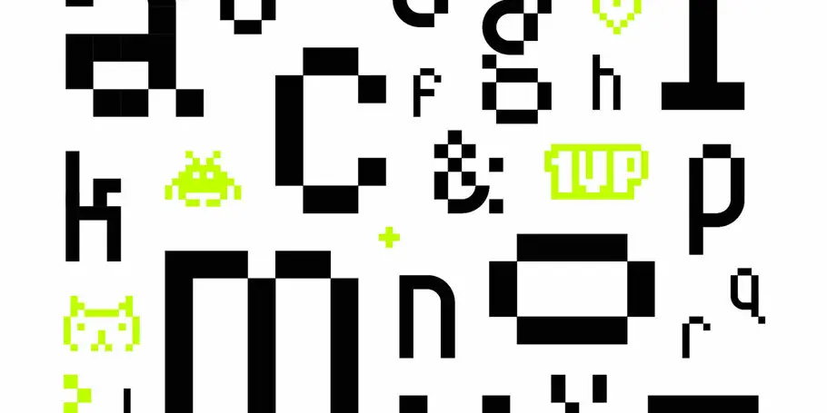
Last year Craig founded NFTy.pe, a decentralized type foundry that creates NF typefaces - quantifiably unique, generative typefaces in partnership with leading design studios. The fonts are modular, component-based design with generative scripts that are written into the typeface.
The project focuses on innovation and commoditization: NFTy.pe creates 1,000 versions of each typeface, available for a 1-month period. The number of copies sold are the only number of copies available. The goal behind NFTy.pe to create a new ownership model in the type industry.
“It’s 2022 there’s still really no way to effectively expedite the creation of typefaces and type families. There is still this type time commitment, it’s something that architecture has solved over the years, just by taking this sort of modular approach and we need to go big quickly, we go modular, and that sort of just makes things, scale more quickly…. how many parts does it take to make a typeface?”
