Scaling a global brand identity.
In today’s global market, maintaining a cohesive brand identity across different languages and cultures requires thoughtful design solutions, and typography plays a central role in this effort.
Xiaomi, a Chinese multinational technology company known for its smartphones, consumer electronics, and smart home devices, needed a typeface that could do more than just look good; it had to function as a seamless extension of their brand, across several devices, languages, and cultures.
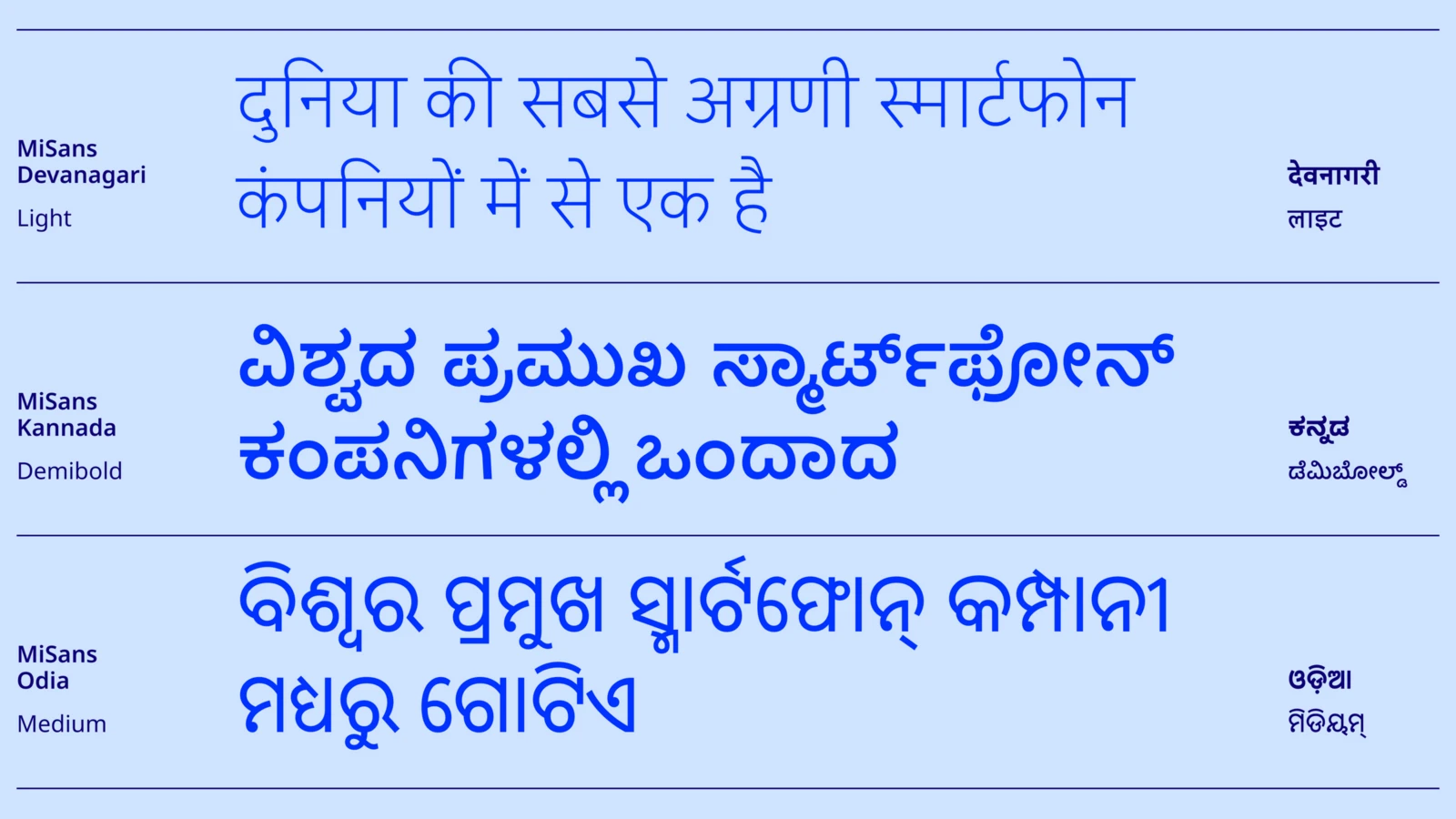
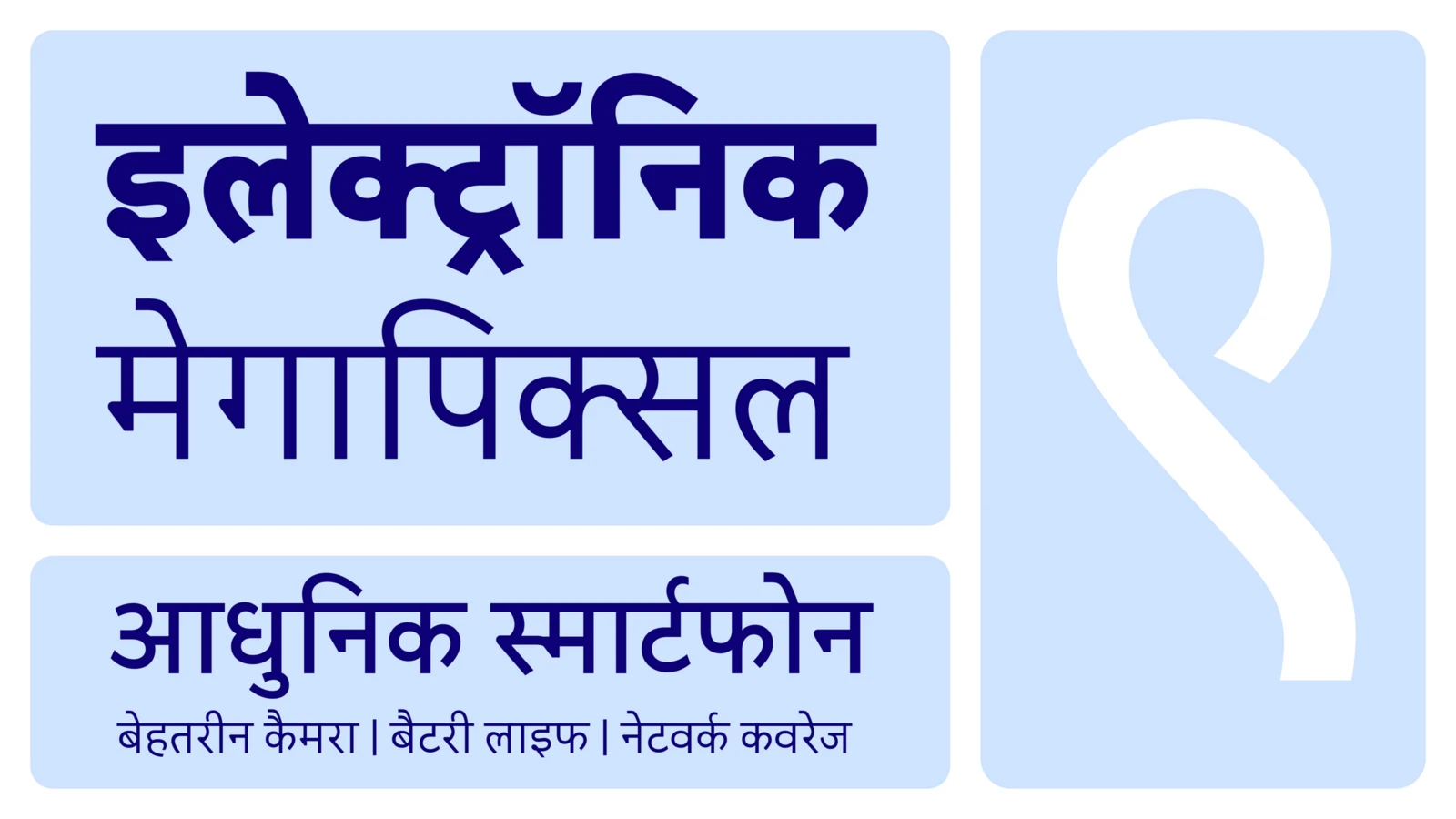
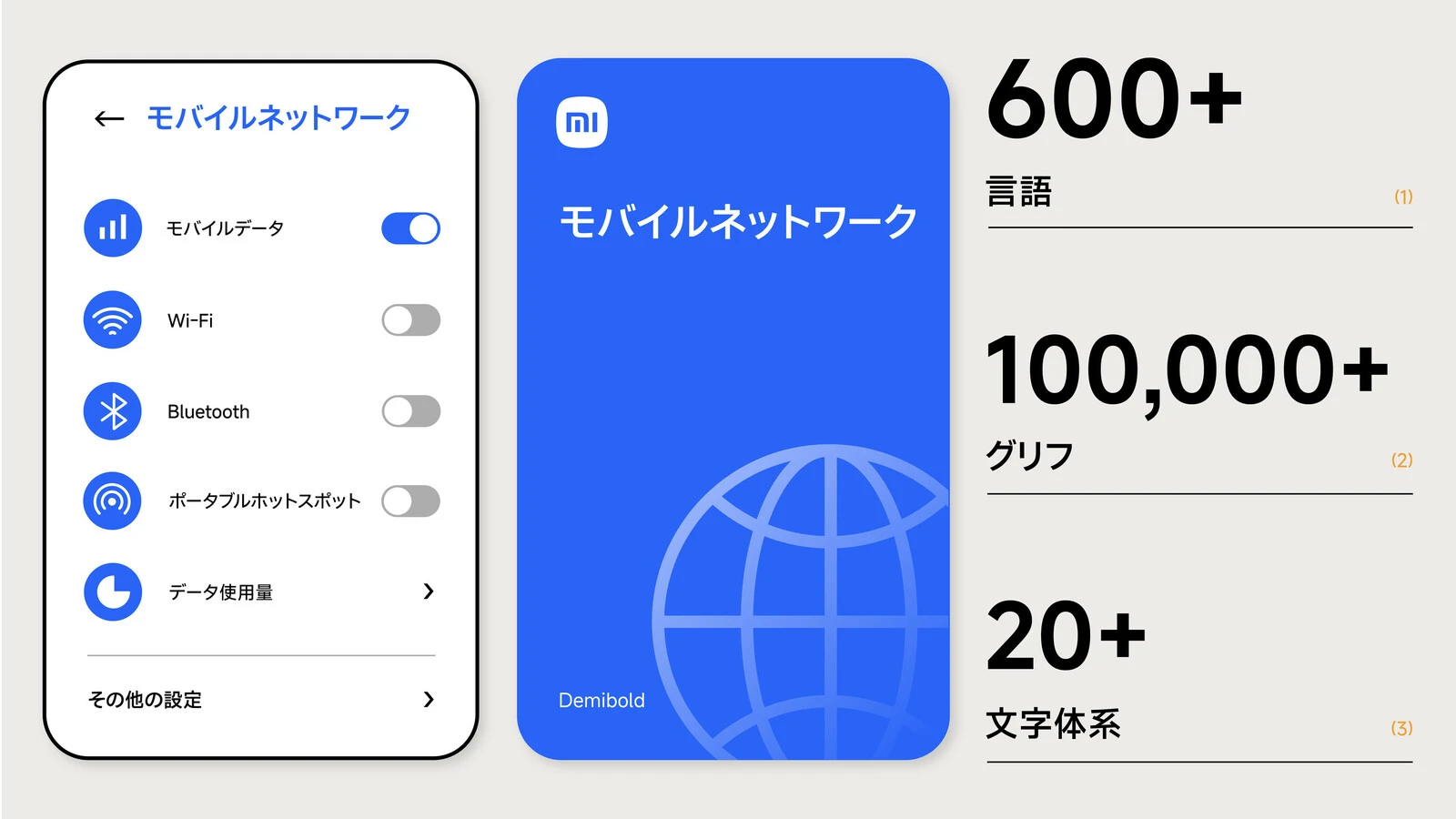
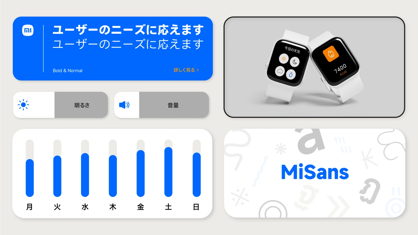
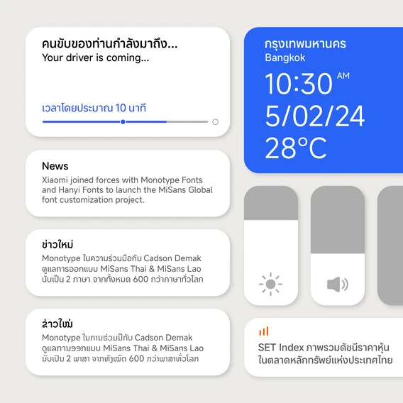
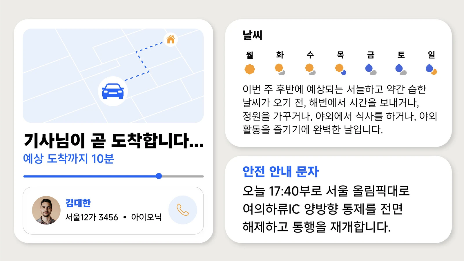
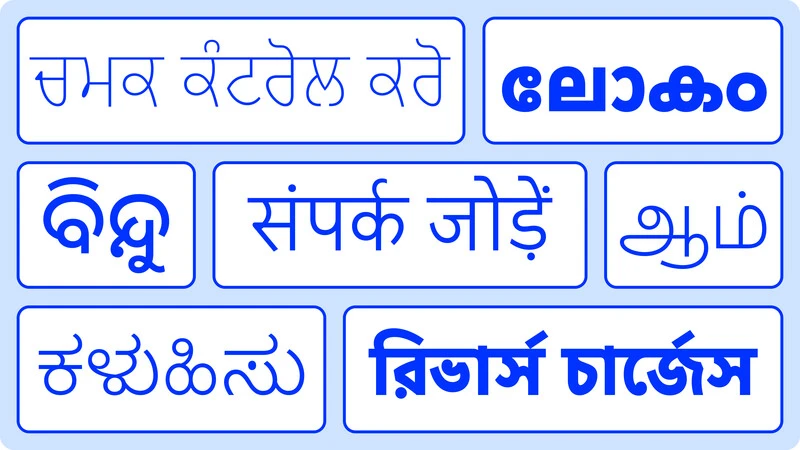
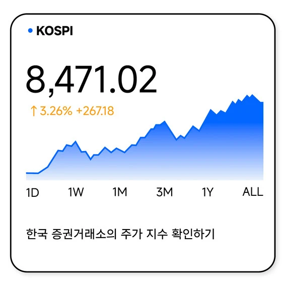
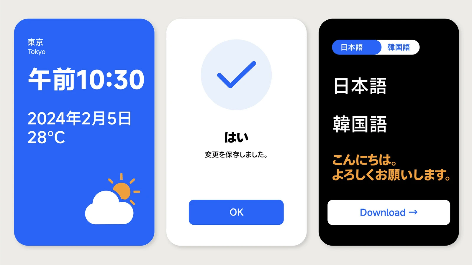
Enter MiSans, a typeface designed to evoke Xiaomi’s core design principles while honoring the nuances of every language it supports. This ambitious project began by substantially extending MiSans Latin, designed by Hanyi Fonts, to deliver seamless support across a diverse range of scripts. MiSans now features typefaces meticulously crafted by Monotype, covering Thai, Lao, Japanese (kanji, hiragana, katakana), and Korean (Hangul, Hanja), alongside an extensive suite of Indian scripts encompassing Bengali, Devanagari, Gujarati, Gurmukhi, Odia, Tamil, Telugu, Kannada, and Malayalam. MiSans is more than a visual tool. It’s a cultural bridge that brings clarity and consistency to Xiaomi’s communication across diverse regions.
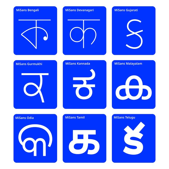
Developing a typeface of this scale required an innovative approach to unify scripts with distinct structures and traditions. Each script was carefully designed to maintain its unique character while aligning with Xiaomi’s aesthetic of clarity, simplicity, and modernity. The design represents a purposeful approach to multi-script typography, blending innovation with a deep understanding of cultural identity and user needs to meet the demands of a connected, multilingual world.
Technical foundation and deliverables.
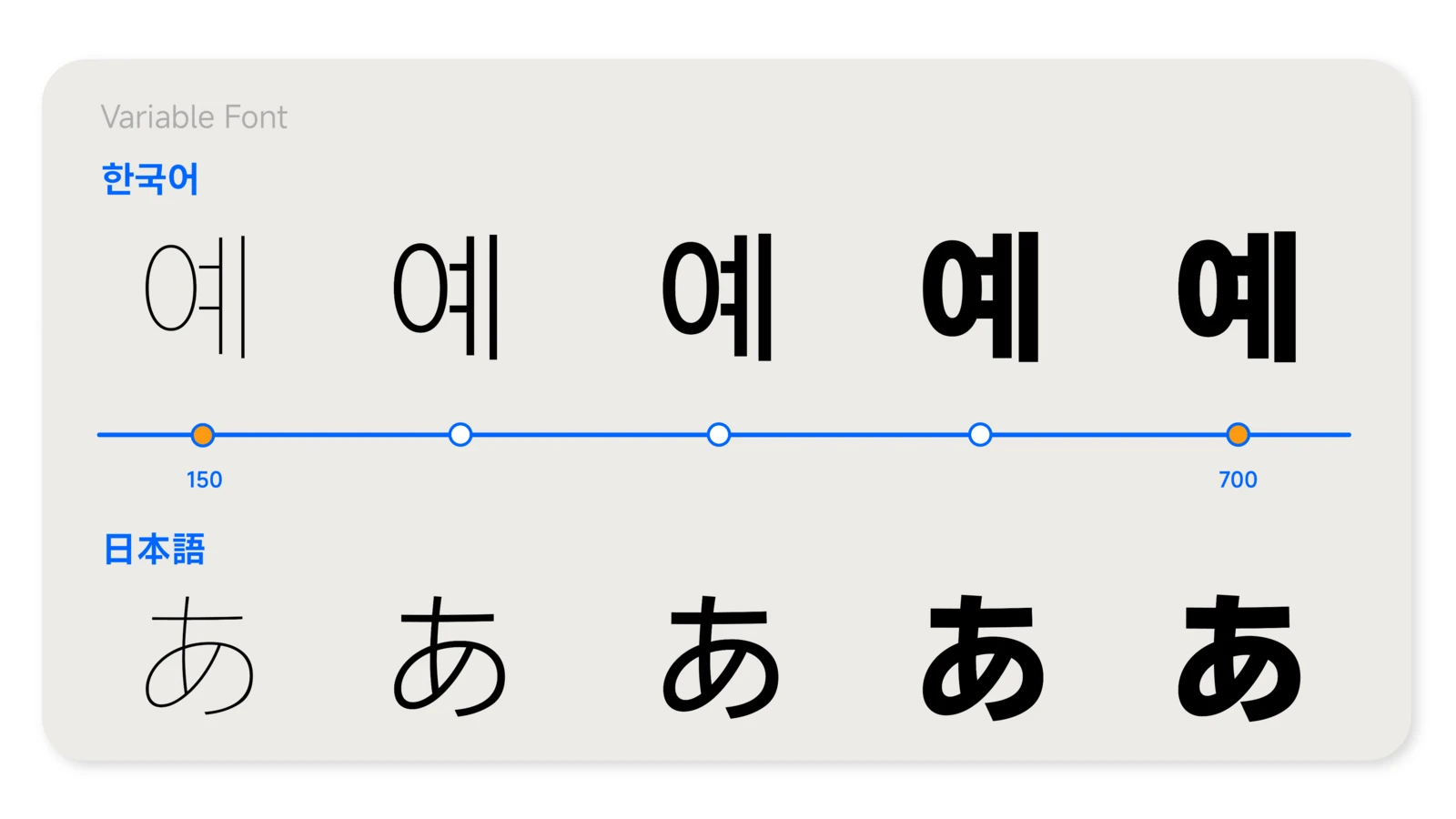
MiSans was engineered using a three-master system, interpolated into ten instances to cover the full weight range. Furthermore, the hinting and character set management for CCJK fonts required careful handling to ensure they worked flawlessly. Deliverables included OTF, TTF, variable and webfont formats, ensuring readiness for print and digital environments, making MiSans universally accessible.
This project took place in two phases. The first phase focused on Indic scripts, Lao, and Thai, and took approximately nine months. The second phase largely covered Japanese and Korean and took about twelve months to complete.
The collaboration behind MiSans.
Creating the MiSans typeface was a collaborative effort that brought together a team of international type design experts to ensure each script was treated with care, respect, and contextual sensitivity alongside technical excellence. Monotype enlisted specialists who deeply understood both the cultural and technical nuances of each script.
For the Indic scripts, Monotype partnered with Vaibhav Singh and Alessia Masarella from Typeland, whose knowledge of the region’s typographic traditions played a pivotal role in shaping designs that resonate authentically across India’s diverse linguistic landscape.
For the Lao and Thai scripts, Cadson Demak’s team leveraged their extensive expertise to design typefaces that honor the identity of these scripts while maintaining alignment with Xiaomi’s aesthetic principles. For example, they chose to go with a Loopless style of Thai, as its fundamental structure has come to be naturally associated with the requirements of digital environments.
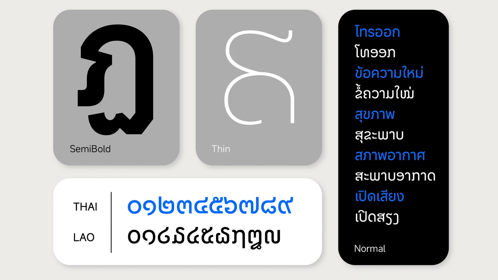
One typeface, many scripts.
Their work emphasized the importance of balancing historical references with a forward-looking design approach, ensuring the typeface felt modern and relevant.
Addressing the complexities of Japanese and Korean required a specialized focus. Monotype’s in-house CCJK team, led by designers Ryota Doi, Tao Di, and Chorong Kim, took charge of this challenge along with Jin Yoo, a Hangul type design expert. This team worked to integrate these intricate scripts into the broader type system without losing their distinctive character.
The collaboration didn’t stop at multilingual font development. Throughout the project, Monotype and Xiaomi maintained a constant exchange of ideas and feedback, enabling the team to test and refine the designs as an entire typographic system, in real-time and address challenges as they arose. By bringing together the right blend of cultural sensitivity, design expertise, and client collaboration, the MiSans project became a testament to what’s possible when diverse talents work toward a shared vision.
A brand voice that speaks every language.